Assumptions, categorical predictors & how to show your results
2026-07-28
check the OLS assumptions that matter — spot outliers with Cook’s D and judge the linearity assumption — and decide what to do about a suspicious case;
use a categorical predictor — dummy-code it, choose a reference category, and read the coefficients as differences between groups;
visualize regression results — a coefficient plot for categorical predictors, and predicted values for a continuous one.
One part of today’s lecture per goal. Our running question: the carbon divide — who pollutes, and why?
Part 1 of 3
Regression is easy to run and easy to fool. Before we trust a line, we interrogate it.
The climate crisis is the defining North–South injustice of your generation: the countries that emit most are rarely the ones that suffer most.
A first, blunt question before any of the justice: do richer countries simply emit more CO₂?
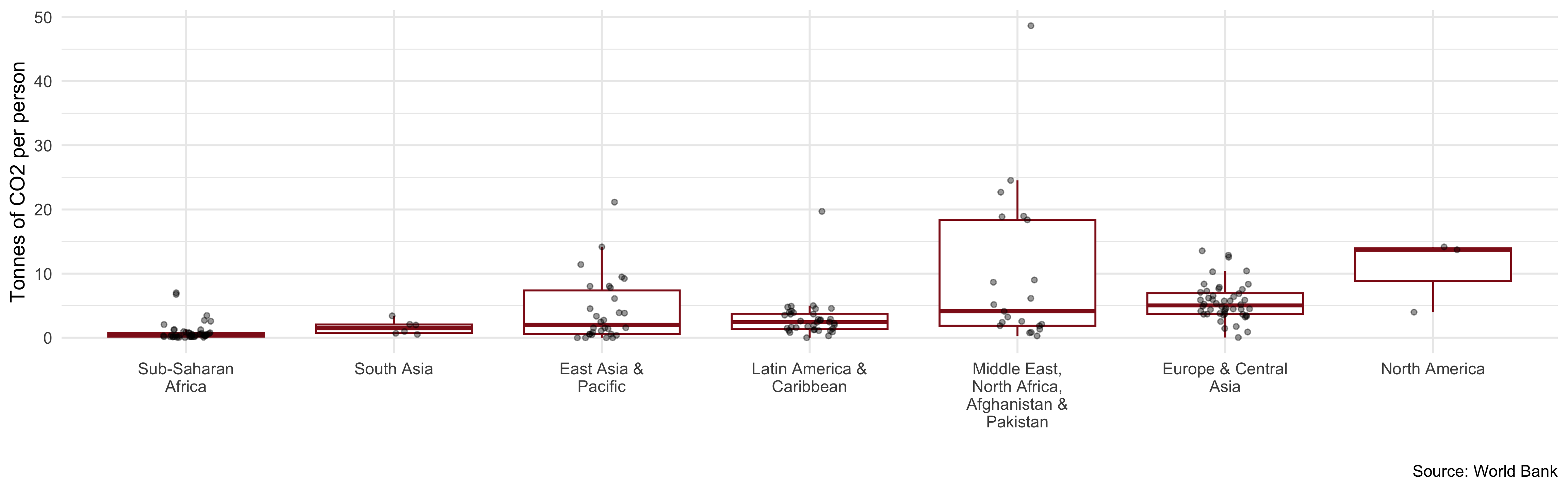
Research question of the day: across the world’s countries, how does CO₂ emitted per person relate to a country’s wealth — and to the world region it sits in?
The gap is staggering: the average Qatari emits hundreds of times more CO₂ than the average person in Chad or the DR Congo Chancel (2022).
# Download from the World Bank API; if it is unreachable, fall back to a
# cached copy so the analysis still runs (smart habit for any live data!)
co2_raw <- tryCatch(
wb_data("EN.GHG.CO2.PC.CE.AR5", # CO2 emissions, tonnes per person
start_date = 2000, end_date = 2023),
error = function(e) readRDS("data/wb_co2_raw.rds")
)
gdp_raw <- tryCatch(
wb_data("NY.GDP.PCAP.PP.KD", # GDP per person, PPP (constant 2021 $)
start_date = 2000, end_date = 2023),
error = function(e) readRDS("data/wb_gdp_raw.rds")
)
countries <- tryCatch( # Region & income group for every country
wb_countries(),
error = function(e) readRDS("data/wb_countries_raw.rds")
)# Most recent CO2 value per country
Dat_co2 <- co2_raw %>%
rename(co2 = EN.GHG.CO2.PC.CE.AR5) %>%
select(iso3c, country, year = date, co2) %>%
drop_na(co2) %>%
group_by(country) %>%
filter(year == max(year)) %>%
ungroup()
# Most recent GDP value per country (keep only the key + GDP)
Dat_gdp <- gdp_raw %>%
rename(gdp = NY.GDP.PCAP.PP.KD) %>%
select(iso3c, year = date, gdp) %>%
drop_na(gdp) %>%
group_by(iso3c) %>%
filter(year == max(year)) %>%
ungroup() %>%
select(iso3c, gdp)
# Region & income group (drop the World Bank's aggregate "regions")
Dat_meta <- countries %>%
filter(region != "Aggregates") %>%
select(iso3c, region, income_level)
(Dat <- Dat_co2 %>%
inner_join(Dat_gdp, by = "iso3c") %>%
inner_join(Dat_meta, by = "iso3c") %>%
mutate(
gdp_k = gdp / 1000, # GDP in THOUSANDS of $, for readable slopes
region = fct_relevel(region, "Sub-Saharan Africa") # reference group
))
# # A tibble: 191 × 8
# iso3c country year co2 gdp region income_level gdp_k
# <chr> <chr> <dbl> <dbl> <dbl> <fct> <chr> <dbl>
# 1 ABW Aruba 2023 5.00 42783. Latin America & Caribbean High income 42.8
# 2 AFG Afghanistan 2023 0.281 1984. Middle East, North Africa, Afghanistan & Paki… Low income 1.98
# 3 AGO Angola 2023 0.744 8598. Sub-Saharan Africa Lower middl… 8.60
# 4 ALB Albania 2023 1.75 20502. Europe & Central Asia Upper middl… 20.5
# 5 ARE United Arab Emirates 2023 18.4 70240. Middle East, North Africa, Afghanistan & Paki… High income 70.2
# 6 ARG Argentina 2023 4.17 27230. Latin America & Caribbean Upper middl… 27.2
# 7 ARM Armenia 2023 2.53 19403. Europe & Central Asia Upper middl… 19.4
# 8 ATG Antigua and Barbuda 2023 3.69 28712. Latin America & Caribbean High income 28.7
# 9 AUS Australia 2023 14.2 60685. East Asia & Pacific High income 60.7
# 10 AUT Austria 2023 6.40 64536. Europe & Central Asia High income 64.5
# # ℹ 181 more rows
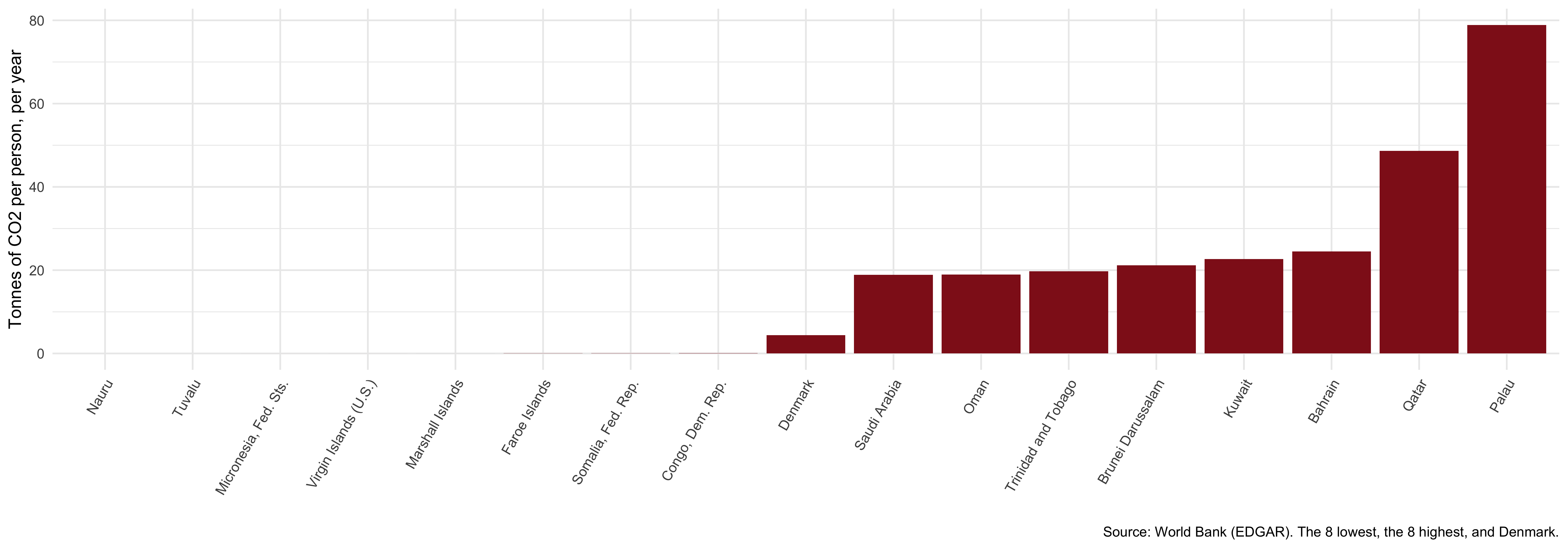
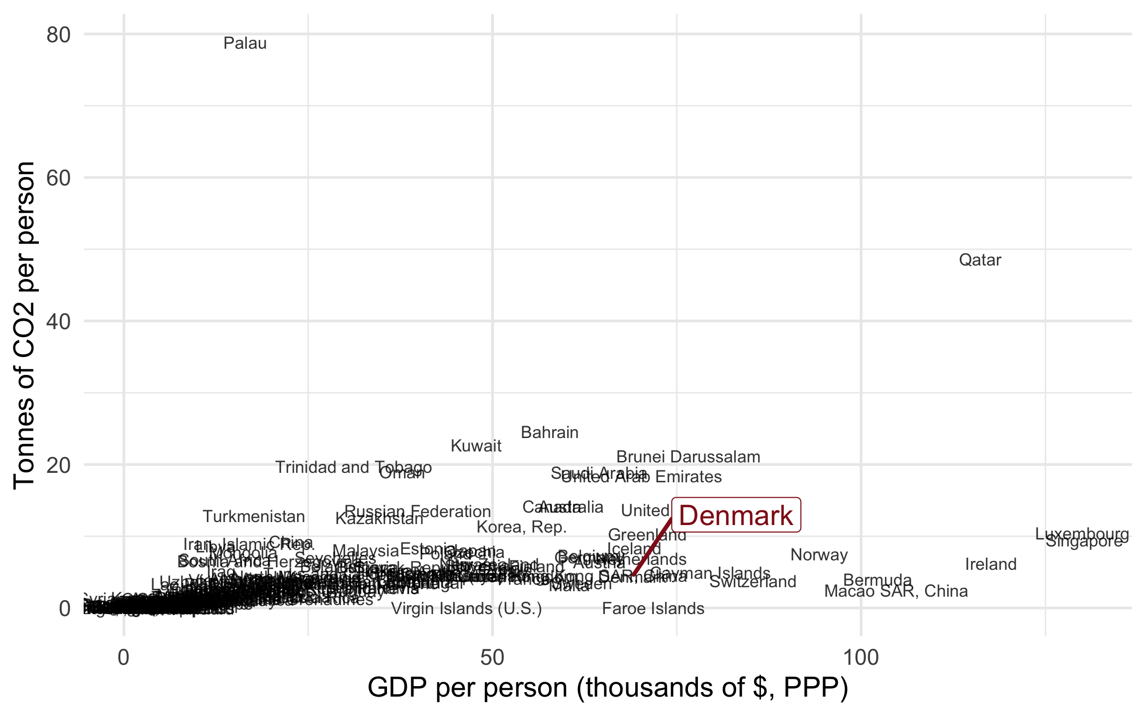
The extremes are oil-and-gas economies (Qatar, Kuwait, Brunei) and rich English-speaking countries; at the other end sit some of the world’s poorest states.
Ask every scatter plot four questions:

| CO2 per person | |
|---|---|
| (Intercept) | 1.360+ |
| (0.763) | |
| gdp_k | 0.118*** |
| (0.028) | |
| Num.Obs. | 191 |
| R2 | 0.167 |
| + p < 0.1, * p < 0.05, ** p < 0.01, *** p < 0.001 |
Each extra $1,000 of GDP per person comes with about 0.12 more tonnes of CO₂ per person. But \(R^2 \approx 0.17\) — and a low \(R^2\) is often a warning sign. Should we trust this line?
For OLS to describe the data honestly:
lm_robust() handles it.\(\rightarrow\) The first two we check with plots.
Beware: a single strange country, or a curved relationship, can bend the OLS line away from the pattern in the bulk of the data — and quietly change your conclusion.
A model is a reduced representation of reality. It should capture the general pattern — not be dictated by one or two singular cases.
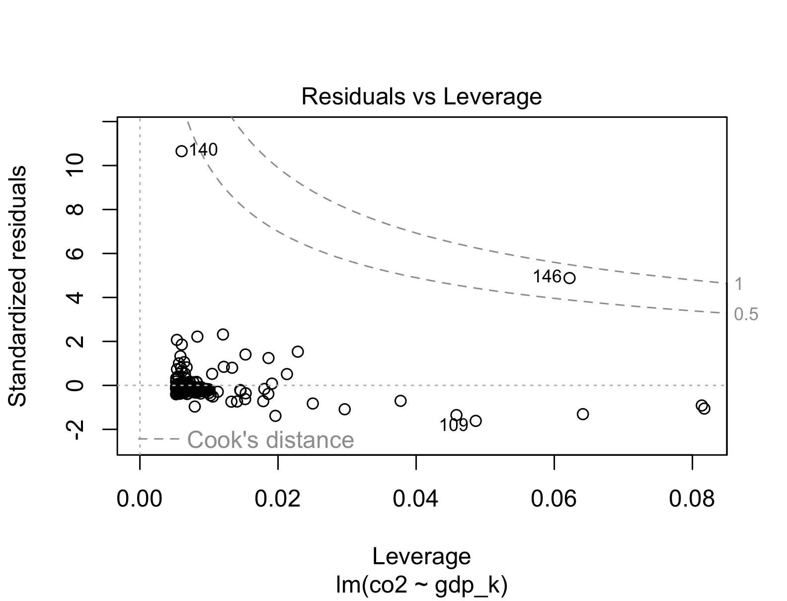
Standardized residuals: how far a country sits from the line. Watch:
Leverage: influence on the line; \(x_i\) far from \(\bar{x}\) (Qatar’s huge GDP).
Cook’s D: how much all predictions shift if case \(i\) were removed.
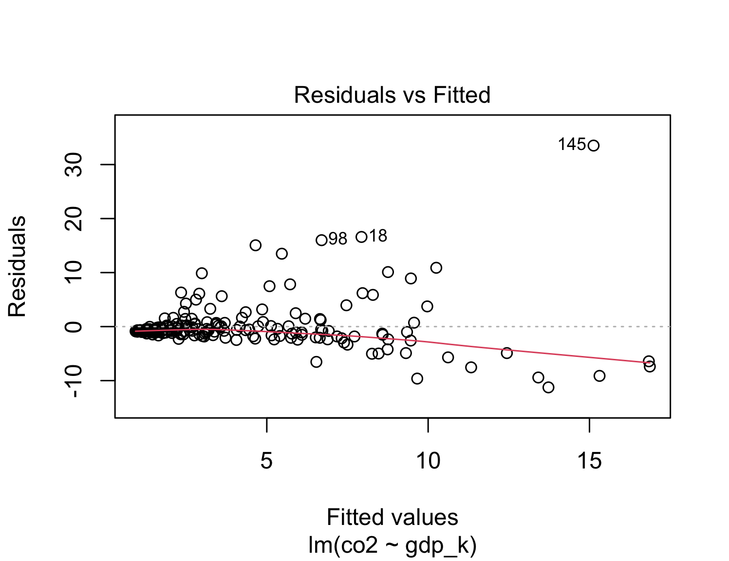
Fitted values \(\hat{Y}\) on the X-axis, residuals on the Y-axis.
Red line: the smoothed relationship between the two.
Ideal: the red line is flat — the straight line captured everything.
Our case: the red line bends — driven by the same rich, high-emitting outliers. The linearity assumption is strained.
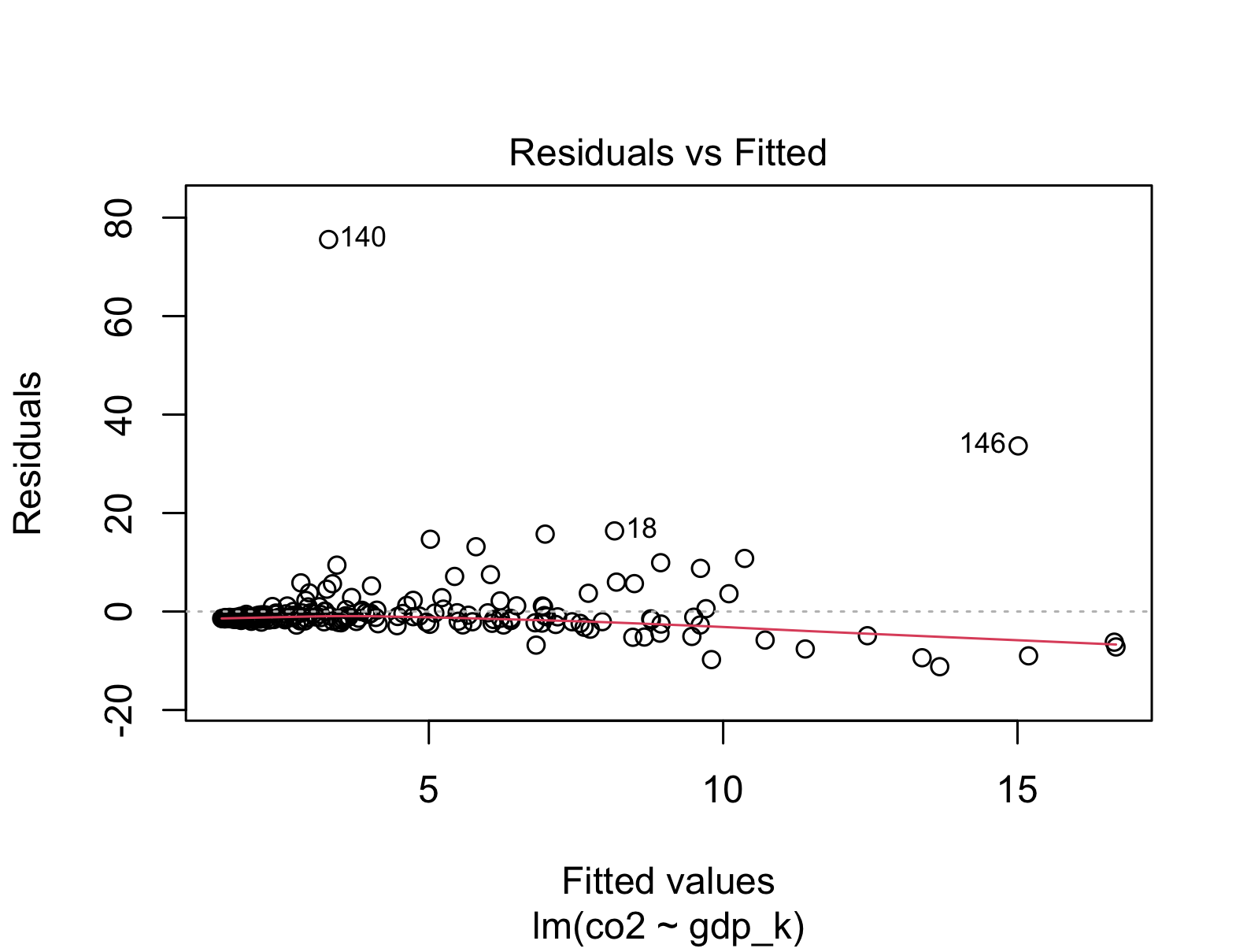
Discuss: the plots flag two countries. Palau — a tiny Pacific island whose per-person figure is distorted by a tanker-refuelling port and ~18,000 residents. Qatar — a genuine petro-state. Should we delete both?
No — judgement, not reflex. Palau is a measurement artefact for our question (national wealth → emissions): we drop it. Qatar is a real, important case; we keep it, but stay aware it has high leverage. Never delete a case just because it is inconvenient.
With Palau gone, the outlier plot calms down and the red linearity line straightens — the same line now fits the bulk of countries far better.
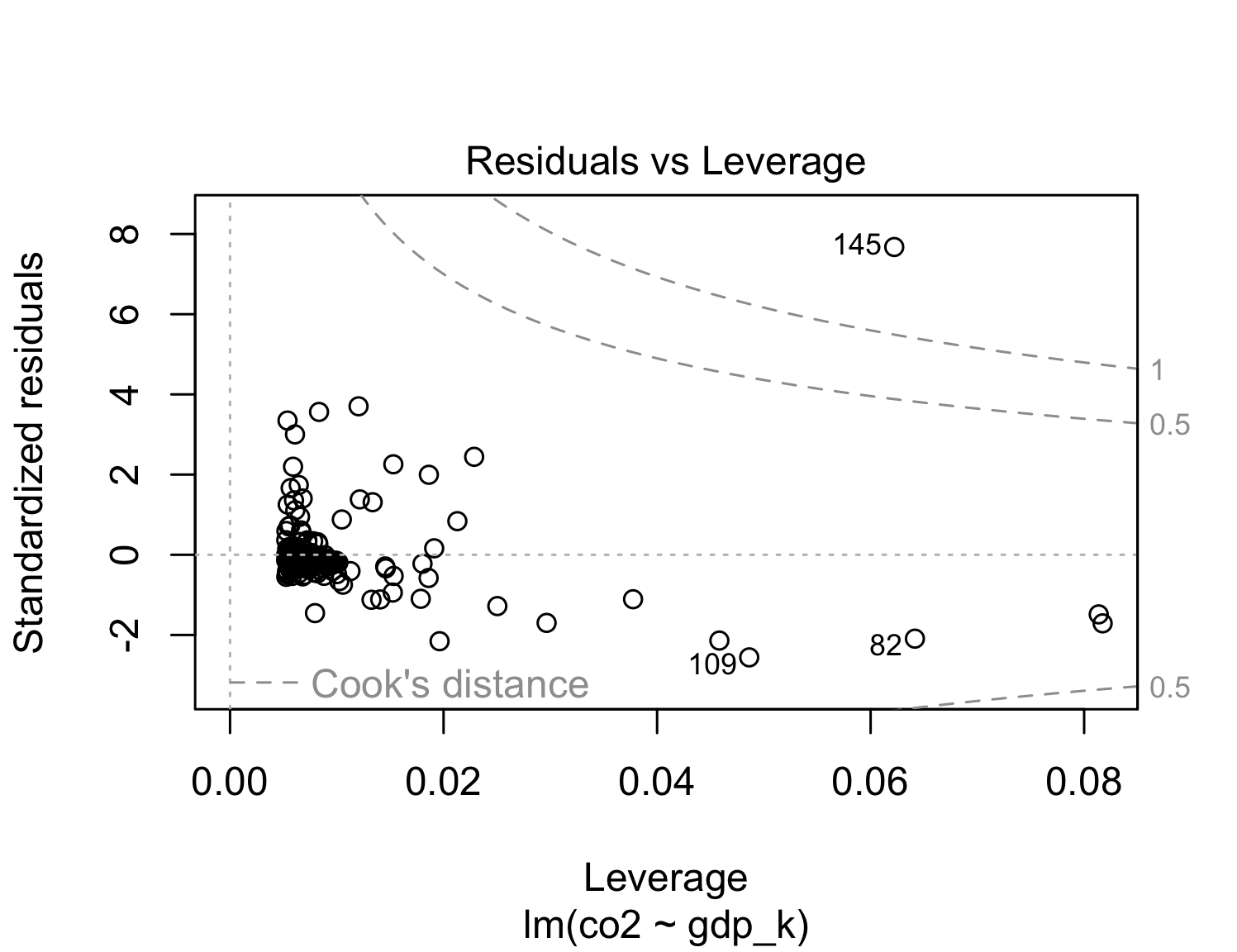
Same specification, one artefact removed. The slope is now more stable and \(R^2\) has roughly doubled: dropping one distorting case sharpened the whole picture.
| CO2 per person | |
|---|---|
| (Intercept) | 0.806 |
| (0.523) | |
| gdp_k | 0.123*** |
| (0.027) | |
| Num.Obs. | 190 |
| R2 | 0.356 |
| + p < 0.1, * p < 0.05, ** p < 0.01, *** p < 0.001 |
Part 2 of 3
Wealth is continuous. But much of what we compare is categorical — here, the world region a country sits in.

Discuss: if we predict CO₂ from region alone, what would \(\hat{Y}\) be for a Sub-Saharan African country? For a North American one? How does the difference between them relate to \(\hat{\beta}\)?
A regression needs numbers, not words. R turns each category into a dummy: 1 if the case is in that category, 0 otherwise — leaving one category out as the reference.
\[x = \begin{cases} 1, & \text{if in the category} \\ 0 & \text{otherwise} \end{cases}\]
| Country | N. America | Europe | … |
|---|---|---|---|
| USA | 1 | 0 | 0 |
| Canada | 1 | 0 | 0 |
| Denmark | 0 | 1 | 0 |
| Germany | 0 | 1 | 0 |
| … | 0 | 0 | 1 |
| Reference (Sub-Saharan Africa) |
0 | 0 | 0 |
Each coefficient = that region’s average difference in CO₂ from the reference.
# R dummy-codes a factor (or character) automatically,
# using its FIRST level as the reference category.
ols_2 <- lm_robust(co2 ~ region, data = Dat)
modelsummary(
list("CO2 per person" = ols_2),
stars = TRUE,
# Shorten the region labels for the table
coef_rename = c("regionEast Asia & Pacific" = "East Asia & Pacific",
"regionEurope & Central Asia" = "Europe & Central Asia",
"regionLatin America & Caribbean" = "Latin America",
"regionMiddle East, North Africa, Afghanistan & Pakistan" = "Middle East & N. Africa",
"regionNorth America" = "North America",
"regionSouth Asia" = "South Asia"),
gof_map = c("nobs", "r.squared"),
output = "kableExtra"
)| CO2 per person | |
|---|---|
| (Intercept) | 0.911*** |
| (0.218) | |
| East Asia & Pacific | 3.315*** |
| (0.943) | |
| Europe & Central Asia | 4.679*** |
| (0.471) | |
| Latin America | 2.065*** |
| (0.574) | |
| Middle East & N. Africa | 8.728** |
| (2.618) | |
| North America | 9.711** |
| (3.325) | |
| South Asia | 0.703 |
| (0.499) | |
| Num.Obs. | 190 |
| R2 | 0.241 |
| + p < 0.1, * p < 0.05, ** p < 0.01, *** p < 0.001 |
Reference (Sub-Saharan Africa): average CO₂ is the intercept, 0.91 t per person — the value when all region dummies are 0.
North America vs. Sub-Saharan Africa: 9.71 t per person more, on average → an average of 10.62 t.
Every coefficient is a difference of group means from the reference. No line, no linearity assumption to check — the model just reports averages.
You practice today’s diagnostics and a categorical predictor — this time with income groups instead of regions.
Open exercise 1 in a new tab ↗
Part 3 of 3
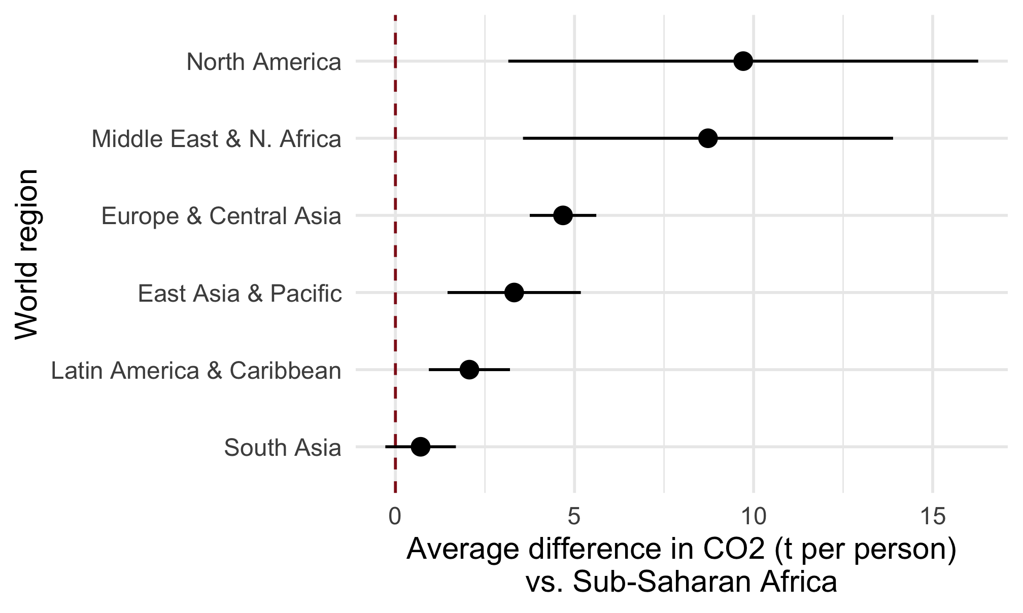
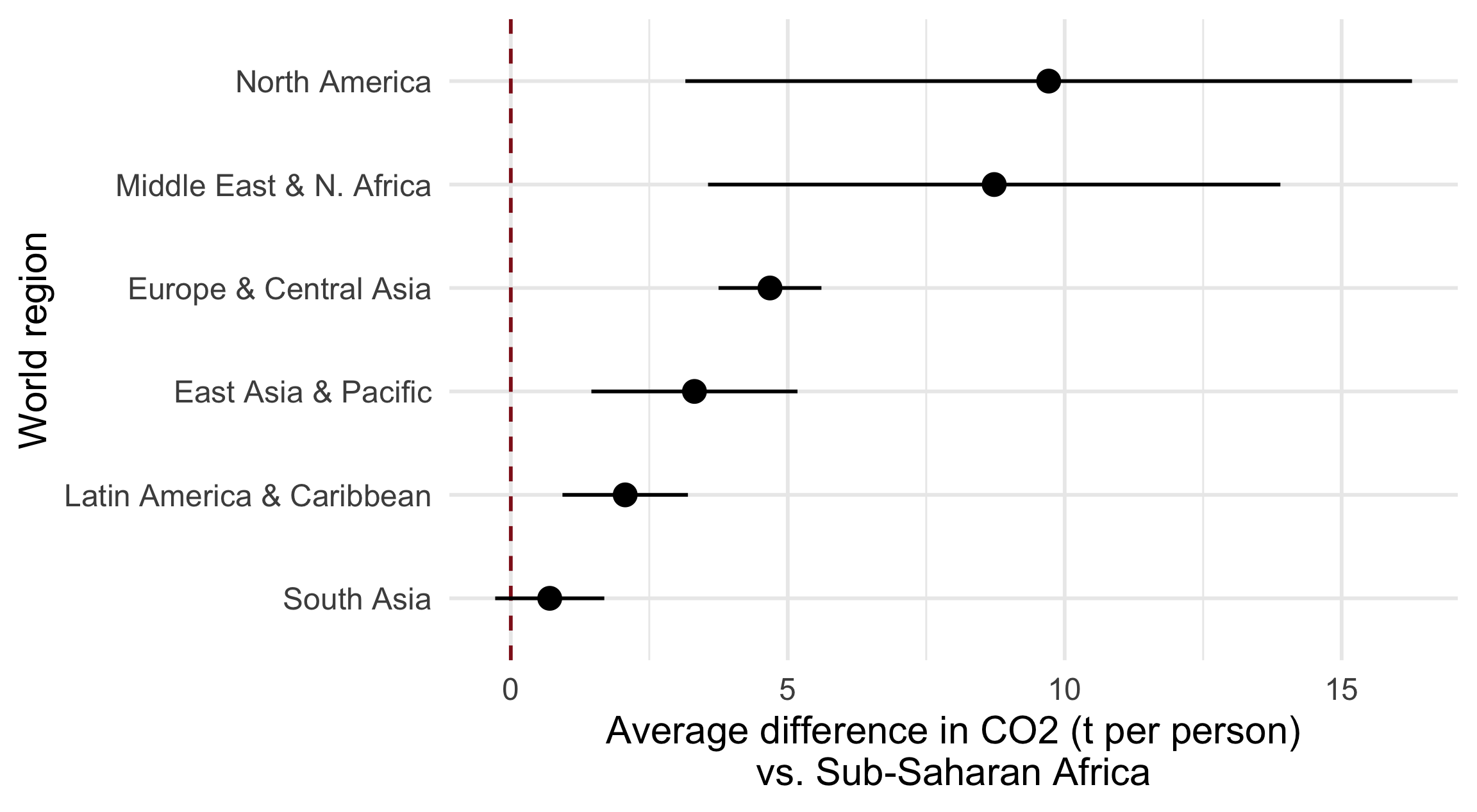
A regression table is for you. A figure is for your reader. Two go-to plots: coefficients, and predictions.
(plotdata <- lm_robust(co2 ~ region, data = Dat) %>%
tidy() %>% # Turn the results into a tibble #<<
mutate(term = term %>% # Tidy up the region labels
str_remove("region") %>%
str_replace(", North Africa, Afghanistan & Pakistan", " & N. Africa")) %>%
filter(term != "(Intercept)")) # Drop the reference
# term estimate std.error statistic p.value conf.low conf.high df outcome
# 1 East Asia & Pacific 3.315 0.943 3.52 5.54e-04 1.455 5.18 183 co2
# 2 Europe & Central Asia 4.679 0.471 9.94 6.90e-19 3.750 5.61 183 co2
# 3 Latin America & Caribbean 2.065 0.574 3.60 4.14e-04 0.932 3.20 183 co2
# 4 Middle East & N. Africa 8.728 2.618 3.33 1.04e-03 3.561 13.89 183 co2
# 5 North America 9.711 3.325 2.92 3.93e-03 3.152 16.27 183 co2
# 6 South Asia 0.703 0.499 1.41 1.61e-01 -0.282 1.69 183 co2ggplot(data = plotdata,
aes(y = estimate,
x = reorder(term, estimate))) + # Order by size
# Reference line at "no difference"
geom_hline(yintercept = 0, color = "#901A1E", lty = "dashed") +
# A point with its 95% confidence interval
geom_pointrange(aes(ymin = conf.low, ymax = conf.high)) + #<<
coord_flip() + # Flip the axes so labels are readable #<<
labs(x = "World region",
y = "Average difference in CO2 (t per person)\nvs. Sub-Saharan Africa") +
theme_minimal(base_size = 15)
# Estimate Std. Error t value Pr(>|t|) CI Lower CI Upper DF
# (Intercept) 0.806 0.5226 1.54 1.25e-01 -0.2249 1.837 188
# gdp_k 0.123 0.0275 4.48 1.27e-05 0.0691 0.178 188
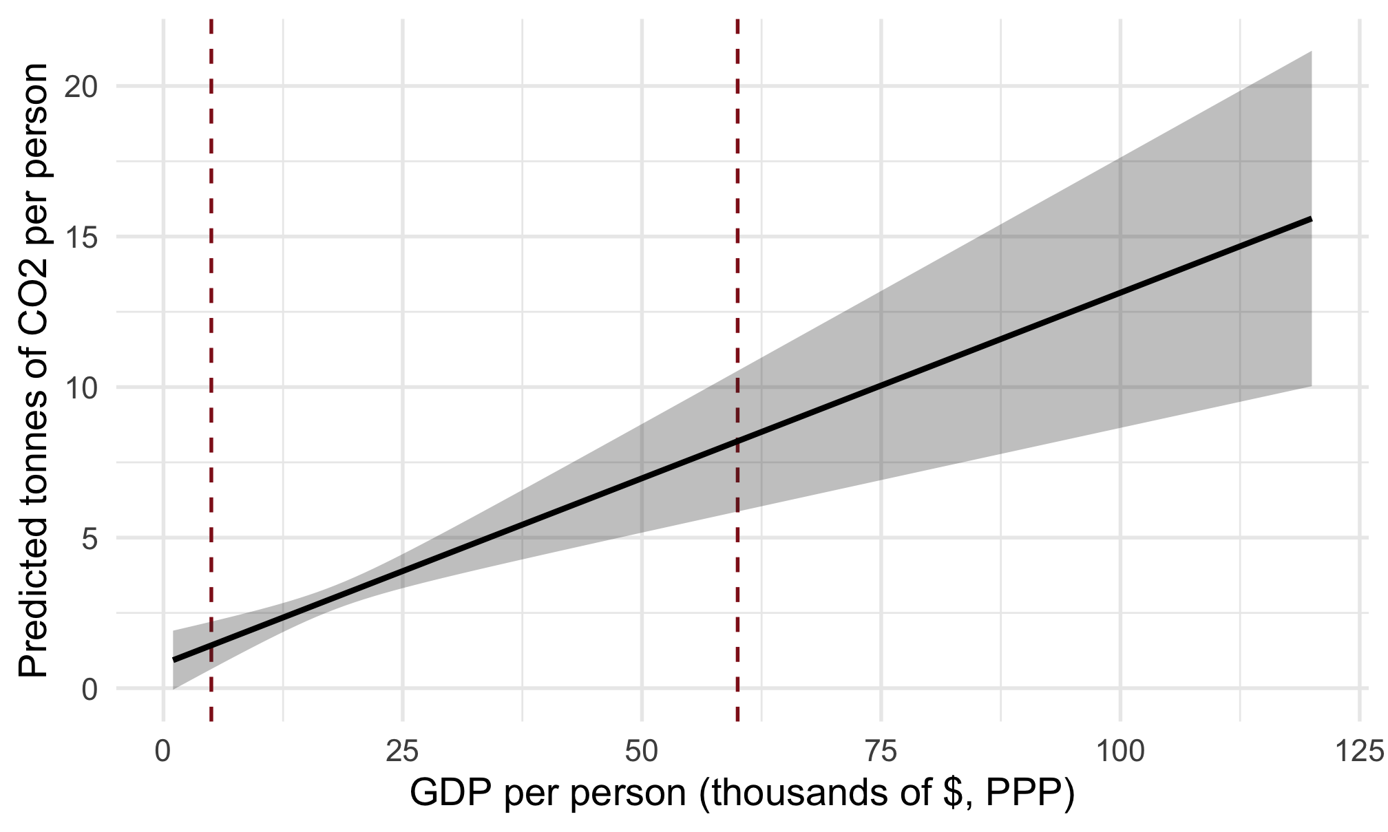
(fict_dat <- predict( # Predicted CO2 + 95% interval
object = ols_1,
newdata = fict_dat,
interval = "confidence", level = 0.95)$fit %>%
as_tibble() %>%
bind_cols(fict_dat, .))
# # A tibble: 120 × 4
# gdp_k fit lwr upr
# <dbl> <dbl> <dbl> <dbl>
# 1 1 0.929 -0.0518 1.91
# 2 2 1.05 0.121 1.98
# 3 3 1.18 0.293 2.06
# 4 4 1.30 0.464 2.13
# 5 5 1.42 0.635 2.21
# 6 6 1.55 0.805 2.29
# 7 7 1.67 0.973 2.36
# 8 8 1.79 1.14 2.44
# 9 9 1.92 1.31 2.53
# 10 10 2.04 1.47 2.61
# # ℹ 110 more rows
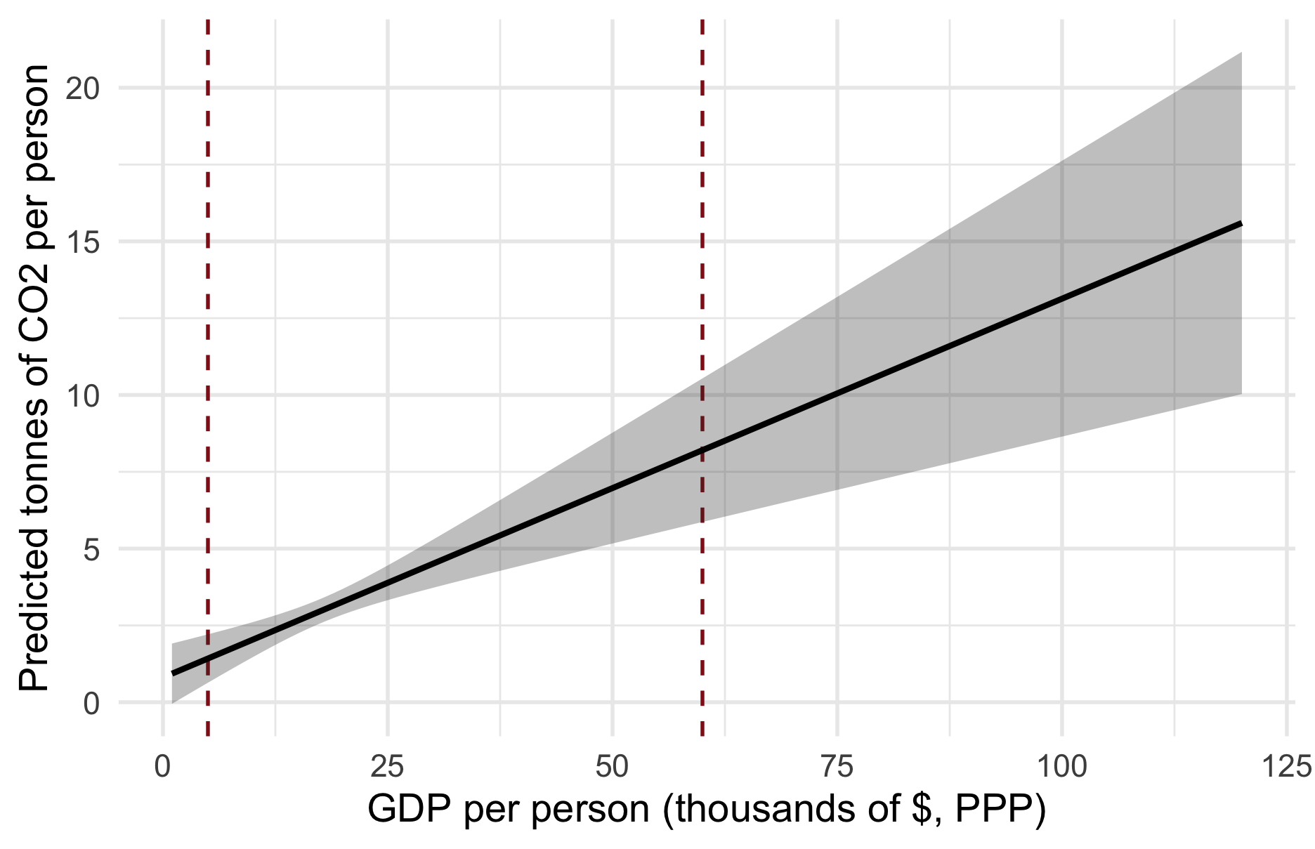

Richer countries and richer regions emit far more per person. Yet the people who emit the least — across Sub-Saharan Africa and South Asia — are the ones most exposed to the warming those emissions cause. That gap, not the slope, is the real research agenda Chancel (2022).
You practice visualizing regression: a coefficient plot and a prediction plot of your own.
Open exercise 2 in a new tab ↗
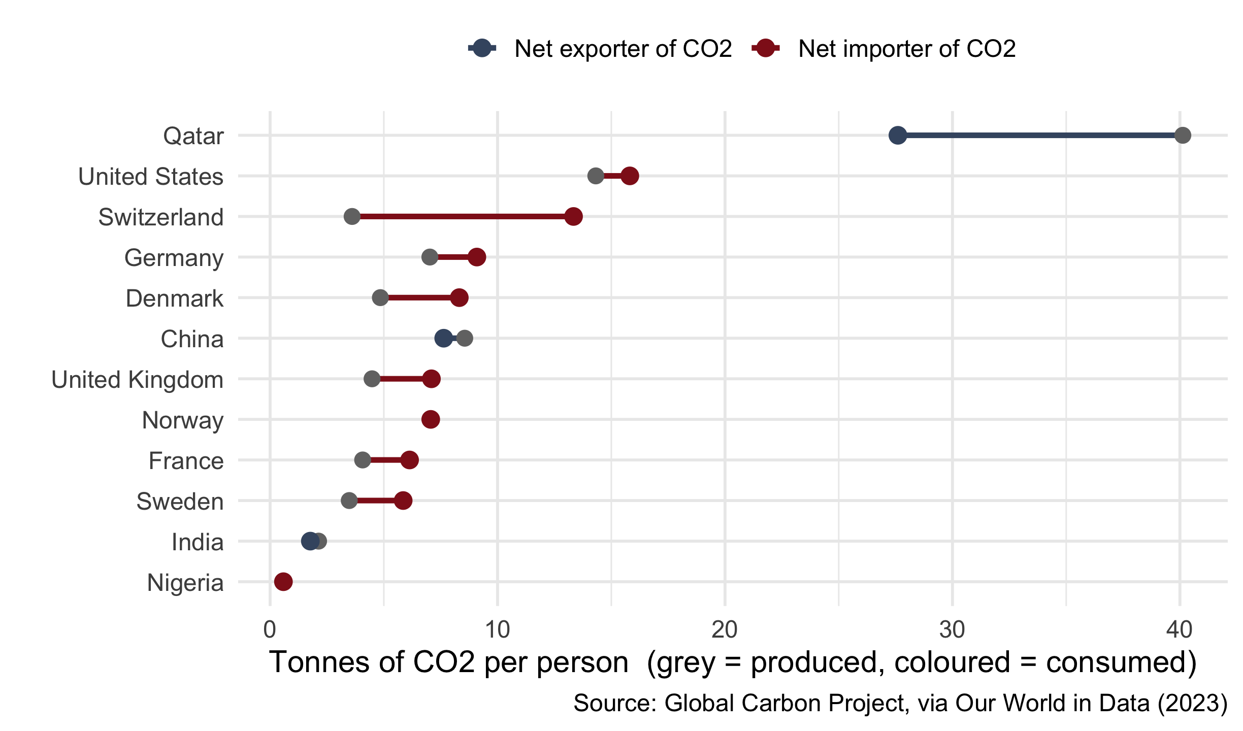
Everything so far counted CO2 where it is produced. But Denmark burns little at home and imports carbon-heavy goods — steel, electronics, meat.
Consumption-based accounting re-assigns them to whoever consumes the goods: Denmark’s footprint jumps from 4.8 to 8.3 t — factory economies (China, India) carry what we outsourced.
The wisdom: how you measure the outcome can flip the story — a fairer CO2 number makes the North–South gap wider, not smaller.
# Join each country's consumption footprint, then run the SAME regression
Dat_cons <- Dat %>%
inner_join(
readRDS("data/owid_consumption.rds") %>%
select(iso3c = iso_code, consumption),
by = "iso3c"
)
modelsummary(
list("Produced (WB)" = lm_robust(co2 ~ gdp_k, data = Dat_cons),
"Consumed (GCP)" = lm_robust(consumption ~ gdp_k, data = Dat_cons)),
stars = TRUE,
coef_rename = c("gdp_k" = "GDP per person ($1,000s)"),
gof_map = c("nobs", "r.squared"),
output = "kableExtra"
)| Produced (WB) | Consumed (GCP) | |
|---|---|---|
| (Intercept) | 0.762 | 0.648 |
| (0.856) | (0.589) | |
| GDP per person ($1,000s) | 0.142*** | 0.176*** |
| (0.037) | (0.025) | |
| Num.Obs. | 118 | 118 |
| R2 | 0.374 | 0.599 |
| + p < 0.1, * p < 0.05, ** p < 0.01, *** p < 0.001 |
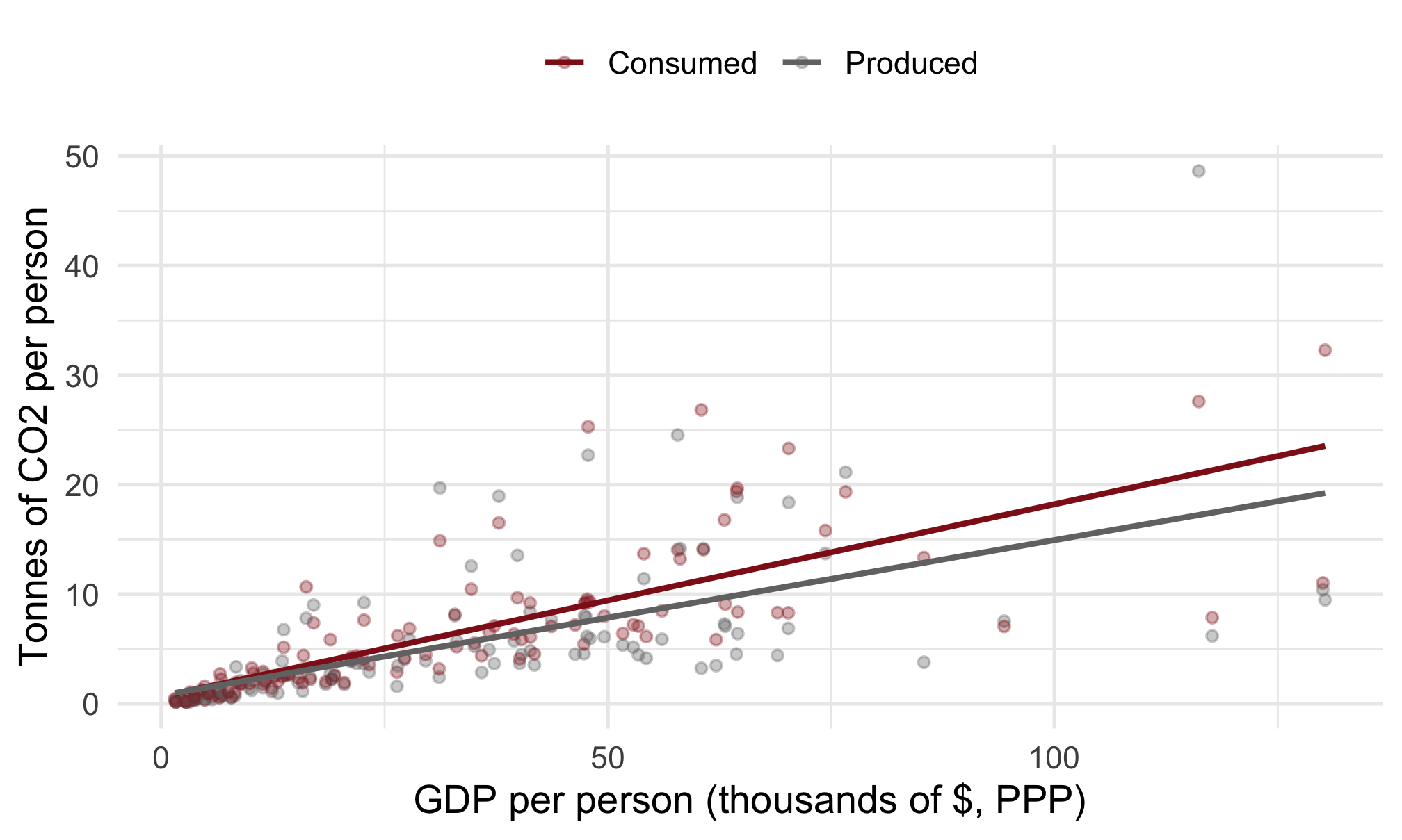
Same predictor, same countries — a different outcome. Wealth explains far more of the consumption footprint (\(R^2 \approx 0.6\)) than of production (\(R^2 \approx 0.37\)), and the slope is steeper. What a country consumes tracks its wealth more tightly than what it happens to emit at home — and Qatar is no longer the lone outlier.
Outliers can bend the OLS line. Cook’s D (plot(which = 5)) finds the influential ones.
OLS assumes a linear relationship for continuous predictors — check it (plot(which = 1)); it does not apply to categorical predictors.
Not every outlier is deleted: separate artefacts (drop) from real, important cases (keep, but note their leverage).
Categorical predictors are dummy-coded: each coefficient is a group’s average difference from the reference category. R does this automatically.
Coefficient plots show categorical results; prediction plots show what a continuous model implies across a range of values.
How you measure the outcome can flip the story — production vs. consumption CO2 is the same countries, a different (and fairer) number.
lm() diagnostics:
plot(model, which = 5) — identify influential outliers (Cook’s D).plot(model, which = 1) — check the linearity assumption.tidy() — turn a model into a tibble of coefficients + confidence intervals.geom_pointrange() + coord_flip() — the coefficient plot.predict(model, newdata = ..., interval = "confidence") — \(\hat{Y}\) for synthetic data.fct_relevel() — set which category is the reference.Look back at the goals from the start. Can you tick all three?
plot(model, which = 5) and which = 1 and say, in words, what each one is telling you.Anything shaky? That is what this week’s Absalon quiz and the Friday exercise class are for.
Chancel, L. (2022). “Global Carbon Inequality over 1990-2019”. In: Nature Sustainability, pp. 931-938.
What if the outcome is yes/no? A short preview of the Linear Probability Model.
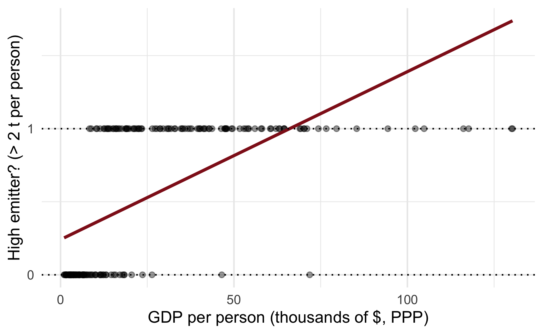
Linear Probability Model (LPM): just OLS with a 0/1 outcome — e.g. is this a high-emitting country? (above 2 t per person).

The red line pierces 1 at high GDP — a probability above 100%. That is the LPM’s controversial side.
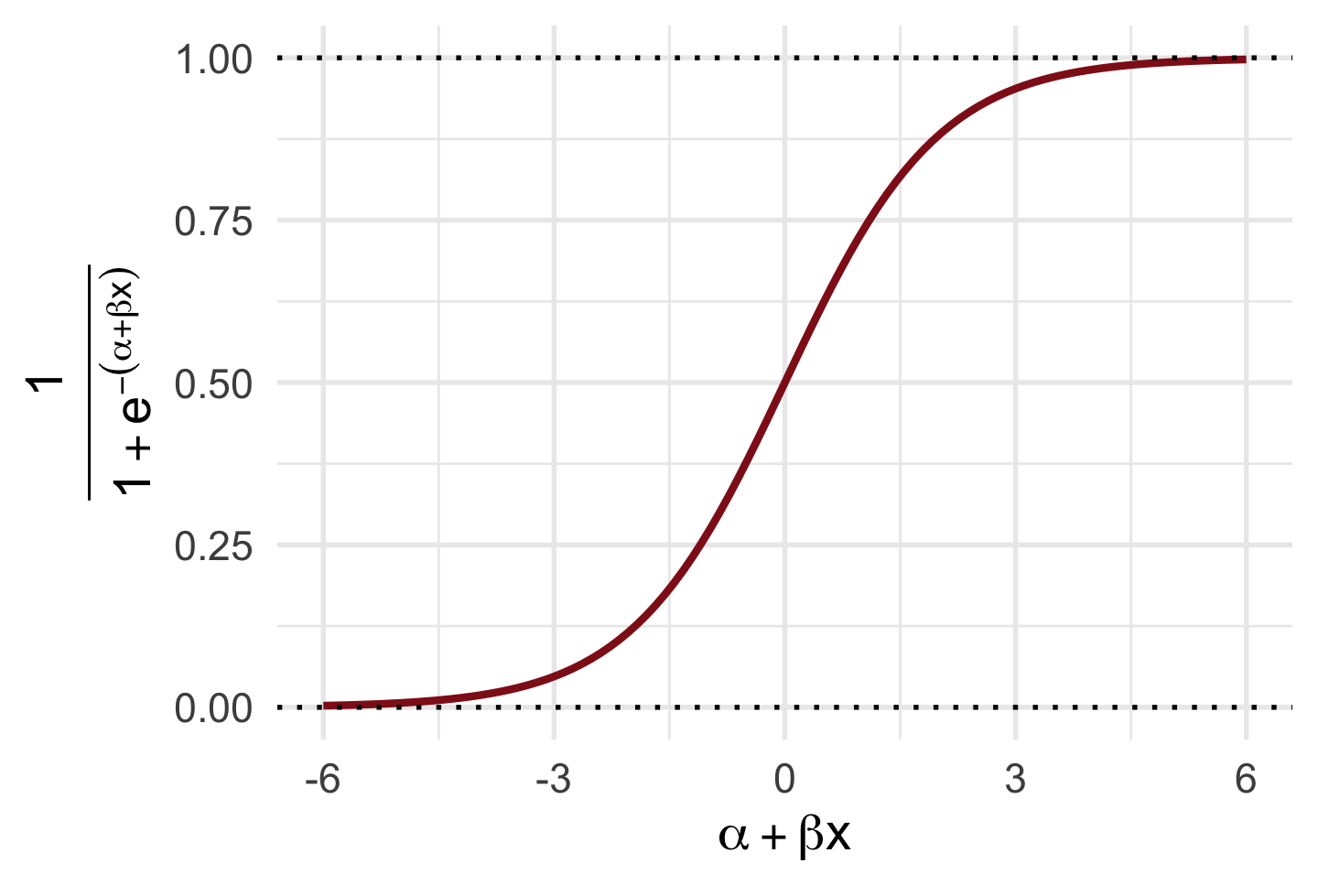
\[\begin{aligned} \text{logit}(y_i) &= \alpha + \beta x, \\ y_i &= \text{logit}^{-1}(\alpha + \beta x) \\ &= \frac{1}{1 + e^{-(\alpha + \beta x)}}. \end{aligned}\]
A link function squeezes the linear model into the \([0, 1]\) range. The sigmoid-shaped logistic function does exactly that.
GLMs bring their own interpretation traps (Breen, Karlson, and Holm, 2018). In this course we use Linear Probability Models for binary outcomes — and 0/1 coding for categorical ones.

Lecture 4 · OLS wisdoms