Fitting curves with a linear model
2026-07-28
spot when OLS’s linearity assumption fails, and use LOESS to see the true shape;
fit and interpret a polynomial — a curve built from a straight-line model — and know when higher orders overfit;
transform a predictor with log₂ and read it as “per doubling” — then say which model fits best.
One part per goal. Our running question: does life expectancy simply rise in a straight line with health spending?
Part 1 of 3
More health spending buys more life — but surely not forever, and not at a constant rate. Let’s look.
Richer countries spend more on health and live longer. But is the relationship a straight line — each extra dollar worth the same everywhere?
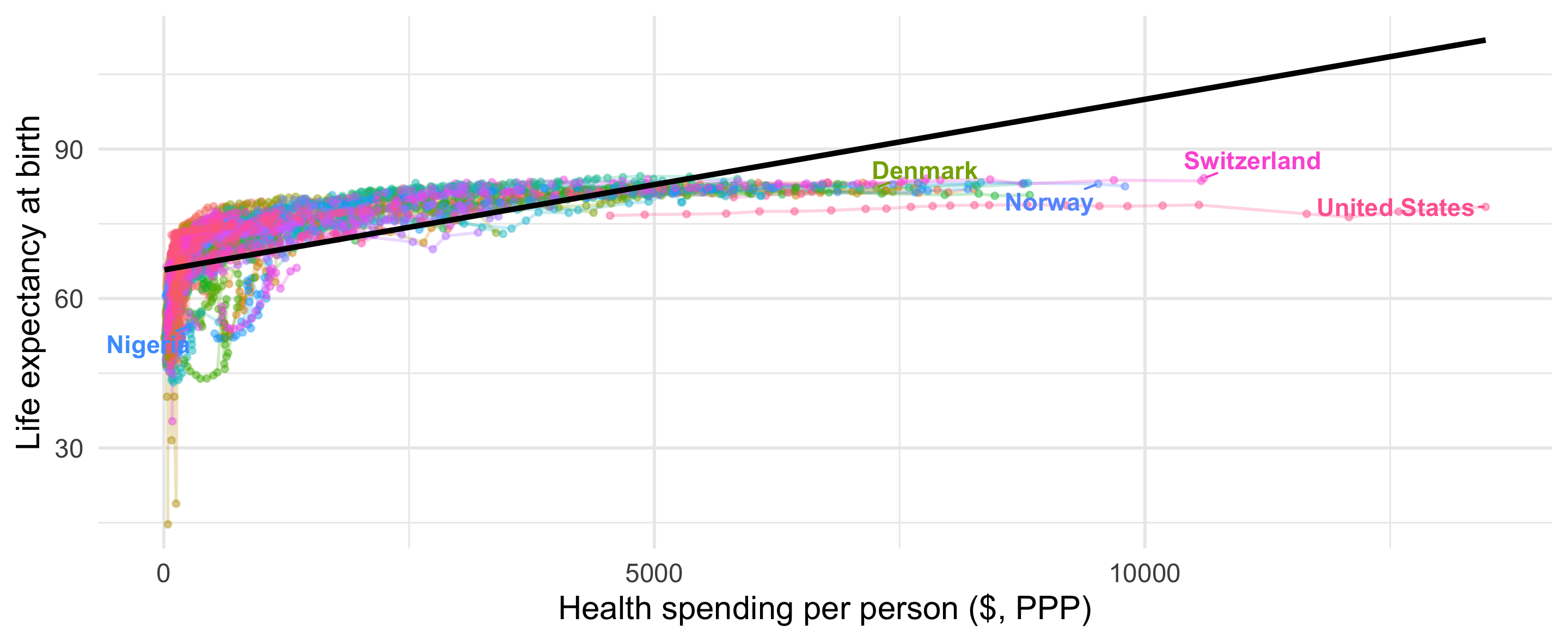
Research question: how does life expectancy at birth relate to health spending per person — linearly, or as a bending curve?
Life expectancy over time. Source: Our World in Data.
# World Bank: life expectancy + health spending per capita (PPP $), 2000-
life_raw <- wb_data(c("SP.DYN.LE00.IN", "SH.XPD.CHEX.PP.CD"),
start_date = 2000, end_date = 2025)
Dat_life <- life_raw %>%
rename(LifeExpect = SP.DYN.LE00.IN, HealthExp = SH.XPD.CHEX.PP.CD,
year = date, country_text_id = iso3c) %>%
select(country_text_id, country, year, LifeExpect, HealthExp) %>%
drop_na(LifeExpect, HealthExp)
# V-Dem: civil liberties, joined on country + year, as a control
Dat_vdem <- vdem %>%
as_tibble() %>%
select(country_text_id, year, civ_liberties = v2xcl_rol)
Dat <- inner_join(Dat_life, Dat_vdem, by = c("country_text_id", "year")) %>%
drop_na()This is panel data: many countries, each observed over many years — so the rows are not independent. Every model today uses clusters = country so the standard errors account for repeated observations of the same country.

The line misses the shape — linearity is violated.
# I() lets us rescale inside the formula: 1 unit = $1,000
ols_lin <- lm_robust(
LifeExpect ~ I(HealthExp / 1000) + year + civ_liberties,
data = Dat, clusters = country
)
modelsummary(
list("Life expectancy" = ols_lin),
coef_rename = c("I(HealthExp/1000)" = "Health spend ($1,000s)",
"year" = "Year", "civ_liberties" = "Civil liberties"),
stars = TRUE, gof_map = c("nobs", "r.squared"),
output = "kableExtra"
)| Life expectancy | |
|---|---|
| (Intercept) | −129.922* |
| (55.077) | |
| Health spend ($1,000s) | 2.877*** |
| (0.408) | |
| Year | 0.095*** |
| (0.027) | |
| Civil liberties | 6.274** |
| (2.079) | |
| Num.Obs. | 4070 |
| R2 | 0.455 |
| + p < 0.1, * p < 0.05, ** p < 0.01, *** p < 0.001 |
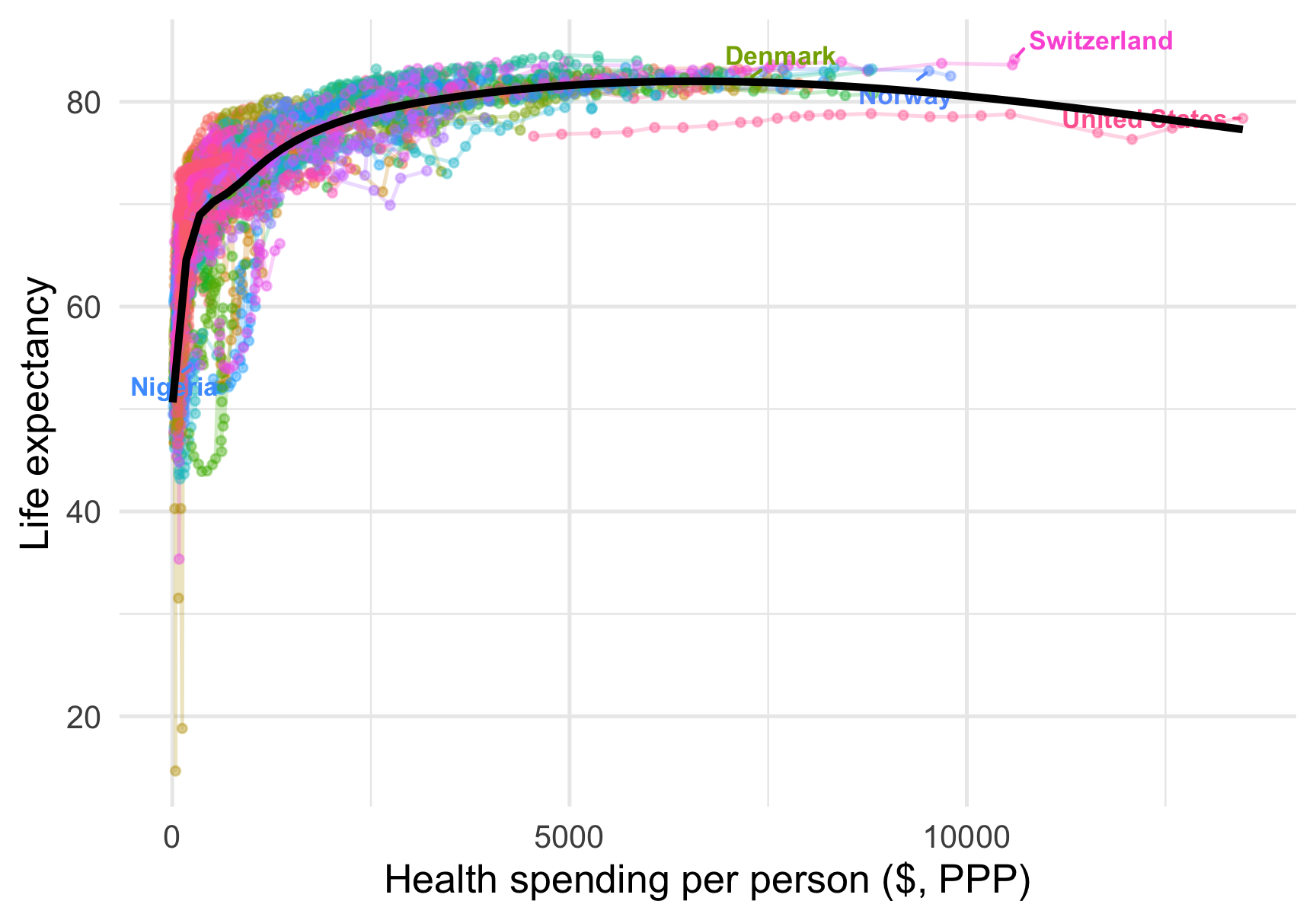
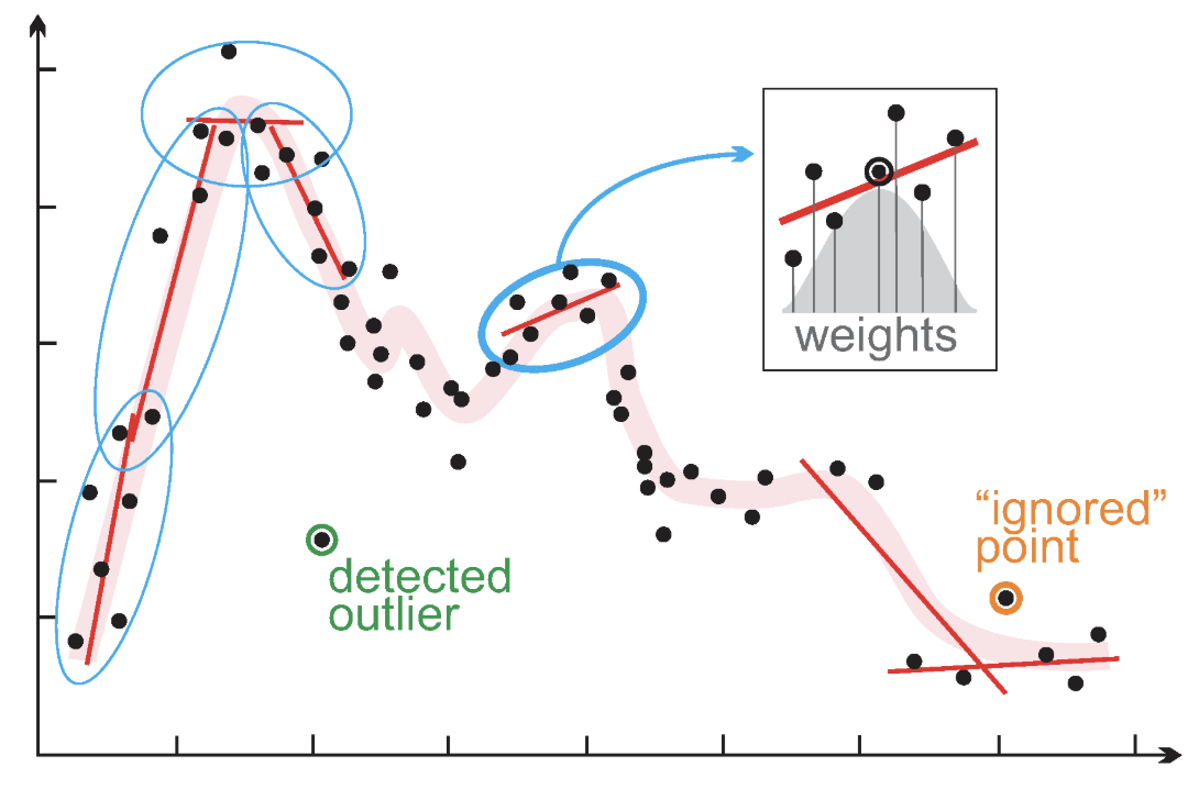
Before modelling a shape, see it. LOESS (locally estimated scatterplot smoothing) fits a little regression around each point using only its nearest neighbours, then stitches them into one smooth curve.
Beware: LOESS is descriptive — it wiggles to the data and easily overfits. Use it to spot the shape, not to test a hypothesis.
The shape is clear. Now we fit it — without leaving OLS. Two tricks: polynomials and transformations.
Part 2 of 3
A polynomial is a variable interacted with itself — last week’s idea, pointed inward.
In Lecture 11, an interaction let one variable’s slope depend on another variable: \[Y = \alpha + \beta_1 X + \beta_2 Z + \beta_3 (X \times Z)\]
A polynomial is the same move with \(Z = X\) — a variable interacted with itself: \[Y = \alpha + \beta_1 X + \beta_2 (X \times X) = \alpha + \beta_1 X + \beta_2 X^2\]
So the health-spending slope now depends on the level of health spending itself — it can start steep and flatten out, exactly the shape LOESS showed.
Everything you learned about reading interaction terms carries straight over: the effect of \(X\) is no longer one number.
\[Y_i = \alpha + \beta_1 X + \beta_2 X^2 + \dots + e_i\]
poly(x, 2, raw = TRUE) adds both \(X\) and \(X^2\) in one clean term. raw = TRUE keeps the original units so the coefficients are interpretable.
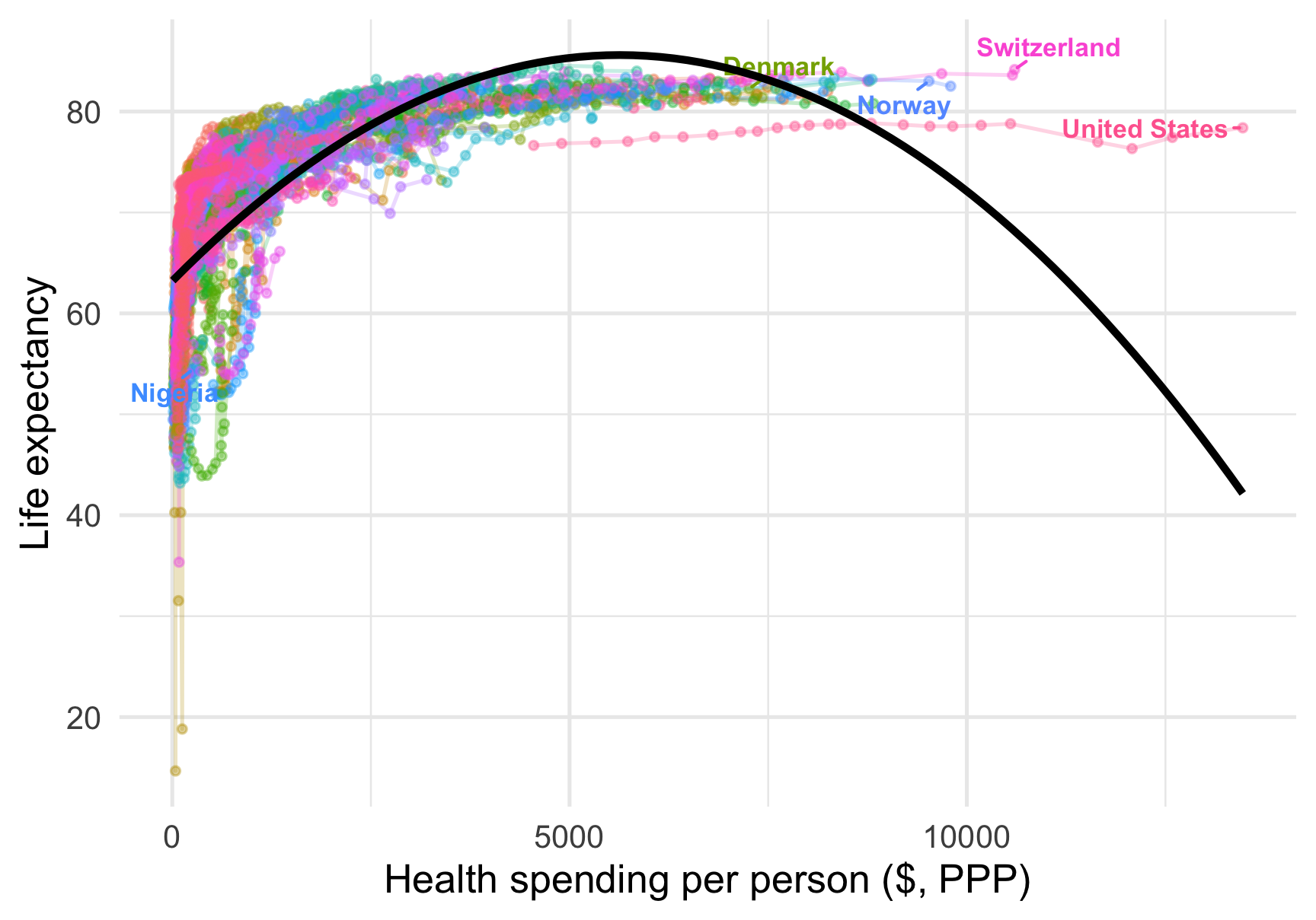
One squared term, and the straight line becomes a curve that follows the bend.
| Life expectancy | |
|---|---|
| (Intercept) | −101.184* |
| (46.208) | |
| Health spend | 7.472*** |
| (0.792) | |
| Health spend² | −0.676*** |
| (0.129) | |
| Year | 0.081*** |
| (0.023) | |
| Civil liberties | 2.840 |
| (1.727) | |
| Num.Obs. | 4070 |
| R2 | 0.588 |
| + p < 0.1, * p < 0.05, ** p < 0.01, *** p < 0.001 |
The slope of health spending is no longer one number — it changes as spending rises:
From $1,000 to $2,000: about \(7.47 + 2 \times (-0.68) = \mathbf{6.12}\) years. The gains flatten — diminishing returns, quantified.

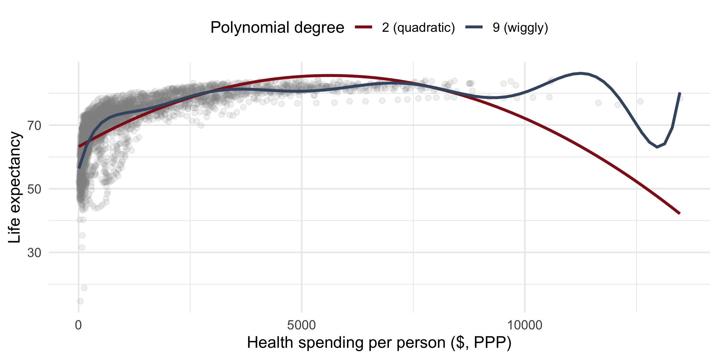
Beware overfitting. A high-degree polynomial bends to chase every wiggle — including noise. It fits this sample better and the next one worse. It also implies absurd swings (life expectancy shooting up or down at the extremes).
Rule of thumb: stop at the lowest degree that captures the shape. Here, a quadratic is plenty — degree 2, rarely more than 3.
You fit a polynomial yourself — does xenophobia rise and then fall with age? Back to the ESS.
Open exercise 1 in a new tab ↗
Part 3 of 3
A polynomial adds a term. A transformation reshapes the variable itself — and our favourite is the logarithm.
A logarithm is just a power question, asked backwards.
Raising 2 to a power means repeated doubling — multiply 2 by itself that many times: \[2^{\color{#901A1E}{3}} = 2 \times 2 \times 2 = 8\]
The base-2 logarithm asks the reverse: “2 raised to which power gives this number?” — and the answer is exactly that exponent: \[\log_2(8) = \color{#901A1E}{3} \quad\text{because}\quad 2^{\color{#901A1E}{3}} = 8\]
| exponent | power of 2 | value | log₂(value) |
|---|---|---|---|
| 1 | \(2^1\) | 2 | 1 |
| 2 | \(2^2\) | 4 | 2 |
| 3 | \(2^3\) | 8 | 3 |
| 4 | \(2^4\) | 16 | 4 |
| 10 | \(2^{10}\) | 1,024 | 10 |
Read a row left to right: multiply 2 by itself exponent times to get the value. log₂ hands that count back to you.
Because the exponent counts doublings, moving +1 on the log₂ scale = one doubling of the original value: \[\log_2(2) = 1, \quad \log_2(4) = 2, \quad \log_2(8) = 3\]
Perfect for health spending: $500 → $1,000 is one doubling, and so is $4,000 → $8,000. If each doubling buys the same extra years, a curve on the raw dollar scale becomes a straight line on the log₂ scale.
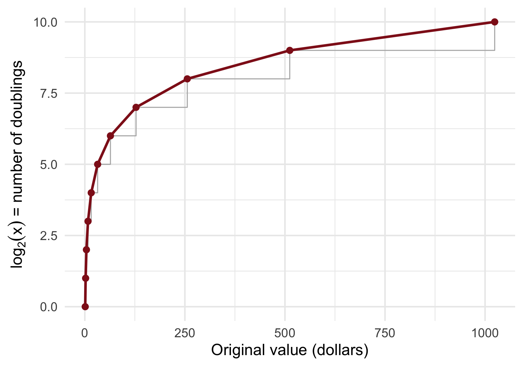
We fit life expectancy on log₂(spending). Drawn back on the normal dollar axis, that fit is a curve — rising fast, then flattening. Exactly the shape we needed.
Same model, same fit. The next slide shows it on a log₂ axis — where the very same curve becomes a perfectly straight line. Flip back and forth.
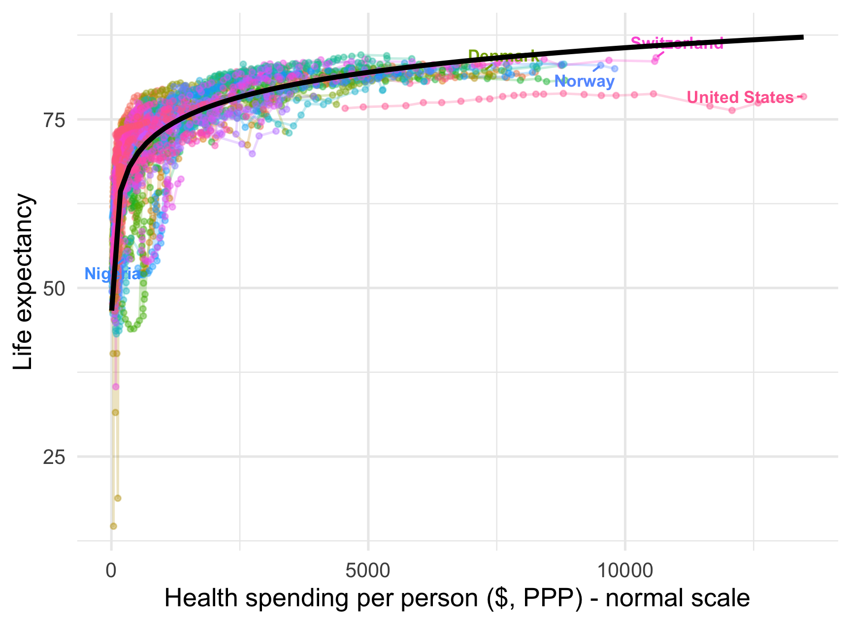
On the normal dollar axis, the log fit is a curve.
ols_log <- lm_robust(
LifeExpect ~ log2(HealthExp) + year + civ_liberties,
data = Dat, clusters = country
)
modelsummary(
list("Life expectancy" = ols_log),
coef_rename = c("log2(HealthExp)" = "Health spend (log2)",
"year" = "Year",
"civ_liberties" = "Civil liberties"),
stars = TRUE, gof_map = c("nobs", "r.squared"),
output = "kableExtra"
)One coefficient, and it reads beautifully: every doubling of health spending is associated with about 3.63 more years of life expectancy.
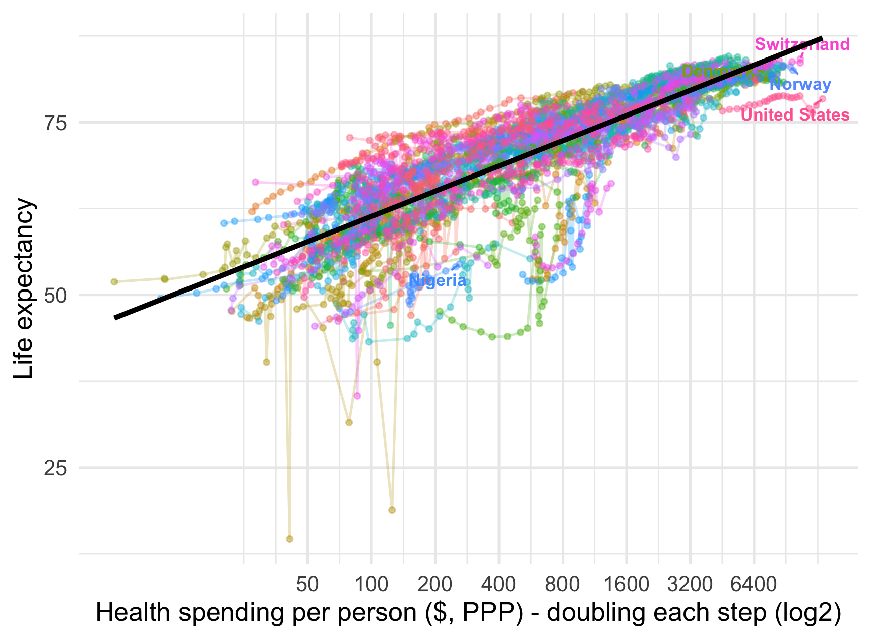
On a log₂ axis, that same curve is a straight line.

Both curves beat the straight line — but here the log₂ model wins on fit and is simpler to read (one coefficient, not two).
Discuss: the log needs one coefficient, the quadratic two. When might you still prefer the polynomial — for example, if the curve went up and then down?
Polynomials and transformations keep a linear model and bend the predictor.
A third route bends the link between predictors and outcome — generalised linear models (logistic, Poisson …), for binary or count outcomes.
You will meet GLMs later in your studies. Today’s lesson is the foundation: even a “linear” model can fit deeply non-linear relationships once you reshape what goes into it.
When a scatter bends, the linearity assumption fails. LOESS reveals the shape — but only describes it, so beware overfitting.
A polynomial (\(X + X^2\)) is a variable interacted with itself: its slope depends on its own level, so it can curve. Read \(\beta_1 + 2\beta_2 X\); watch for overfitting at high degrees.
A log₂ transformation turns “per dollar” into “per doubling” — one interpretable coefficient, and it straightens a flattening curve.
Match the tool to the shape: a log bends one way (monotone, flattening); a quadratic can rise then fall. Compare fits, but let theory choose.
It is still OLS — we only reshaped the predictors. That is what makes a “linear” model so powerful.
Shaky on any of these? That is what this week’s Absalon quiz and the Friday exercise class are for.
lm_robust(y ~ ..., clusters = country): OLS with cluster-robust SEs for panel data.I(x / 1000) and I(x^2): build a rescaled or squared predictor inside the formula.poly(x, 2, raw = TRUE): add \(X\) and \(X^2\) in one term, in original units.log2(x): base-2 log — a one-unit rise is a doubling.geom_smooth(method = "lm", formula = y ~ poly(x, 2)) / y ~ log2(x): draw the fitted curve.scale_x_continuous(trans = scales::log2_trans()): plot on a log₂ axis.NULL

Lecture 12 · Polynomials & transformations