Lectures
The whole course, on one dataset — your own
Merlin Schaeffer · Department of Sociology
today
By the end of today you can …
say what an explanatory research question is — the kind this course teaches you to answer;
explain how the course works — the weekly rhythm, the quizzes, and what I assume you know;
run R code inside your own course project — set up today, together.
One part of today’s lecture per goal.
What is this course about?
Part 1 of 3
Sociology asks many kinds of questions.
This course is about one kind: what is the effect of X?
My research agenda
How does international immigration transform societies?
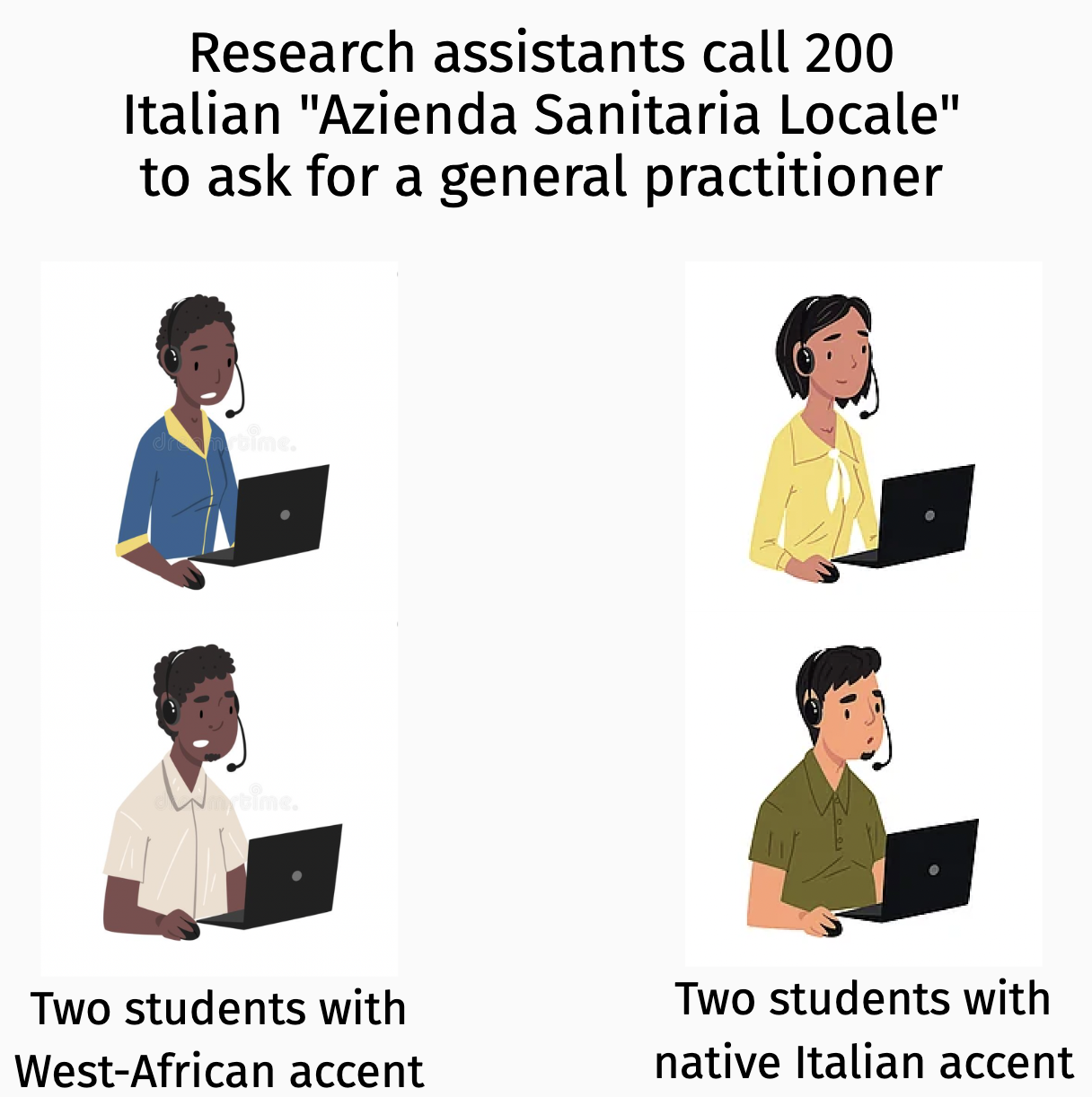
Some of my current work
Source: Schaeffer, Romarri, Rosenberg, and Krakowski (2025)
Some of my current work
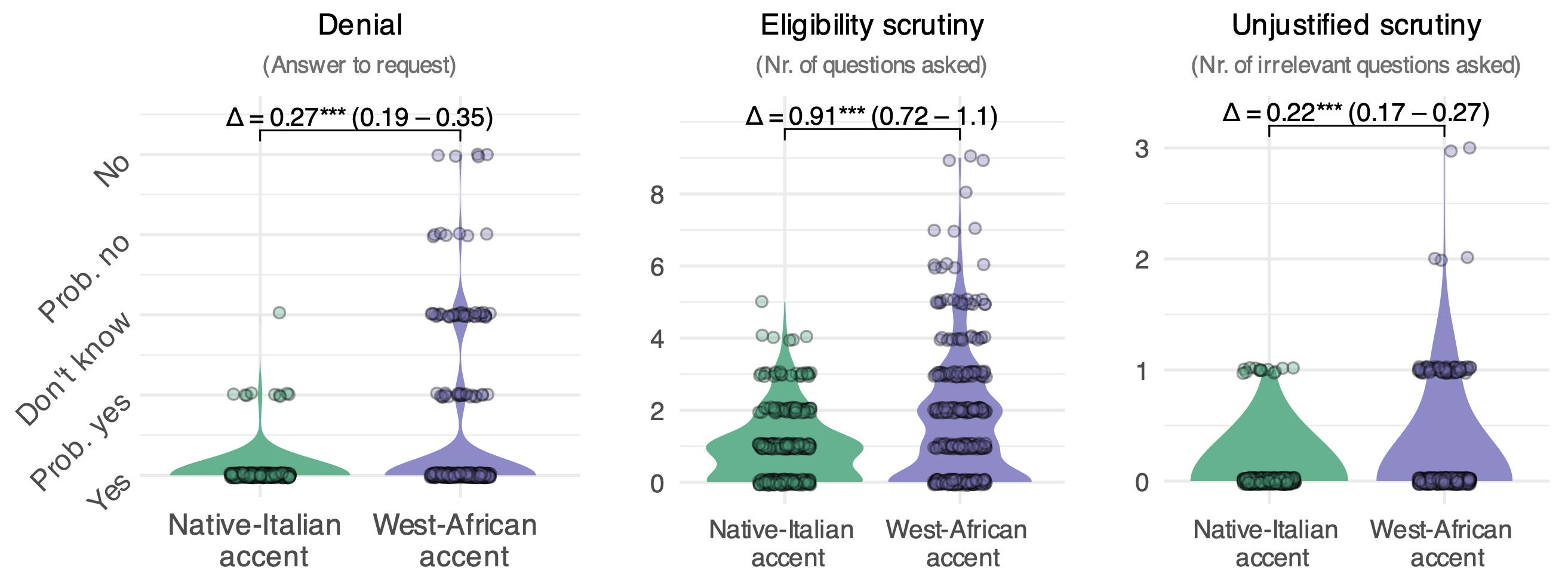
Source: Schaeffer, Romarri, Rosenberg et al. (2025)
Some of my current work
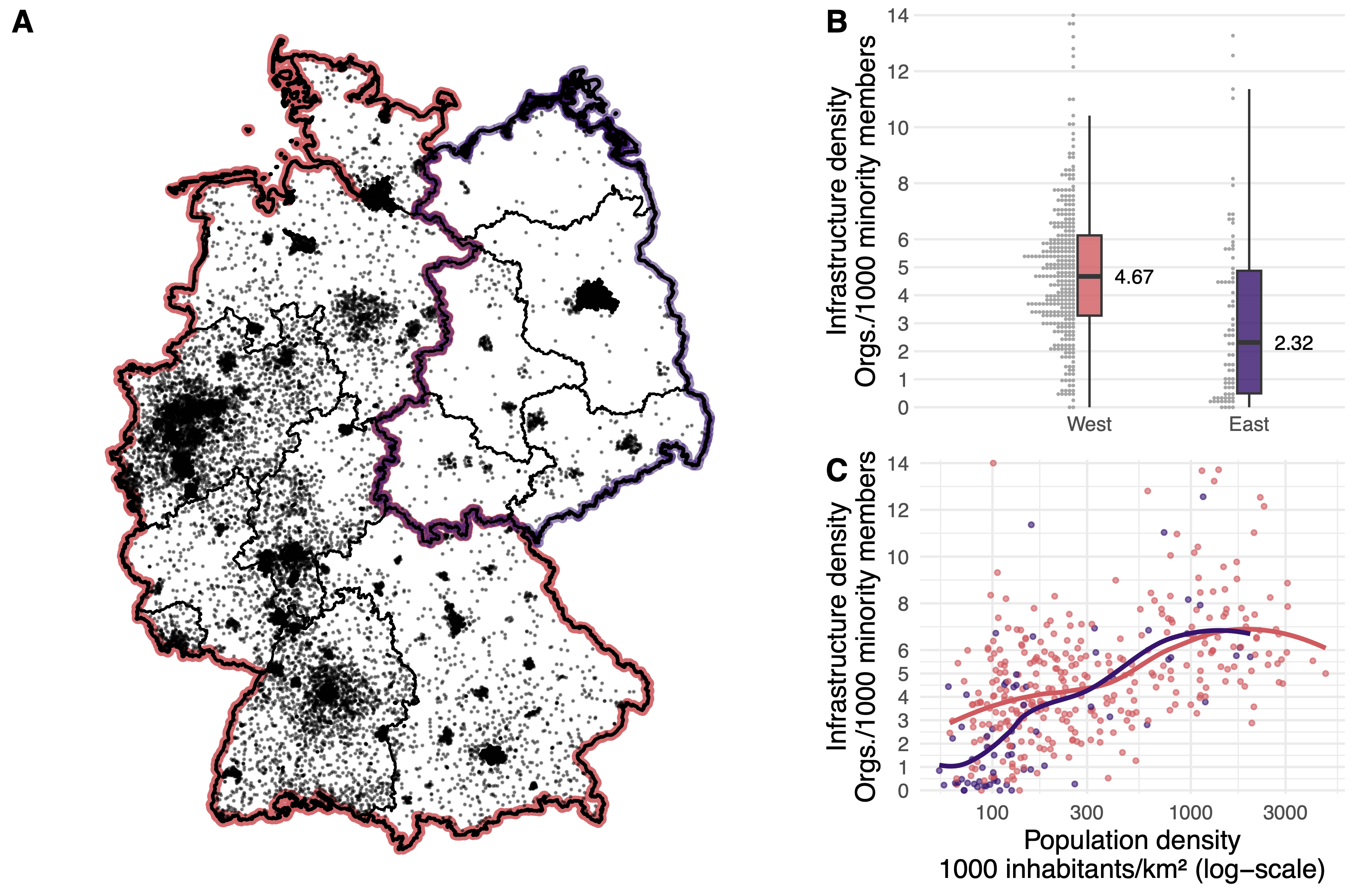
Source: Wiedner, Schaeffer, Carol, and Böller (2025)
Some of my current work
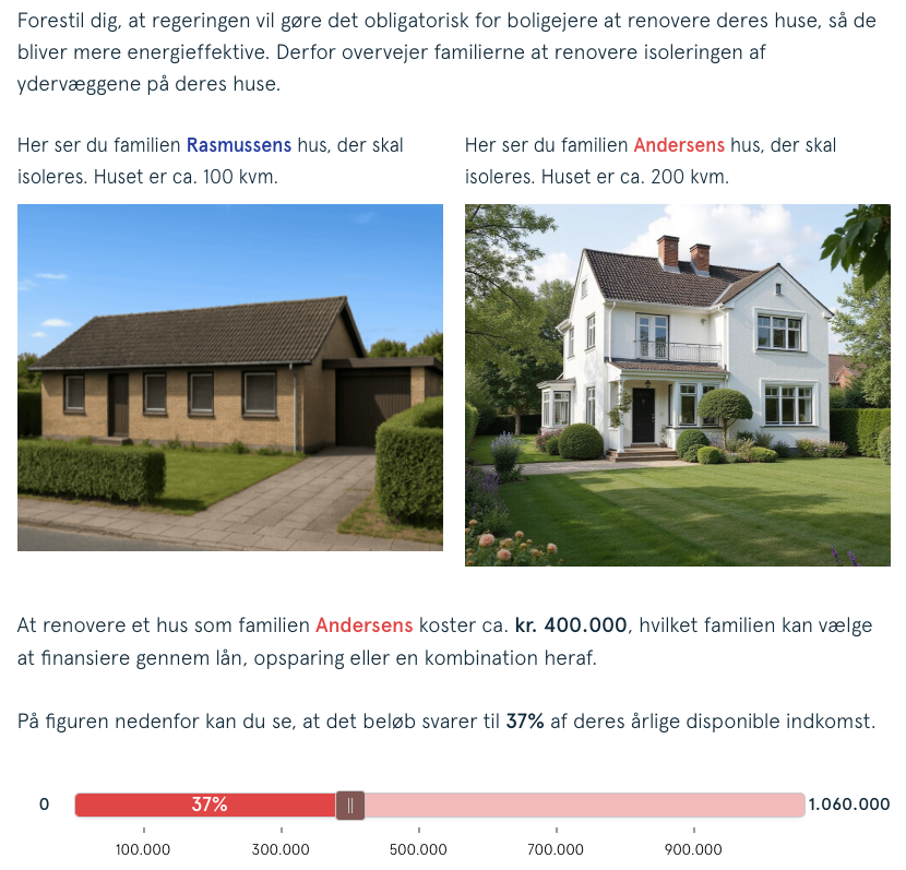
Source: Schaeffer and Andersen (2025)
Some of my current work
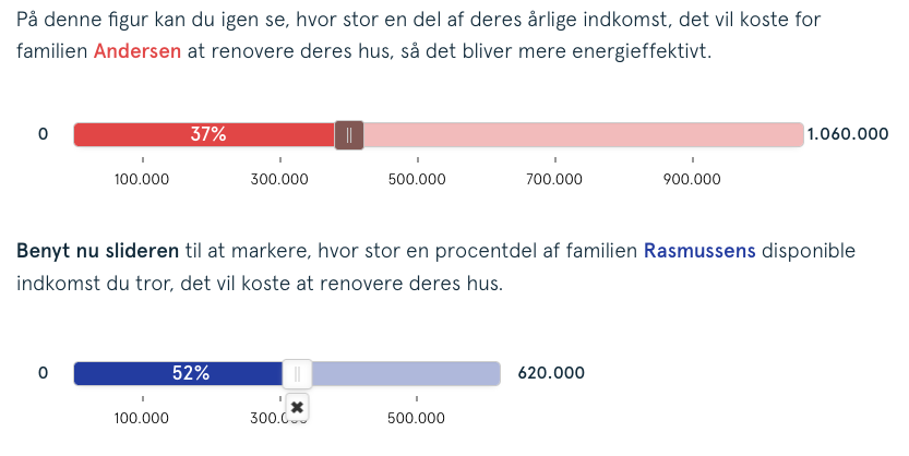
Source: Schaeffer and Andersen (2025)
Some of my current work
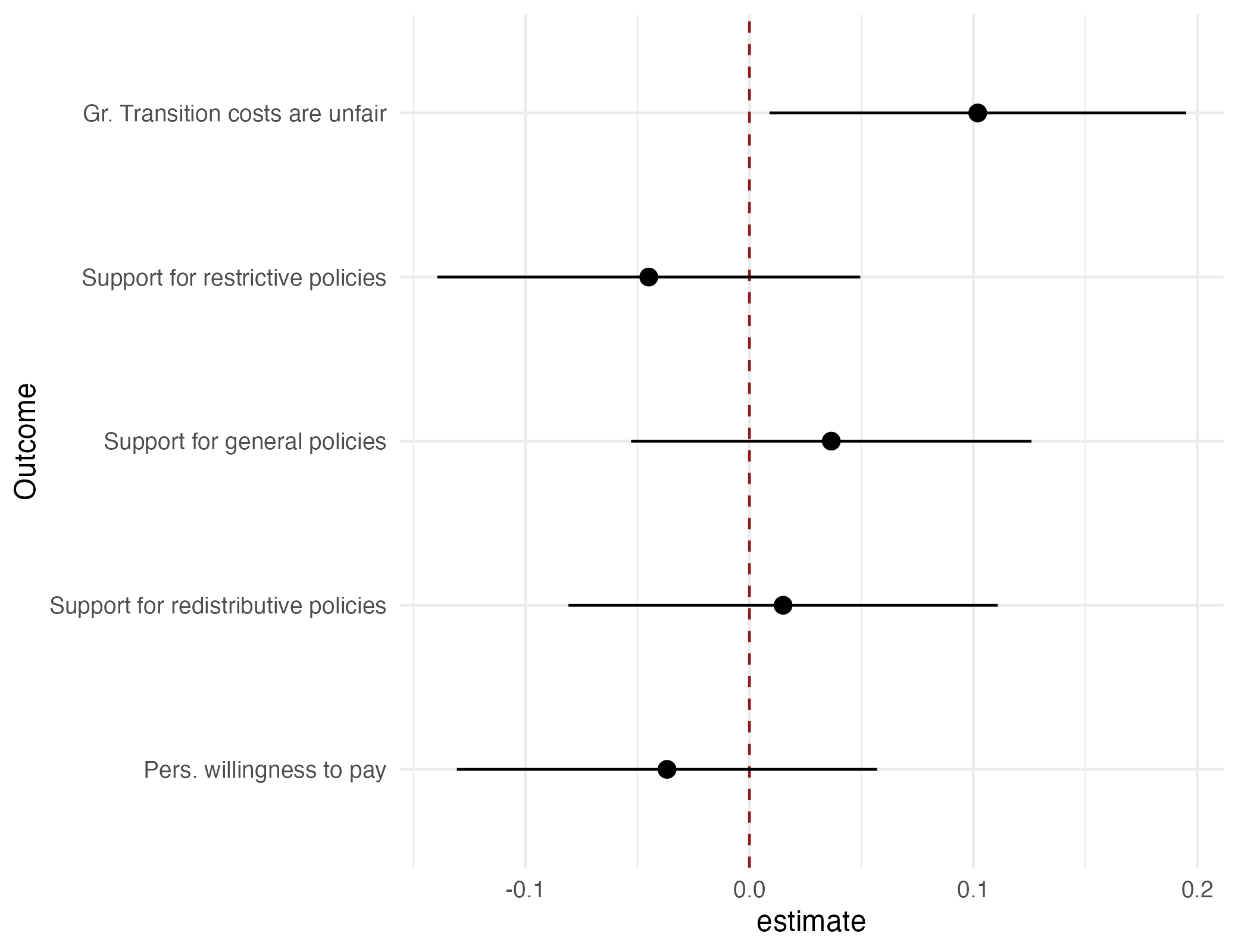
Source: Schaeffer and Andersen (2025)
4 types of research questions
(1) Ontological: what is the nature of X?
- What is power?
- What is gender; how is it different from sex?
- What is a state? “A human community that (successfully) claims the monopoly of the legitimate use of physical force within a given territory.” — Max Weber, “Politics as a Vocation” (1918)
(2) Critical: is X (un-)just?
- Is home office exploitation?
- Is the colorblind ideology a new form of racism?
Discuss: think of the last exam you wrote — which type of research question did it engage with?
(3) Descriptive: what types of X exist, and how frequent are they?
- What are the survival strategies of the poor?
- How did Danes structure their days during the COVID-19 lockdowns?
(4) Explanatory: what is the effect of X?
- What are the consequences of anomie? Why does the suicide rate vary across societies?
- How does capitalism affect us?
- How does urbanization affect us?
This course is about explanatory questions: what is the effect of X?
Goal of empirical sociology
Use data to discover patterns,
and the social mechanisms that bring them about.

Three learning goals
(1) Multiple OLS regression
- Multiple predictors & confounder adjustment (Frisch-Waugh),
- Interaction effects,
- Polynomials.
(2) Visualization of regression results
- Model predictions,
- Coefficient plots.
(3) Fundamentals of causal inference
- Potential outcomes & directed acyclical graphs (DAG),
- Randomised Controlled Trials (RCT),
- Intention to treat (ITT) & instrument variable (IV) regression,
- Multiple regression,
- 2-SLS instrument variable regression,
- Regression discontinuity designs (RDD).
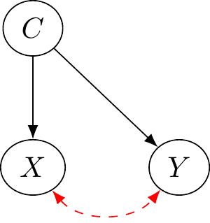
Example: regression discontinuity design

Example: regression discontinuity design
Municipalities where far-right candidates ran versus where they won
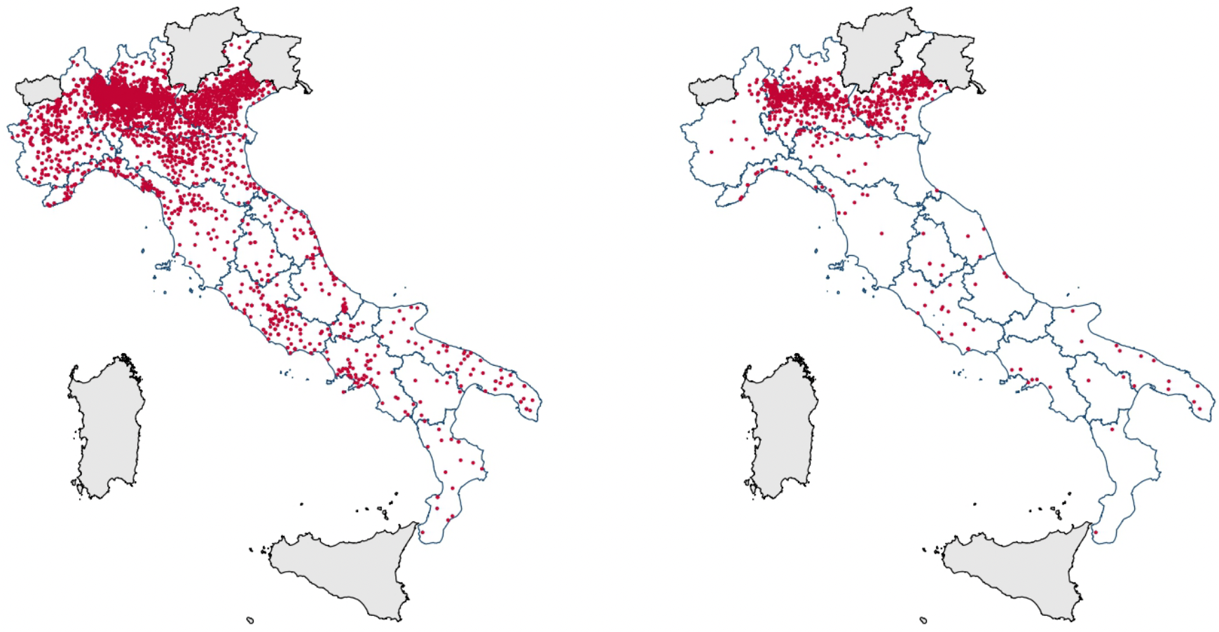
Source: Romarri (2020)
Example: regression discontinuity design
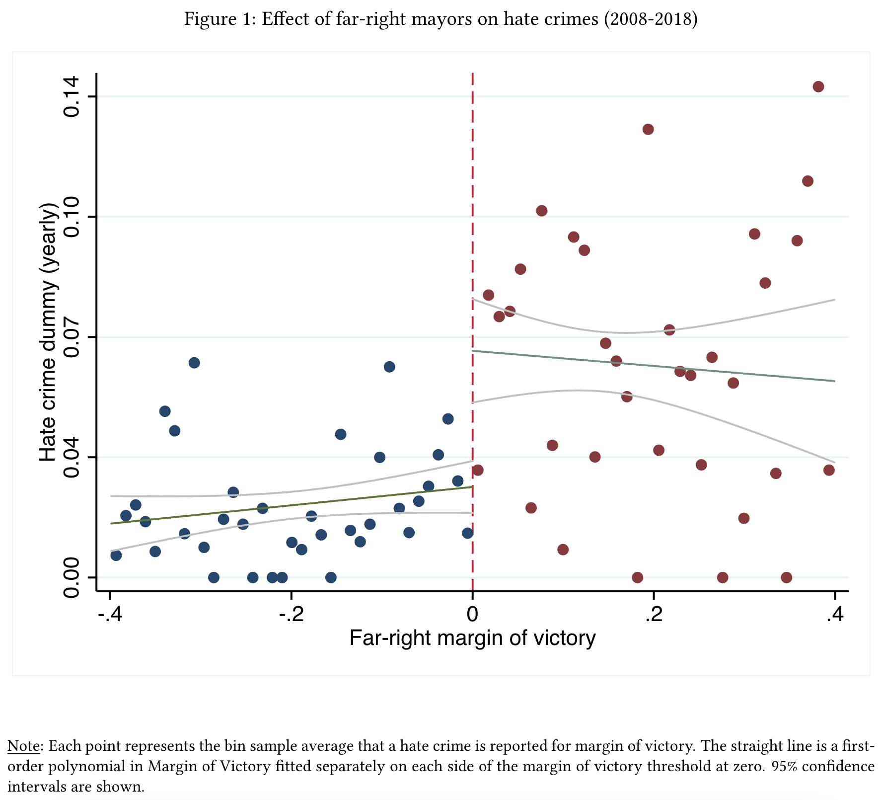
Source: Romarri (2020)
Discuss: why compare municipalities where the far-right barely won with those where it barely lost?
Near the threshold, winning is almost random — so the two groups are comparable, like in an experiment. The full logic comes in Lecture 13.
Example: regression discontinuity design
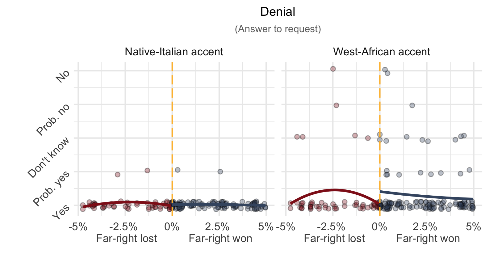
Source: Schaeffer, Romarri, Rosenberg et al. (2025)
Break
How the course works
Part 2 of 3
The weekly rhythm, the quizzes that qualify you for the exam, and what I assume you already know.
Course structure
| TA | Fridays | Room |
|---|---|---|
| Sofie | 8 am | CSS 2-2-49 |
| Natalie | 10 am | CSS 2-0-30 |
| Joakim | 10 am | CSS 2-0-42 |
Recommendations
- Activate email notifications on Absalon.
- Regularly check your KU email, or forward it to your personal email.
- Ask and answer questions in the t-R-ouble forum on Absalon.
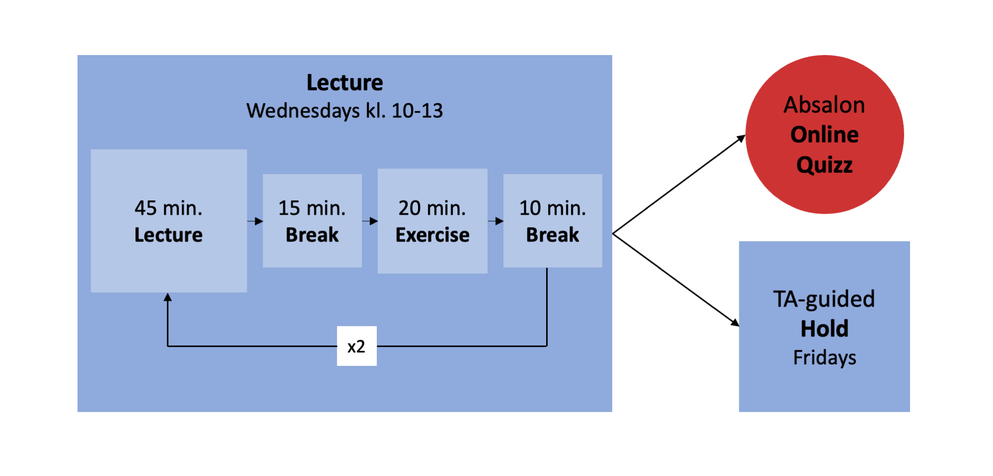
Weekly Absalon online quizzes
13 online quizzes on Absalon, designed by Epinion & us.
Based on data Epinion collects for the municipality of Copenhagen, DR, Skat, etc.
Made available online Wednesdays after the lecture.
Beware: submit at least 10 completed quizzes — individually, each within two weeks of release — or you do not qualify for the exam.


Consequently, this course assumes
- You have basic R coding skills and know how to use RStudio.
- You know basic statistics:
- Descriptive statistics: \(\%\), \(\bar{x}\), \(\text{SD}(x)\).
- Associations:
- Correlation: \(r_{y,x}\),
- OLS regression: \(y_{i} = \alpha + \beta x_{i} + \epsilon_{i}\).
- Inference: confidence intervals, \(t\)-values & \(p\)-values.
Rusty on any of this? Part 3 of today gets your tools ready, and the first weeks refresh the statistics.
Two textbooks
\(\rightarrow\) Available at Academic Books on City Campus and at the university library.
Carried over from last semester; serves as a reference for regression and statistical inference.
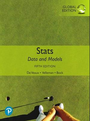
Veaux, Velleman, and Bock (2021)
To learn how to identify causal effects, we use Angrist & Pischke’s textbook.
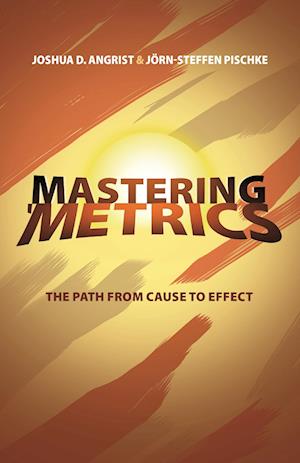
Angrist and Pischke (2014)
AI (like ChatGPT)
Privacy: don’t use AI/LLMs to process sensitive information!
Learning:
- Use AI to explain, comment, debug, and improve R code while you draft it.
- Use AI to get summaries of text passages and concepts that you do not understand.
- Use AI to discuss your understanding of the course materials and ask about things that confuse you.
Generation: don’t use AI to generate, draft, and write your R code. You need to learn how to code to assess whether the AI coded what you asked for.

Questions?

Get your tools ready
Part 3 of 3
Everyone leaves today with a working R setup — we do this together, now.
Task 1: install R & RStudio
Install RStudio, or update to the most recent version.
The same steps, with more detail, are on the course website under About & setup.
Task 2: get to know RStudio
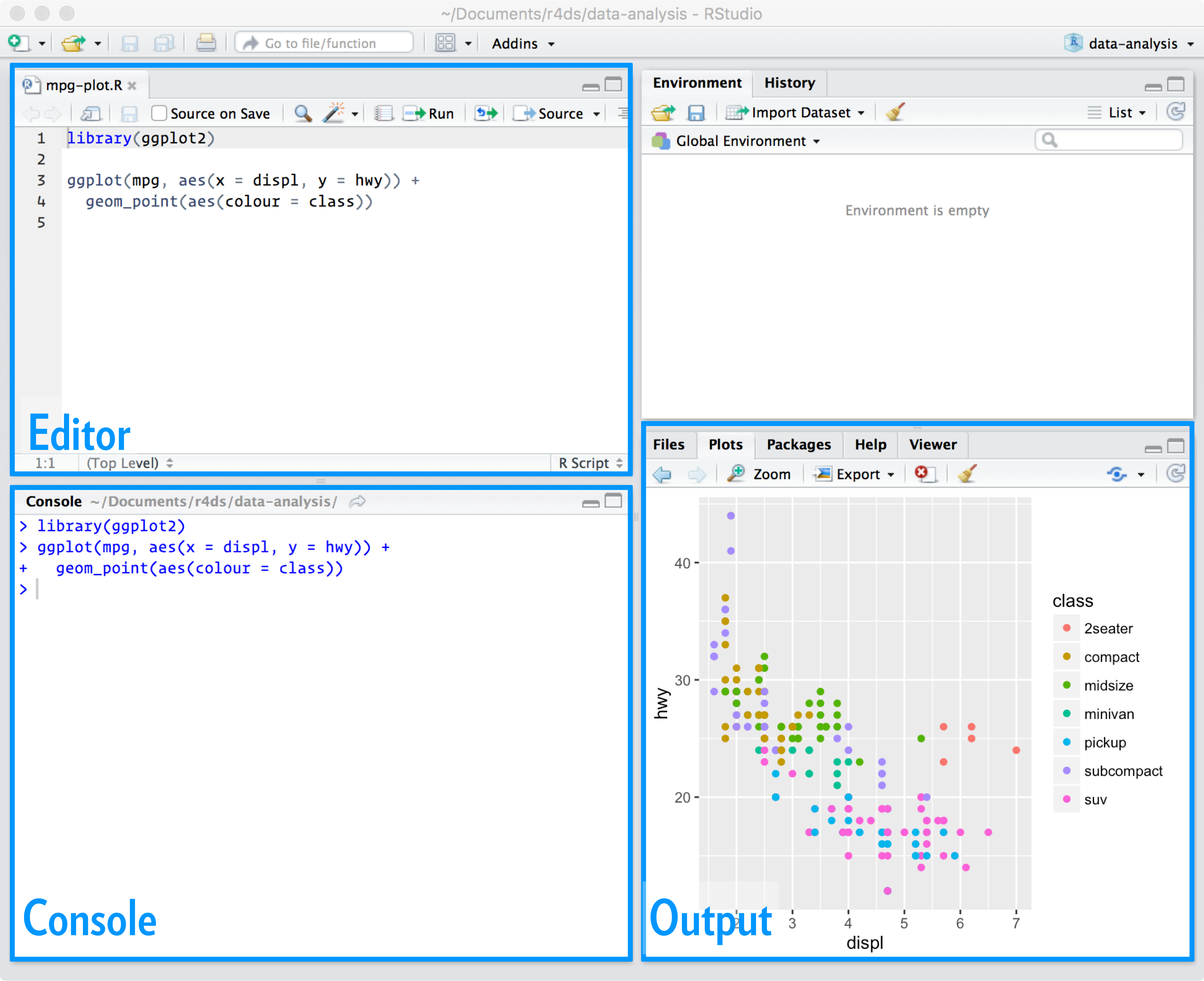
Task 3: set RStudio preferences
Set these preferences to improve reproducibility!
\(\rightarrow\) RStudio / Tools / Global options.

RStudio workflow
Use Projects to manage all files (scripts, data, figures, and tables) belonging to the same project.
Always start your RStudio session by clicking on the Project for this course.
Use the editor to write as many R scripts as you like, saved in the same folder as your Project. Thereby you can reproduce your results.
Set up your “Stats_II” project
- Click on the Project button.

Set up your “Stats_II” project
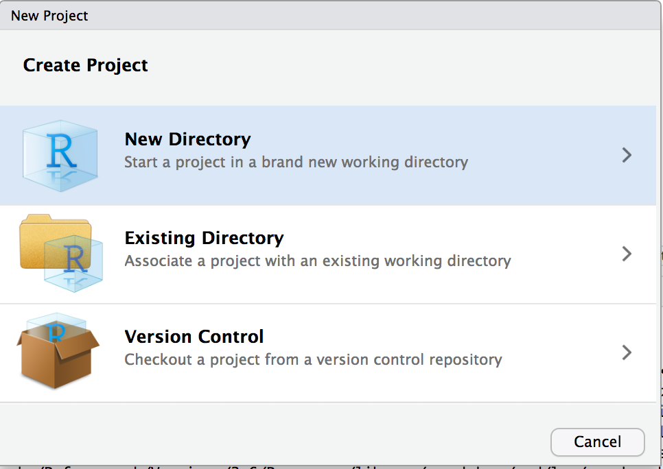
Set up a new project in RStudio:
- “New Directory”
- “New Project”
- Finally, a name for the folder and — under “Browse” — where you want that folder to be located. I call mine Stats_II. This also generates a folder with the name you chose. Use that folder for everything related to this course.
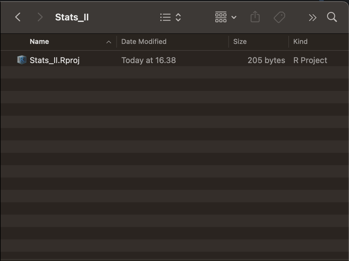
Done! Now you should find an empty folder under the path where you wanted it set up.
Beware: in the future, always start RStudio by double-clicking the project icon in your folder for this course.
Set up your “Stats_II” project
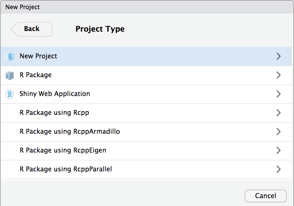
Set up a new project in RStudio:
- “New Directory”
- “New Project”
- Finally, a name for the folder and — under “Browse” — where you want that folder to be located.
Set up your “Stats_II” project
Set up a new project in RStudio:
- “New Directory”
- “New Project”
- Finally, a name for the folder and — under “Browse” — where you want that folder to be located.

Set up your “Stats_II” project
Done! Now you should find an empty folder under the path where you wanted it set up.
R scripts
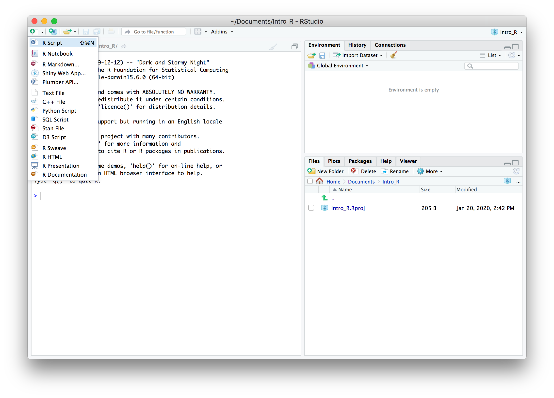
- Open a new R script.
- Save it in your new folder. Find it under “Files”.
R scripts
- Type the lines shown in the screenshot on the right.
- Save the file by clicking on the floppy-disc icon. I called mine “Lecture.R”.
- Mark all code and click “Run”.
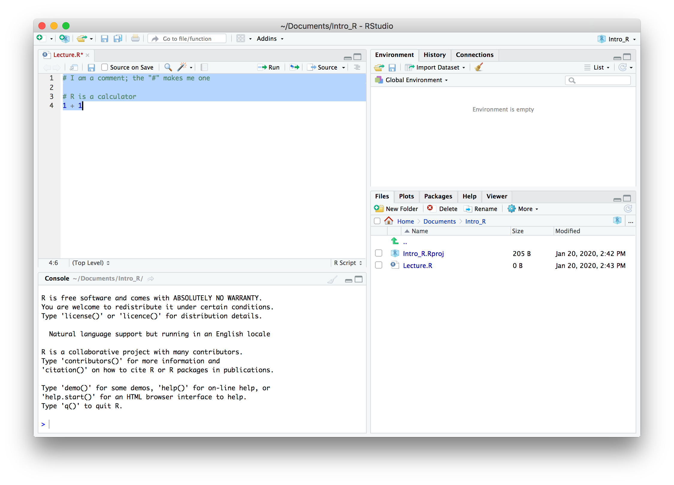
R scripts
OK, you are good to go!
Pro tip: use the R script to take notes during the lecture!
A # defines a comment. So use it to take notes and code in one single document per lecture.
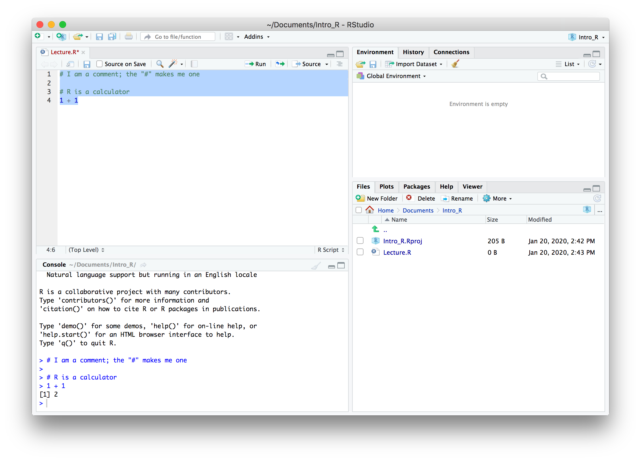
Check yourself: today’s goals
Look back at the goals from the start of the lecture. Can you tick all three?
- Explain to your neighbour what an explanatory research question is — and give one example.
- Name what it takes to qualify for the exam — how many quizzes, submitted how?
- Open your Stats_II project in RStudio and run a line of R code from a saved script.
Anything feel shaky? That is what this week’s Absalon quiz and the Friday exercise class are for.
References
Angrist, J. D. and J. Pischke (2014). Mastering ’Metrics: The Path from Cause to Effect. Princeton University Press.
Romarri, A. (2020). Do Far-Right Mayors Increase the Probability of Hate Crimes? Evidence From Italy. SSRN Scholarly Paper ID 3506811. Rochester, NY: Social Science Research Network.
Schaeffer, M. and S. Andersen (2025). “Unveiling the Price of Green”. In: Unpublished manuscript.
Schaeffer, M., A. Romarri, D. Rosenberg, et al. (2025). “When Politics Enters the Waiting Room: Far-Right Electoral Victories Exacerbate Discrimination in Access to Healthcare”. In: American Political Science Review. Forthcoming.
Veaux, D., Velleman, and Bock (2021). Stats: Data and Models, Global Edition. Pearson Higher Ed.
Wiedner, J., M. Schaeffer, S. Carol, et al. (2025). “Local Communities, Distant Origins: How Cultural Distance and Local Context Shape Immigrant Ethno-Religious Infrastructures”. In: American Journal of Sociology.
```{r setup, include = FALSE} library(RefManageR) library(knitr) library(ggrepel) # Nicely placed labels in figures
options(htmltools.preserve.raw = FALSE, htmltools.dir.version = FALSE, servr.interval = 0.5, width = 115, digits = 3) knitr::opts_chunk$set( collapse = TRUE, message = FALSE, fig.retina = 3, error = TRUE, warning = FALSE, cache = FALSE, fig.align = ‘center’, comment = “#”, strip.white = TRUE, tidy = FALSE)
BibOptions(check.entries = FALSE, bib.style = “authoryear”, style = “markdown”, hyperlink = FALSE, no.print.fields = c(“doi”, “url”, “ISSN”, “urldate”, “language”, “note”, “isbn”, “volume”)) myBib <- ReadBib(“../Stats_II.bib”, check = FALSE)
## By the end of today you can … {.inverse background-color="#901A1E"}

1. **check the OLS assumptions that matter** — spot outliers with *Cook's D* and judge the *linearity* assumption — and decide what to do about a suspicious case;

2. **use a categorical predictor** — dummy-code it, choose a reference category, and read the coefficients as differences between groups;

3. **visualize regression results** — a *coefficient plot* for categorical predictors, and *predicted values* for a continuous one.

::: {.backgrnote}
One part of today's lecture per goal. Our running question: **the carbon divide** — who pollutes, and why?
:::

::: {.notes}
Today is craft, not new theory: they can already fit a line, so now they learn to distrust one. Frame it as three habits — interrogate the line, handle categories, show the result. The running example is the carbon divide, which is worth a sentence: this is their generation's justice question, and we are doing it with the same OLS they already know.
:::

## Does the line fit? {.inverse background-color="#901A1E"}

[Part 1 of 3]{.part-pill}

::: {.lead}
Regression is easy to *run* and easy to *fool*. Before we trust a line, we interrogate it.
:::

## The research question of the day {.inverse background-color="#901A1E"}

::: {.push-left}
The climate crisis is the defining North–South injustice of your generation: the countries that emit **most** are rarely the ones that suffer **most**.

A first, blunt question before any of the justice: **do richer countries simply emit more CO₂?**
:::

::: {.push-right}
::: {.content-box-blue}
**Research question of the day:** across the world's countries, how does **CO₂ emitted per person** relate to a country's **wealth** — and to the **world region** it sits in?
:::

::: {.backgrnote}
The gap is staggering: the average Qatari emits *hundreds of times* more CO₂ than the average person in Chad or the DR Congo `r Citet(myBib, "chancel_global_2022")`.
:::
:::

::: {.notes}
Name the injustice before the statistics: the countries that emit most are rarely the ones that suffer most. Then set today's much blunter question — do richer countries simply emit more? Be explicit that this is a *descriptive* question; nothing today is causal, and they should notice we are not claiming it is.
:::

## Preparation

::: {.panel-tabset}

### Packages for today's session
```{r libraries}
pacman::p_load( # Load (and install if needed) several R packages
  tidyverse,    # Data manipulation and visualization
  wbstats,      # Download data from the World Bank API
  estimatr,     # OLS with robust standard errors
  modelsummary  # Nicely formatted regression tables
)
Get the data
# Download from the World Bank API; if it is unreachable, fall back to a
# cached copy so the analysis still runs (smart habit for any live data!)
co2_raw <- tryCatch(
  wb_data("EN.GHG.CO2.PC.CE.AR5", # CO2 emissions, tonnes per person
          start_date = 2000, end_date = 2023),
  error = function(e) readRDS("data/wb_co2_raw.rds")
)
gdp_raw <- tryCatch(
  wb_data("NY.GDP.PCAP.PP.KD", # GDP per person, PPP (constant 2021 $)
          start_date = 2000, end_date = 2023),
  error = function(e) readRDS("data/wb_gdp_raw.rds")
)
countries <- tryCatch( # Region & income group for every country
  wb_countries(),
  error = function(e) readRDS("data/wb_countries_raw.rds")
)
Build one tibble
# Most recent CO2 value per country
Dat_co2 <- co2_raw %>%
  rename(co2 = EN.GHG.CO2.PC.CE.AR5) %>%
  select(iso3c, country, year = date, co2) %>%
  drop_na(co2) %>%
  group_by(country) %>%
  filter(year == max(year)) %>%
  ungroup()

# Most recent GDP value per country (keep only the key + GDP)
Dat_gdp <- gdp_raw %>%
  rename(gdp = NY.GDP.PCAP.PP.KD) %>%
  select(iso3c, year = date, gdp) %>%
  drop_na(gdp) %>%
  group_by(iso3c) %>%
  filter(year == max(year)) %>%
  ungroup() %>%
  select(iso3c, gdp)

# Region & income group (drop the World Bank's aggregate "regions")
Dat_meta <- countries %>%
  filter(region != "Aggregates") %>%
  select(iso3c, region, income_level)

(Dat <- Dat_co2 %>%
   inner_join(Dat_gdp,  by = "iso3c") %>%
   inner_join(Dat_meta, by = "iso3c") %>%
   mutate(
     gdp_k  = gdp / 1000, # GDP in THOUSANDS of $, for readable slopes
     region = fct_relevel(region, "Sub-Saharan Africa") # reference group
   ))
:::
CO₂ emissions across the world
{r co2-world, out.width='100%', fig.height = 7, fig.width = 20, echo = FALSE} Dat %>% arrange(co2) %>% filter(row_number() <= 8 | row_number() > n() - 8 | country == "Denmark") %>% ggplot(aes(y = co2, x = reorder(country, co2))) + geom_col(fill = "#901A1E") + labs(y = "Tonnes of CO2 per person, per year", x = "", caption = "Source: World Bank (EDGAR). The 8 lowest, the 8 highest, and Denmark.") + theme_minimal(base_size = 16) + theme(axis.text.x = element_text(angle = 60, hjust = 1))
The extremes are oil-and-gas economies (Qatar, Kuwait, Brunei) and rich English-speaking countries; at the other end sit some of the world’s poorest states.
Does wealth drive emissions?
Ask every scatter plot four questions:
- Direction of the relationship?
- Form — is it a straight line?
- Spread around the trend?
- Any outliers?
{r scatter1, out.width='100%', fig.height = 5, fig.width = 8, echo = FALSE} ggplot(data = Dat, aes(y = co2, x = gdp_k, label = country)) + geom_text(size = 3, alpha = 0.8) + geom_label_repel(data = Dat %>% filter(country == "Denmark"), color = "#901A1E", size = 5, box.padding = 1.5, force = 60, segment.size = 1) + labs(y = "Tonnes of CO2 per person", x = "GDP per person (thousands of $, PPP)") + theme_minimal(base_size = 14)
A first regression
```{r ols1, results = ‘hide’} # OLS with robust standard errors ols_1 <- lm_robust( co2 ~ gdp_k, data = Dat )
modelsummary( list(“CO2 per person” = ols_1), stars = TRUE, gof_map = c(“nobs”, “r.squared”), output = “kableExtra” )
:::

::: {.push-right}
```{r ref.label = "ols1", echo = FALSE, results = 'asis'}
Each extra $1,000 of GDP per person comes with about r round(coef(lm_robust(co2 ~ gdp_k, data = Dat))[2], 2) more tonnes of CO₂ per person. But \(R^2 \approx `r round(summary(lm_robust(co2 ~ gdp_k, data = Dat))\)r.squared, 2)`$ — and a low \(R^2\) is often a warning sign. Should we trust this line?
OLS makes assumptions
For OLS to describe the data honestly:
- No influential outliers
- Linearity (a straight line fits)
- Homoscedasticity — don’t worry:
lm_robust()handles it. - Independent observations.
\(\rightarrow\) The first two we check with plots.
Beware: a single strange country, or a curved relationship, can bend the OLS line away from the pattern in the bulk of the data — and quietly change your conclusion.
A model is a reduced representation of reality. It should capture the general pattern — not be dictated by one or two singular cases.
Assumption 1: outliers
Standardized residuals: how far a country sits from the line. Watch:
- Qatar — CO₂
r round(Dat$co2[Dat$country == "Qatar"], 1)t: extremely rich and extremely high. - Palau — CO₂
r round(Dat$co2[Dat$country == "Palau"], 1)t: only middling GDP, yet off the chart.
- Qatar — CO₂
Leverage: influence on the line; \(x_i\) far from \(\bar{x}\) (Qatar’s huge GDP).
Cook’s D: how much all predictions shift if case \(i\) were removed.
- Beyond the dashed grey lines = influential.
{r outlier, results = FALSE, fig.show = 'hide'} # Re-estimate with base lm(), then the best outlier plot: #<< lm(co2 ~ gdp_k, data = Dat) %>% plot(which = 5)
{r ref.label = "outlier", out.width='80%', fig.height = 4.2, fig.width = 5.5, results = FALSE, echo = FALSE}
Assumption 2: linearity
Fitted values \(\hat{Y}\) on the X-axis, residuals on the Y-axis.
Red line: the smoothed relationship between the two.
Ideal: the red line is flat — the straight line captured everything.
Our case: the red line bends — driven by the same rich, high-emitting outliers. The linearity assumption is strained.
{r linearity, results = FALSE, fig.show = 'hide'} # Same model, the best linearity plot: #<< lm(co2 ~ gdp_k, data = Dat) %>% plot(which = 1)
{r ref.label = "linearity", out.width='80%', fig.height = 4.2, fig.width = 5.5, results = FALSE, echo = FALSE}
Not every outlier is an error
Discuss: the plots flag two countries. Palau — a tiny Pacific island whose per-person figure is distorted by a tanker-refuelling port and ~18,000 residents. Qatar — a genuine petro-state. Should we delete both?
No — judgement, not reflex. Palau is a measurement artefact for our question (national wealth → emissions): we drop it. Qatar is a real, important case; we keep it, but stay aware it has high leverage. Never delete a case just because it is inconvenient.
Removing the artefact
With Palau gone, the outlier plot calms down and the red linearity line straightens — the same line now fits the bulk of countries far better.
{r outlier2, out.width='72%', fig.height = 4, fig.width = 5.2, results = FALSE, echo = FALSE} lm(co2 ~ gdp_k, data = Dat) %>% plot(which = 5)
{r linearity2, out.width='72%', fig.height = 4, fig.width = 5.2, results = FALSE, echo = FALSE} lm(co2 ~ gdp_k, data = Dat) %>% plot(which = 1)
The line, re-fitted
```{r ols1b, results = ‘hide’} ols_1 <- lm_robust(co2 ~ gdp_k, data = Dat)
modelsummary( list(“CO2 per person” = ols_1), stars = TRUE, gof_map = c(“nobs”, “r.squared”), output = “kableExtra” )
::: {.backgrnote}
Same specification, one artefact removed. The slope is now more stable and $R^2$ has roughly doubled: dropping *one* distorting case sharpened the whole picture.
:::
:::

::: {.notes}
One row out of 190-odd, and $R^2$ roughly doubles — that is the number to dwell on. It should feel slightly alarming, and it should: a single case had that much say over the fit. Good moment to ask what would have happened if we had never looked at the diagnostic plots.
:::

::: {.push-right}
```{r ref.label = "ols1b", echo = FALSE, results = 'asis'}
Comparing groups
Part 2 of 3
Wealth is continuous. But much of what we compare is categorical — here, the world region a country sits in.
CO₂ by world region
{r region-box, out.width='100%', fig.height = 5, fig.width = 16, echo = FALSE} ggplot(data = Dat, aes(y = co2, x = reorder(region, co2, FUN = median))) + geom_boxplot(outlier.shape = NA, color = "#901A1E") + geom_jitter(width = 0.12, alpha = 0.4, size = 1.5) + scale_x_discrete(labels = function(x) str_wrap(x, 16)) + labs(y = "Tonnes of CO2 per person", x = "", caption = "Source: World Bank") + theme_minimal(base_size = 15)
Discuss: if we predict CO₂ from region alone, what would \(\hat{Y}\) be for a Sub-Saharan African country? For a North American one? How does the difference between them relate to \(\hat{\beta}\)?
Dummy coding: from labels to 0/1
A regression needs numbers, not words. R turns each category into a dummy: 1 if the case is in that category, 0 otherwise — leaving one category out as the reference.
\[x = \begin{cases} 1, & \text{if in the category} \\ 0 & \text{otherwise} \end{cases}\]
| Country | N. America | Europe | … |
|---|---|---|---|
| USA | 1 | 0 | 0 |
| Canada | 1 | 0 | 0 |
| Denmark | 0 | 1 | 0 |
| Germany | 0 | 1 | 0 |
| … | 0 | 0 | 1 |
| Reference (Sub-Saharan Africa) |
0 | 0 | 0 |
Each coefficient = that region’s average difference in CO₂ from the reference.
Categorical predictors in R
```{r ols2, results = ‘hide’} # R dummy-codes a factor (or character) automatically, # using its FIRST level as the reference category. ols_2 <- lm_robust(co2 ~ region, data = Dat)
modelsummary( list(“CO2 per person” = ols_2), stars = TRUE, # Shorten the region labels for the table coef_rename = c(“regionEast Asia & Pacific” = “East Asia & Pacific”, “regionEurope & Central Asia” = “Europe & Central Asia”, “regionLatin America & Caribbean” = “Latin America”, “regionMiddle East, North Africa, Afghanistan & Pakistan” = “Middle East & N. Africa”, “regionNorth America” = “North America”, “regionSouth Asia” = “South Asia”), gof_map = c(“nobs”, “r.squared”), output = “kableExtra” )
### The table
```{r ref.label = "ols2", echo = FALSE, results = 'asis'}
{r coefs, echo = FALSE} b <- coef(lm_robust(co2 ~ region, data = Dat))
Reference (Sub-Saharan Africa): average CO₂ is the intercept,
r round(b[1], 2)t per person — the value when all region dummies are 0.North America vs. Sub-Saharan Africa:
r round(b["regionNorth America"], 2)t per person more, on average → an average ofr round(b[1] + b["regionNorth America"], 2)t.Every coefficient is a difference of group means from the reference. No line, no linearity assumption to check — the model just reports averages.
Break
Your turn: exercise 1
You practice today’s diagnostics and a categorical predictor — this time with income groups instead of regions.
Open exercise 1 in a new tab ↗
Break
Showing your results
Part 3 of 3
A regression table is for you. A figure is for your reader. Two go-to plots: coefficients, and predictions.
(1) Coefficient plots
(plotdata <- lm_robust(co2 ~ region, data = Dat) %>%
   tidy() %>% # Turn the results into a tibble #<<
   mutate(term = term %>% # Tidy up the region labels
            str_remove("region") %>%
            str_replace(", North Africa, Afghanistan & Pakistan", " & N. Africa")) %>%
   filter(term != "(Intercept)")) # Drop the reference
{r coefplot, fig.show = 'hide'} ggplot(data = plotdata, aes(y = estimate, x = reorder(term, estimate))) + # Order by size # Reference line at "no difference" geom_hline(yintercept = 0, color = "#901A1E", lty = "dashed") + # A point with its 95% confidence interval geom_pointrange(aes(ymin = conf.low, ymax = conf.high)) + #<< coord_flip() + # Flip the axes so labels are readable #<< labs(x = "World region", y = "Average difference in CO2 (t per person)\nvs. Sub-Saharan Africa") + theme_minimal(base_size = 15)
{r ref.label = "coefplot", out.width='78%', fig.height = 4.4, fig.width = 8, echo = FALSE}
(2) Model predictions
{r ols-pred, results = 'hide'} # Back to the continuous predictor (ols_1 <- lm_robust(co2 ~ gdp_k, data = Dat)) {r ref.label = "ols-pred", echo = FALSE}
{r predplot, out.width='62%', fig.height = 4.2, fig.width = 6.5, echo = FALSE} ggplot(data = fict_dat, aes(y = fit, x = gdp_k)) + # Mark a poor and a rich benchmark geom_vline(xintercept = c(5, 60), color = "#901A1E", lty = "dashed") + geom_ribbon(aes(ymin = lwr, ymax = upr), alpha = 0.3) + geom_line(linewidth = 1) + labs(x = "GDP per person (thousands of $, PPP)", y = "Predicted tonnes of CO2 per person") + theme_minimal(base_size = 14)
The carbon divide, in two pictures
{r ref.label = "coefplot", out.width='100%', fig.height = 4.2, fig.width = 7, echo = FALSE}
{r ref.label = "predplot", out.width='100%', fig.height = 4.2, fig.width = 7, echo = FALSE}
Richer countries and richer regions emit far more per person. Yet the people who emit the least — across Sub-Saharan Africa and South Asia — are the ones most exposed to the warming those emissions cause. That gap, not the slope, is the real research agenda r Citet(myBib, "chancel_global_2022").
Your turn: exercise 2
You practice visualizing regression: a coefficient plot and a prediction plot of your own.
Open exercise 2 in a new tab ↗
One last wisdom: whose carbon is it?
Everything so far counted CO2 where it is produced. But Denmark burns little at home and imports carbon-heavy goods — steel, electronics, meat.
Consumption-based accounting re-assigns them to whoever consumes the goods: Denmark’s footprint jumps from r round(readRDS("data/owid_consumption.rds") %>% filter(country == "Denmark") %>% pull(production), 1) to r round(readRDS("data/owid_consumption.rds") %>% filter(country == "Denmark") %>% pull(consumption), 1) t — factory economies (China, India) carry what we outsourced.
The wisdom: how you measure the outcome can flip the story — a fairer CO2 number makes the North–South gap wider, not smaller.
```{r consumption, out.width=‘100%’, fig.height = 5.0, fig.width = 8.5, echo = FALSE} cons <- readRDS(“data/owid_consumption.rds”)
show <- c(“Switzerland”, “Denmark”, “United Kingdom”, “Sweden”, “France”, “Germany”, “United States”, “Norway”, “Nigeria”, “India”, “China”, “Qatar”)
plot_cons <- cons %>% filter(country %in% show) %>% mutate(flow = if_else(consumption >= production, “Net importer of CO2”, “Net exporter of CO2”), country = fct_reorder(country, consumption))
ggplot(plot_cons, aes(y = country)) + geom_segment(aes(x = production, xend = consumption, yend = country, color = flow), linewidth = 1.3) + geom_point(aes(x = production), color = “grey45”, size = 3) + geom_point(aes(x = consumption, color = flow), size = 3.4) + scale_color_manual(values = c(“Net importer of CO2” = “#901A1E”, “Net exporter of CO2” = “#425570”)) + labs(x = “Tonnes of CO2 per person (grey = produced, coloured = consumed)”, y = ““, color =”“, caption =”Source: Global Carbon Project, via Our World in Data (2023)“) + theme_minimal(base_size = 15) + theme(legend.position =”top”)
:::

## Run the fit again — with the consumption footprint

::: {.panel-tabset}

### Fit both models
```{r cons-fit, results = 'hide'}
# Join each country's consumption footprint, then run the SAME regression
Dat_cons <- Dat %>%
  inner_join(
    readRDS("data/owid_consumption.rds") %>%
      select(iso3c = iso_code, consumption),
    by = "iso3c"
  )

modelsummary(
  list("Produced (WB)"  = lm_robust(co2 ~ gdp_k,         data = Dat_cons),
       "Consumed (GCP)" = lm_robust(consumption ~ gdp_k, data = Dat_cons)),
  stars = TRUE,
  coef_rename = c("gdp_k" = "GDP per person ($1,000s)"),
  gof_map = c("nobs", "r.squared"),
  output = "kableExtra"
)
The comparison
{r ref.label = "cons-fit", echo = FALSE, results = 'asis'}
Same predictor, same countries — a different outcome. Wealth explains far more of the consumption footprint (\(R^2 \approx `r round(summary(lm(consumption ~ gdp_k, data = Dat_cons))\)r.squared, 2)$) than of *production* ($R^2 \approxr round(summary(lm(co2 ~ gdp_k, data = Dat_cons))\(r.squared, 2)`\)), and the slope is steeper. What a country consumes tracks its wealth more tightly than what it happens to emit at home — and Qatar is no longer the lone outlier.
The picture
{r cons-scatter, out.width='58%', fig.height = 4.2, fig.width = 7, echo = FALSE} Dat_cons %>% select(gdp_k, Produced = co2, Consumed = consumption) %>% pivot_longer(c(Produced, Consumed), names_to = "measure", values_to = "co2t") %>% ggplot(aes(x = gdp_k, y = co2t, color = measure)) + geom_point(alpha = 0.35, size = 1.5) + geom_smooth(method = "lm", se = FALSE, linewidth = 1) + scale_color_manual(values = c("Consumed" = "#901A1E", "Produced" = "grey45")) + labs(x = "GDP per person (thousands of $, PPP)", y = "Tonnes of CO2 per person", color = "") + theme_minimal(base_size = 14) + theme(legend.position = "top")
Today’s general lessons
Outliers can bend the OLS line. Cook’s D (
plot(which = 5)) finds the influential ones.OLS assumes a linear relationship for continuous predictors — check it (
plot(which = 1)); it does not apply to categorical predictors.Not every outlier is deleted: separate artefacts (drop) from real, important cases (keep, but note their leverage).
Categorical predictors are dummy-coded: each coefficient is a group’s average difference from the reference category. R does this automatically.
Coefficient plots show categorical results; prediction plots show what a continuous model implies across a range of values.
How you measure the outcome can flip the story — production vs. consumption CO2 is the same countries, a different (and fairer) number.
Today’s important functions
- Post-
lm()diagnostics:plot(model, which = 5)— identify influential outliers (Cook’s D).plot(model, which = 1)— check the linearity assumption.
- Building the figures:
tidy()— turn a model into a tibble of coefficients + confidence intervals.geom_pointrange()+coord_flip()— the coefficient plot.predict(model, newdata = ..., interval = "confidence")— \(\hat{Y}\) for synthetic data.
fct_relevel()— set which category is the reference.
Check yourself: today’s goals
Look back at the goals from the start. Can you tick all three?
- Run
plot(model, which = 5)andwhich = 1and say, in words, what each one is telling you. - Decide whether a flagged outlier is an artefact to drop or a real case to keep — and defend your call.
- Read a coefficient on a dummy variable as a difference from the reference — and build a coefficient plot and a prediction plot for your reader.
Anything shaky? That is what this week’s Absalon quiz and the Friday exercise class are for.
References
{r ref, results = 'asis', echo = FALSE} PrintBibliography(myBib)
Appendix: binary outcomes
What if the outcome is yes/no? A short preview of the Linear Probability Model.
LPM vs. generalised linear models
Linear Probability Model (LPM): just OLS with a 0/1 outcome — e.g. is this a high-emitting country? (above 2 t per person).
- It predicts \(\hat{\text{P}}(y_i = 1 \mid x_i)\).
- Simple, and the coefficients read as changes in probability.
- But: it can predict probabilities below 0 or above 1.
{r lpm, out.width='82%', fig.height = 4, fig.width = 6.5, echo = FALSE} Dat_lpm <- Dat %>% mutate(high = as.numeric(co2 > 2)) ggplot(data = Dat_lpm, aes(y = high, x = gdp_k)) + geom_point(alpha = 0.4) + geom_smooth(method = "lm", color = "#901A1E", se = FALSE) + geom_hline(yintercept = c(0, 1), lty = "dotted") + scale_y_continuous(breaks = c(0, 1)) + labs(y = "High emitter? (> 2 t per person)", x = "GDP per person (thousands of $, PPP)") + theme_minimal(base_size = 14)
The red line pierces 1 at high GDP — a probability above 100%. That is the LPM’s controversial side.
Logistic regression — a GLM for binary outcomes
\[\begin{aligned} \text{logit}(y_i) &= \alpha + \beta x, \\ y_i &= \text{logit}^{-1}(\alpha + \beta x) \\ &= \frac{1}{1 + e^{-(\alpha + \beta x)}}. \end{aligned}\]
A link function squeezes the linear model into the \([0, 1]\) range. The sigmoid-shaped logistic function does exactly that.
GLMs bring their own interpretation traps r Citep(myBib, "breen_interpreting_2018"). In this course we use Linear Probability Models for binary outcomes — and 0/1 coding for categorical ones.
```{r logit-fun, out.width=‘82%’, fig.height = 3.4, fig.width = 5, echo = FALSE} logistic <- function(x) 1 / (1 + exp(-x))
ggplot(data = tibble(x = c(-6, 6)), aes(x = x)) + stat_function(fun = logistic, geom = “line”, color = “#901A1E”, linewidth = 1) + geom_hline(yintercept = c(0, 1), lty = “dotted”) + labs(x = expression(alpha + beta * x), y = expression(over(1, 1 + e^-(alpha + beta * x)))) + theme_minimal(base_size = 14)
:::

```{=html}
<script>
(function () {
  function fmt(s) { var m = Math.floor(s / 60), ss = s % 60; return m + ":" + (ss < 10 ? "0" : "") + ss; }
  function build(el) {
    var total = (parseInt(el.getAttribute("data-min"), 10) || 5) * 60, rem = total, id = null;
    el.innerHTML =
      '<div class="kt-display">' + fmt(rem) + '</div>' +
      '<div class="kt-btns">' +
        '<button class="kt-start" type="button">Start</button>' +
        '<button class="kt-pause" type="button">Pause</button>' +
        '<button class="kt-reset" type="button">Reset</button>' +
      '</div>';
    var disp = el.querySelector(".kt-display");
    function render() { disp.textContent = fmt(rem); el.classList.toggle("kt-done", rem <= 0); }
    function start() { if (id) return; id = setInterval(function () { if (rem > 0) { rem--; render(); } else { stop(); } }, 1000); }
    function stop() { clearInterval(id); id = null; }
    function reset() { stop(); rem = total; render(); }
    el.querySelector(".kt-start").onclick = start;
    el.querySelector(".kt-pause").onclick = stop;
    el.querySelector(".kt-reset").onclick = reset;
    el._start = start; el._reset = reset; render();
  }
  function init() {
    document.querySelectorAll(".ku-timer").forEach(build);
    if (window.Reveal && Reveal.on) {
      Reveal.on("slidechanged", function (e) {
        document.querySelectorAll(".ku-timer").forEach(function (t) { if (t._reset) t._reset(); });
        var here = e.currentSlide ? e.currentSlide.querySelectorAll(".ku-timer") : [];
        here.forEach(function (t) { if (t._start) setTimeout(t._start, 250); });
      });
    }
  }
  if (document.readyState !== "loading") init();
  else document.addEventListener("DOMContentLoaded", init);
})();
</script>
```{r setup, include = FALSE} library(RefManageR) library(knitr) library(ggrepel) # Nicely placed labels in figures. library(modelr)
options(htmltools.preserve.raw = FALSE, htmltools.dir.version = FALSE, servr.interval = 0.5, width = 115, digits = 3) knitr::opts_chunk$set( collapse = TRUE, message = FALSE, fig.retina = 3, error = TRUE, warning = FALSE, cache = FALSE, fig.align = ‘center’, comment = “#”, strip.white = TRUE, tidy = FALSE)
BibOptions(check.entries = FALSE, bib.style = “authoryear”, style = “markdown”, hyperlink = FALSE, no.print.fields = c(“doi”, “url”, “ISSN”, “urldate”, “language”, “note”, “isbn”, “volume”)) myBib <- ReadBib(“../Stats_II.bib”, check = FALSE)
##   {.clear}

```{r, echo = FALSE, out.width='44%', fig.align='center'}
knitr::include_graphics('img/L6/vaccine_trial.jpg')
How do we know it works?
Source: r Citet(myBib, "polack_safety_2020")
Goal of empirical sociology
Use data to discover patterns,
and the social mechanisms that bring them about.
{r, echo = FALSE, out.width='55%', fig.align='center'} knitr::include_graphics('https://researchleap.com/wp-content/uploads/2021/12/Population-data.jpeg')
By the end of today you can …
explain why a simple group comparison can mislead us — selection bias;
see how randomisation fixes it — in one picture and one formula;
estimate a causal effect from a real experiment in R.
One part of today’s lecture per goal. Our running question throughout: does news media consumption increase immigrant minorities’ reports of discrimination?
The Integration Paradox
Immigrants who are better integrated — e.g. higher educated, fluent in the language — report more discrimination, not less.
One suspected channel: the news media (highlighted in the study on the right).
Research question of the day: does news media consumption increase immigrant minorities’ reports of discrimination?
{r, echo = FALSE, out.width='90%', fig.align='center'} knitr::include_graphics('img/Steinmann1.png') knitr::include_graphics('img/Steinmann2.png')
{r, echo = FALSE, out.width='90%', fig.align='center'} knitr::include_graphics('img/Steinmann3.png')
Source: r Citet(myBib, "steinmann_paradox_2019")
Why naïve comparisons mislead
Part 1 of 3
Just comparing news-readers with non-readers will not give us a causal effect. Let’s see why.
Preparation
pacman::p_load( # Load several R packages using the pacman package manager
  tidyverse,  # A collection of packages for data manipulation and visualization
  ggplot2,    # Powerful package for creating static, animated and interactive visualizations
  estimatr,   # Package for fast estimators for regression with weighted data
  modelr,     # Provides functions for modelling and prediction
  kableExtra, # Enhances table creation in R
  modelsummary) # Creates tables and plots to summarise statistical models
r Citet(myBib, "schaeffer_association_2023")- 1093 immigrants and children of immigrants.
- Berlin, Hamburg, Munich, Frankfurt, Cologne.
- Interviewed August 2021.
- Financed by the German Research Council (DFG)
On a typical day, about how much time do you spend watching, reading, or listening to news about politics and current affairs? Please give your answer in hours and then minutes.
How often were you personally discriminated against in the following situations here in Germany? Discrimination means a person is treated worse than others, with no factual justification — e.g. insult, ostracism, harassment. Disadvantaging rules and laws also count. … looking for work · at work · in education
… looking for housing · with officials · in public
- Never (2) Rarely (3) Sometimes (4) Often (5) Very often
{r results = FALSE, echo = FALSE} # Read APAD data, load("../assets/APAD.RData")
{r eval = FALSE} load("APAD.RData") # Load APAD dataset
{r results = FALSE} APAD <- APAD %>% # Process the APAD data mutate( # News consumption in minutes (e.g. 2h 30m -> 150) news = news_hrs * 60 + news_mins, # Binary: reads >= 15 minutes of news per day? news_yn = case_when( news < 15 ~ 0, news >= 15 ~ 1, TRUE ~ as.numeric(NA) ), # Average perceived discrimination across 6 domains dis_index = rowMeans( select(., dis_trainee, dis_job, dis_school, dis_house, dis_gov, dis_public), na.rm = TRUE ), # z-standardised version (mean 0, SD 1) z_dis_index = scale(dis_index) %>% as.numeric() )
{r echo = FALSE} APAD
Naïve comparison
{r naiv, out.width = "94%", fig.height = 3.2, fig.width = 5, echo = FALSE} ggplot(data = APAD, aes(y = dis_index, x = news)) + geom_point(aes(size = gewFAKT), alpha = 1/3) + geom_smooth(aes(weight = gewFAKT), method = "lm", colour = "#901A1E") + scale_y_continuous(breaks = 1:5, labels = c("Never", "Rarely", "Sometimes", "Often", "Very often")) + labs(y = "Perceived discrimination", x = "Daily minutes of news consumption") + theme_minimal(base_size = 14) + theme(legend.position = "none")
Discuss: we find a tiny association. Can we trust it as the effect of news?
No — news-readers and non-readers differ in many other ways.
The dream: two parallel worlds
To know the causal effect, we’d compare the same person — reading news vs. not.
| Person | If reads news (\(Y_1\)) | If no news (\(Y_0\)) | Causal effect |
|---|---|---|---|
| Aisha | 4 | ? | ? |
| Ben | ? | 2 | ? |
| Chen | 5 | ? | ? |
Discuss: what would we need in order to measure one person’s causal effect?
Both worlds at once — impossible. The missing cell is the counterfactual: the fundamental problem of causal inference.
Why the naïve comparison misleads
The raw gap between readers and non-readers mixes two things:
\[ \underbrace{Avg_{n}[Y_{1i}|D_{i}=1] - Avg_{n}[Y_{0i}|D_{i}=0]}_{\text{Difference we actually observe}} = \underbrace{\color{#901A1E}{\kappa}}_{\substack{\text{causal}\\\text{effect}}} + \underbrace{Avg_{n}[Y_{0i}|D_{i}=1] - Avg_{n}[Y_{0i}|D_{i}=0]}_{\text{selection bias}} \]
Discuss: which term do we actually want — and which one gets in the way?
We want the causal effect \(\color{#901A1E}{\kappa}\). Selection bias is the contamination: the groups already differed in baseline \(Y_0\), before any news.
Do the groups actually differ?
Discuss: do news-readers and non-readers look the same on their background traits?
{r ref.label = "balance1", echo = FALSE}
No — readers are older and more often German citizens. The comparison is confounded.
{r balance1, results = FALSE} APAD %>% # Start with the APAD data, then pipe # Compare readers vs non-readers on background variables select(news_yn, age, nbh_exposed, imor, german, gewFAKT) %>% # datasummary_balance() treats a column called `weights` as survey weights rename(weights = gewFAKT) %>% datasummary_balance( formula = ~ news_yn, # Split the table by news_yn (0 vs 1) data = ., title = "Who reads the news? Background of readers vs non-readers", output = "kableExtra" )
Seeing the problem: a DAG
```{tikz, DAG2, echo = FALSE, out.width=‘95%’}
:::

::: {.push-right}
**Reading a DAG:** an arrow means *"causes"*.

::: {.content-box-blue}
**Discuss:** the red link is a correlation. Why is it *not* a causal effect?
:::

::: {.content-box-red .fragment}
Citizenship drives *both* news use *and* discrimination → it opens a [backdoor path]{.alert}. The link is **spurious**.
:::
:::

::: {.notes}
Same picture they met last week, so keep it quick. Trace the red link and ask why it is not a causal effect. The reveal: citizenship feeds *both* boxes, which opens a backdoor path — correlation flows along it without any causal arrow between news and discrimination.
:::

## The fix: experiments & randomisation {.inverse background-color="#901A1E"}

[Part 2 of 3]{.part-pill}

::: {.lead}
If observing can't tell us, we *intervene* — and let a coin decide who gets the treatment.
:::

## Experiment: we don't watch, we *act*

::: {.left-column}
- We don't *passively observe* — we [actively intervene]{.alert}.

- **We** decide who gets the treatment $D$ and who doesn't.

```{r, echo = FALSE, out.width='85%', fig.align='center'}
knitr::include_graphics('img/randomisation1.png')
```{tikz, DAG3, echo = FALSE, out.width=‘80%’}
::: {.content-box-blue .center}
**Discuss:** how can our intervention $\color{red}{I}$ **cut the link** between treatment $D$ and confounders $C$?
:::
:::
::: {.notes}
The pivot of the lecture: we stop *watching* and start *acting*. We decide who gets the treatment, which means the confounders no longer get to. Pose the question and let them sit with it over the break — the answer is the next part.
:::
## {background-image="https://gummibaerenland.de/cdn/shop/products/212669_lakritz_schnecken_1.jpg?v=1649245056&width=1200" background-size="cover" background-position="center"}
## Break {.inverse background-color="#901A1E"}
<div class="ku-timer" data-min="15"></div>
## {.clear}
::: {.left-column}
```{r, echo = FALSE, out.width='65%'}
knitr::include_graphics('https://www.laserfiche.com/wp-content/uploads/2014/10/femalecoder.jpg')Open exercise 1 in a new tab ↗
Break
Randomised Controlled Trial (RCT)
{r, echo = FALSE, out.width='100%', fig.align='center'} knitr::include_graphics('img/randomisation2.png')
We flip a coin — randomly deciding who gets the treatment:
- \(\text{News} = 0 \rightarrow\) Control group
- \(\text{News} = 1 \rightarrow\) Treatment group
Because assignment is random, it can not be driven by citizenship, age, or anything else.
Why randomisation works: a fair coin
{r, echo = FALSE, out.width='78%', fig.align='center'} knitr::include_graphics('https://media1.giphy.com/media/v1.Y2lkPTc5MGI3NjExaGJzdDlrMXNwNTFtNHlpd3ppM2p6NmVsYjBmZGczOXJyNnBmdzFoOSZlcD12MV9pbnRlcm5hbF9naWZfYnlfaWQmY3Q9Zw/Ps8XflhsT5EVa/giphy.webp')
A fair coin gives everyone the same chance of treatment, regardless of who they are.
So the two groups look alike on average — on age, citizenship, and on things we can’t even measure.
Equal baselines:
\(Avg_{n}[Y_{0i}|\text{News}=1] = Avg_{n}[Y_{0i}|\text{News}=0]\)
Why it works: the selection bias vanishes
Randomly split subjects → both groups come from the same underlying population.
\(\rightarrow\) similar on average in every way, including their baseline \(Y_0\).
\(\rightarrow\) so \(E[Y_{0i}|D=1] = E[Y_{0i}|D=0]\), and selection bias = 0.
Beware: randomisation can still fail by chance — especially in small samples.
\[ \begin{aligned} & E[Y_{1i}|D=1] - E[Y_{0i}|D=0] \\[4pt] & = E[Y_{0i} + \color{#901A1E}{\kappa}\,|D=1] - E[Y_{0i}|D=0] \\[4pt] & = \color{#901A1E}{\kappa} + \underbrace{E[Y_{0i}|D=1] - E[Y_{0i}|D=0]}_{= \; 0 \;\text{ if randomised}} \\[4pt] & = \underbrace{\color{#901A1E}{\kappa}}_{\text{the average causal effect}} \end{aligned} \]
Why it works: no backdoor in the DAG
Randomising \(I\) means no arrow points into it.
\(\Rightarrow\) no backdoor path from \(I\) to \(Y\).
\(\Rightarrow\) no confounding, no selection bias.
```{tikz, DAG3c, echo = FALSE, out.width=‘72%’}
:::

::: {.notes}
The same result in pictures for the students who don't think in algebra. The point to make with your finger: nothing points *into* the red node, because we control it. No incoming arrow means no backdoor path, which means no confounding. Formula people and picture people should both leave convinced.
:::

## A real experiment, in R {.inverse background-color="#901A1E"}

[Part 3 of 3]{.part-pill}

::: {.lead}
We ran an actual RCT inside the APAD survey — now we estimate its causal effect ourselves.
:::

##   {.clear}

::: {.push-left}
::: {.lead .center}
**The APAD survey experiment**
:::

We asked subjects to read a news article — and [randomly]{.alert} decided which one:

  + Venus $\rightarrow$ *Control* group
  + Discrimination $\rightarrow$ **_Treatment_ 1**
  + Acculturation $\rightarrow$ **_Treatment_ 2**

```{r, echo = FALSE, out.width='45%', fig.align='center'}
knitr::include_graphics('img/randomisation2.png')
{r, echo = FALSE, out.width='100%', fig.align='center'} knitr::include_graphics('img/Contr.png')
{r, echo = FALSE, out.width='62%', fig.align='center'} knitr::include_graphics('img/Exp2.png')
{r, echo = FALSE, out.width='52%', fig.align='center'} knitr::include_graphics('img/Exp1.png')
Did randomisation balance the groups?
{r ref.label = "balance1", echo = FALSE}
Beware: the observational split is imbalanced — the groups differed before any treatment.
{r balance2, echo = FALSE} APAD %>% # Start with the APAD data, then pipe # Keep the treatment indicator, background variables, and survey weights select(article, news_yn, age, nbh_exposed, imor, german, gewFAKT) %>% # datasummary_balance() treats a column called `weights` as survey weights rename(weights = gewFAKT) %>% datasummary_balance( formula = ~ article, # Split the table by the randomised treatment data = ., title = "Background of the randomly assigned treatment groups", output = "kableExtra" )
Randomised split: the groups are balanced — exactly what randomisation buys us.
{r ref.label = "balance2", results = FALSE}
The causal effect
```{r OLS_causal, results = ‘hide’} # Weighted OLS on the survey experiment ols <- lm_robust(dis_index ~ article, weights = gewFAKT, data = APAD)
Same, but on the z-standardised outcome (effect in SDs)
zols <- lm_robust(z_dis_index ~ article, weights = gewFAKT, data = APAD)
modelsummary( # Regression table with readable labels list(“Discr.” = ols, “Z-Discr.” = zols), stars = TRUE, coef_map = c( “(Intercept)” = “Intercept (Venus control)”, “articleTreat_1” = “Article on discrimination”, “articleTreat_2” = “Article on acculturation” ), gof_map = c(“nobs”, “r.squared”), output = “kableExtra” )
:::
:::

. . .

::: {.push-right}
::: {.small}
```{r ref.label = "OLS_causal", echo = FALSE, results = 'asis'}
Because assignment was random, this difference is the causal effect \(\kappa\) — no confounding to worry about.
Visualise the effect
```{r Coefplot2, out.width=‘80%’, fig.height = 3.6, fig.width = 9, echo = FALSE} plotdata <- zols %>% tidy() %>% # Coefficients as a tibble filter(term != “(Intercept)”) %>% # Keep only the treatment effects mutate(term = recode( term, “articleTreat_1” = “Read about”, “articleTreat_2” = “Read about” ))
ggplot(plotdata, aes(x = estimate, y = term)) + geom_vline(xintercept = 0, linewidth = 0.6, colour = “grey60”) + geom_pointrange(aes(xmin = conf.low, xmax = conf.high), colour = “#901A1E”, linewidth = 1.1, size = 1) + geom_text(aes(label = sprintf(“%+.2f”, estimate)), vjust = -1.1, size = 5, colour = “#901A1E”) + scale_x_continuous(limits = c(-0.15, 0.6)) + labs(x = “Effect on perceived discrimination (standard deviations)”, y = NULL, title = “Only the discrimination article had a clear effect”, subtitle = “Point estimate with 95% CI vs. control (Venus); grey line = no effect”) + theme_minimal(base_size = 16) + theme(panel.grid.major.y = element_blank(), plot.title = element_text(face = “bold”, size = rel(1.05)))
### R code
```{r ref.label = "Coefplot2", eval = FALSE}It’s real research!
{r, echo = FALSE, out.width='72%'} knitr::include_graphics('img/SchaefferKas.png')
Source: r Citet(myBib, "schaeffer_integration_2024")
Effects of experimentally induced awareness of discrimination
{r, echo = FALSE, out.width='68%'} knitr::include_graphics('img/pops13027-fig-0001-m.jpg')
Point estimates with 90% and 95% confidence intervals, post-stratification-weighted OLS with (cluster-)robust standard errors.
{r, echo = FALSE, out.width='72%'} knitr::include_graphics('https://www.laserfiche.com/wp-content/uploads/2014/10/femalecoder.jpg')
The logic in one line
```{tikz, logicchain, echo = FALSE, out.width=‘88%’, fig.align=‘center’}
<br>

- **Experiment:** *we* set the treatment, then watch the outcome.
- **RCT:** treatment assigned by chance → groups alike on *everything*, even the unmeasured.
- **Balance test:** our check that randomisation worked.
- **OLS on an RCT:** the coefficient *is* the causal effect.

::: {.notes}
Trace the chain left to right — it is the whole lecture in four boxes. "Randomise" is red because it is the only step that is a *choice we make*; everything downstream follows from it. If they remember one picture from today, this is the one.
:::

## But what if you *can't* randomise? {.inverse background-color="#901A1E"}

::: {.lead}
Most of sociology can't run experiments.
:::

Then we try to make groups comparable **after the fact** — by *statistically holding confounders constant*.

::: {.content-box-green}
That tool is **multiple OLS regression** — the heart of the next weeks.
:::

::: {.notes}
End on the honest limitation. We cannot randomise someone's citizenship, their neighbourhood, or their education — which rules out experiments for most of the questions sociologists actually care about. So the next weeks ask: can we make groups comparable *after the fact*? That is multiple regression, and it is a weaker tool than a coin — say that plainly now so they are properly sceptical later.
:::

## Check yourself: today's goals

Look back at the goals from the start of the lecture. Can you tick all three?

::: {.checklist}
- Explain **selection bias** to a friend in one sentence — *why can a raw group comparison mislead?*
- Show — with the DAG *or* the formula — **why randomisation removes it**.
- Run `lm_robust()` on an experiment in R and **read the coefficient as a causal effect**.
:::

::: {.content-box-green}
Anything feel shaky? That is what this week's **Absalon quiz** and the **Friday exercise class** are for.
:::

## Today's important functions

::: {.small}
- `estimatr::lm_robust(y ~ d, weights = ...)`: the RCT effect — a bivariate OLS of the outcome on the **randomly assigned** treatment (survey-weighted here).
- `modelsummary::datasummary_balance(~ d, data = ...)`: the **balance table** — check treatment and control look alike on background traits (the payoff of randomisation).
- `modelsummary(list("Model" = ...), stars = TRUE)`: a clean regression table.
- `rowMeans(across(...))`: average several survey items into one index.
:::

## References

::: {.small}
```{r ref, results = 'asis', echo = FALSE}
PrintBibliography(myBib)
```{r setup, include = FALSE} library(RefManageR) library(knitr)
options(htmltools.preserve.raw = FALSE, htmltools.dir.version = FALSE, servr.interval = 0.5, width = 115, digits = 3) knitr::opts_chunk$set( collapse = TRUE, message = FALSE, fig.retina = 3, error = TRUE, warning = FALSE, cache = FALSE, fig.align = ‘center’, comment = “#”, strip.white = TRUE, tidy = FALSE)
BibOptions(check.entries = FALSE, bib.style = “authoryear”, style = “markdown”, hyperlink = FALSE, no.print.fields = c(“doi”, “url”, “ISSN”, “urldate”, “language”, “note”, “isbn”, “volume”)) myBib <- ReadBib(“../Stats_II.bib”, check = FALSE)
## By the end of today you can … {.inverse background-color="#901A1E"}

1. recognise a **natural experiment** — "as-if random" assignment *by nature* — and why it trades a little internal validity for more external validity;

2. see how **non-compliance** turns an RCT into an **intention-to-treat** design, where the *offer* $Z$ is not the *treatment* $D$;

3. use an **instrumental variable** to recover the treatment effect for **compliers** — the Wald estimator $\rho/\phi$ — and state the **three IV assumptions**.

::: {.backgrnote}
Two real studies: terror attacks → xenophobia (a natural experiment), and moving out of poverty → children's earnings (an experiment with non-compliance).
:::

## Natural experiments {.inverse background-color="#901A1E"}

[Part 1 of 3]{.part-pill}

::: {.lead}
Some of the most important "treatments" can never be randomised in a lab. Sometimes the world randomises them *for us*.
:::

## The research question of the day {.inverse background-color="#901A1E"}

::: {.lead}
What is the **average causal effect** of a **terrorist attack** on **xenophobia**?
:::

It is *claimed* that attacks like 9/11 shift public attitudes. Can we show it — causally?

::: {.notes}
It's *claimed* that attacks like 9/11 shift public attitudes — today we test that causally. Stress the phrase "average causal effect": we want a cause, not a correlation. Sensitive topic — keep it factual.
:::

## We would need an RCT

::: {.push-left}
If we could **randomly** assign the "treatment", treatment and control groups would come from the same population — alike on **everything**, including their untreated potential outcome $Y_0$:

$$E[Y_{0i} \mid D = 1] = E[Y_{0i} \mid D = 0]$$

so the selection-bias term vanishes and the raw difference **is** the causal effect $\kappa$.
:::

::: {.push-right}
$$\begin{aligned}
& E[Y_{1i} \mid D{=}1] - E[Y_{0i} \mid D{=}0] \\
&= \kappa + \underbrace{E[Y_{0i} \mid D{=}1] - E[Y_{0i} \mid D{=}0]}_{= \,0 \text{ if randomised}} \\
&= \kappa .
\end{aligned}$$

::: {.content-box-red}
**But we cannot treat people with terrorism!** Many sociological "treatments" are impossible — or unethical — to assign.
:::
:::

::: {.notes}
Recall Lecture 6: randomising equalises the two groups' baseline $Y_0$, so selection bias is zero and the raw difference *is* the effect κ. Then hit the wall — we cannot randomly assign terrorism, it's impossible and unethical. So we go hunting for randomisation the world already did for us.
:::

## Nature can randomise for us

::: {.push-left}
A **natural experiment**: exposure to treatment vs. control is [as-if random]{.alert} — decided *by nature* or by forces outside the researcher's control.

The first one: **John Snow** traced the 1854 London cholera outbreak to one water pump. Because rival companies' pipes were laid haphazardly, *which* water a household got was **as-if random** — unrelated to their wealth or health `r Citep(myBib, "snow_mode_1856")`.
:::

::: {.push-right}
```{r, echo = FALSE, out.width='72%'}
knitr::include_graphics('img/L7/snow_map.jpg')
Snow’s cholera map, 1854. Source: r Citet(myBib, "snow_mode_1856")
:::
The Bali bombings, October 2002
r Citet(myBib, "legewie_terrorist_2013") spotted a natural experiment: the 2002 Bali attack struck during the European Social Survey’s fieldwork.
Whether a respondent was interviewed before or after the attack was as-if random — so “after” is the treatment group, “before” the control.
Two assumptions: (1) the interview date is as-if random (watch for reachability bias — easy-to-reach people are interviewed earlier); (2) no other event moved attitudes at the same time.
{r, echo = FALSE, out.width='100%'} knitr::include_graphics('img/L7/Joscha2.png')
Portugal: control = 30 days before, treatment = week after. Source: r Citet(myBib, "legewie_terrorist_2013")
RCT vs. natural experiment
{tikz natexp-dag, echo = FALSE, out.width='30%', fig.align='center'} \usetikzlibrary{shapes.geometric, arrows.meta, positioning, quotes} \definecolor{kured}{HTML}{901A1E} \begin{tikzpicture}[>=Latex, semithick] \sffamily \node[ellipse, draw=kured, thick] (E) at (0,0) {$E$}; \node[ellipse, draw] (D) at (2.6,0) {$D$}; \node[ellipse, draw, gray] (C) at (2.6,1.8) {$C$}; \node[ellipse, draw] (Y) at (5.2,0) {$Y$}; \draw[->, kured] (E) -- (D); \draw[<->, kured, dashed] (E) to["?"] (C); \draw[->] (D) -- (Y); \draw[->, gray, dashed] (C) -- (D); \draw[->, gray, dashed] (C) -- (Y); \end{tikzpicture}
Internal validity — the RCT wins. The researcher controls assignment, so the intervention \(I\) is known to be random. We are sure no confounder \(C\) sneaks in.
External validity — the natural experiment wins. We study a real event \(E\), not an artificial lab intervention — findings travel better. The price: we must assume \(E\) is as-if random (the “?” arrow), not know it.
Learning goal 1: terror can raise xenophobia
Because the interview day is as-if random, Legewie estimates the causal effect of the Bali attack on anti-immigrant attitudes — country by country, with plain weighted OLS.
The attack significantly raised xenophobia in Portugal, Poland & Finland — but had no detectable effect in Great Britain, the Netherlands, or Norway. The same shock, different societies: why is the next research question r Citep(myBib, "legewie_terrorist_2013").
Finding the natural experiment — not the statistics — is the hard, creative part.
{r, echo = FALSE, out.width='72%'} knitr::include_graphics('img/L7/Joscha4.png')
Source: r Citet(myBib, "legewie_terrorist_2013")
Break
Your turn: exercise 1
You replicate Legewie: estimate the Bali effect for Portugal and Sweden, and make a coefficient plot — real AJS-style analysis.
Open exercise 1 in a new tab ↗
Non-compliance & intention-to-treat
Part 2 of 3
Even a real RCT hits a snag: you can offer a treatment, but you cannot force people to take it.
Does your neighbourhood shape your future?
Moving to Opportunity (MTO): one of the largest social-science RCTs ever. ~4,600 low-income families in high-poverty housing were randomly offered a voucher to move to a low-poverty neighbourhood.
The question: does growing up in a poor neighbourhood hold children back — causally?
The catch: the lottery randomised the offer, not the move. Families could decline. So the randomly assigned \(Z\) (offer) is not the treatment \(D\) (actually moving).
Only some compliers move
Among families with young children who were offered the experimental voucher, only about 48% actually moved r Citep(myBib, "chetty_effects_2016").
This is non-compliance: the random \(Z\) (the offer) and the treatment \(D\) (moving) come apart, \(|r_{Z,D}| < 1\).
{r, echo = FALSE, out.width='86%'} knitr::include_graphics('img/L7/Chetty_1.png')
Take-up ≈ 0.4766. Source: r Citet(myBib, "chetty_effects_2016")
The intention-to-treat effect
Compare everyone offered the voucher to everyone not offered — regardless of who moved. Because the offer was randomised, this intention-to-treat (ITT) difference is a clean causal effect: +$1,624 in adult earnings for kids offered the move.
But of what? It is the causal effect of being offered the move \(Z\) — not of actually moving \(D\). It is diluted: a big effect for the ~48% who moved, mixed with zero for the ~52% who stayed.
{r, echo = FALSE, out.width='86%'} knitr::include_graphics('img/L7/Chetty_2.png')
ITT ≈ +$1,624. Source: r Citet(myBib, "chetty_effects_2016")
RCT vs. intention-to-treat
Full-compliance RCT: the intervention is the treatment. \[|r_{I,D}| = 1 \;\Rightarrow\; I = D\] The randomised difference is the treatment effect directly.
ITT / non-compliance: the offer only nudges the treatment. \[|r_{Z,D}| < 1 \;\Rightarrow\; Z \neq D\] The randomised offer injects some random variation into \(D\) — enough to work with.
That leftover random variation in \(D\) is exactly what an instrumental variable exploits.
Instrumental variables
Part 3 of 3
Use the randomly-assigned offer as an instrument to recover the effect of the treatment itself.
The cast of characters
Every IV argument juggles the same seven players. Anchor them in the MTO study:
| Symbol | Role | In Moving to Opportunity |
|---|---|---|
| \(Z\) | Instrument — randomly assigned | the voucher offer (the lottery) |
| \(D\) | Treatment — what we care about | actually moving to a low-poverty area |
| \(Y\) | Outcome | the child’s adult income |
| \(C\) | Confounders — why we can’t just compare movers | ambition, family resources … |
| \(\phi\) | First stage \(Z \rightarrow D\) | offer → move \(= 0.48\) |
| \(\rho\) | Reduced form \(Z \rightarrow Y\) (the ITT) | offer → income \(= \$1{,}624\) |
| \(\lambda\) | What we want \(D \rightarrow Y\) | move → income \(= \rho/\phi \approx \$3{,}400\) |
Keep this in view — every formula today is just these seven symbols.
An instrument, and its three demands
Goal: the causal effect \(\lambda\) of the treatment \(D\) on outcome \(Y\).
Three requirements for an instrument \(Z\):
- First stage: \(Z\) has a real effect \(\phi\) on \(D\) (testable).
- As-if random: \(Z\) is unrelated to confounders \(C\) (by design).
- Exclusion restriction: \(Z\) affects \(Y\) only through \(D\) (not testable — argue for it).
{tikz iv-dag, echo = FALSE, out.width='82%'} \usetikzlibrary{shapes.geometric, arrows.meta, positioning, quotes} \definecolor{kured}{HTML}{901A1E} \begin{tikzpicture}[>=Latex, semithick] \sffamily \node[ellipse, draw=kured, thick] (Z) at (0,0) {$Z$}; \node[ellipse, draw] (D) at (2.6,0) {$D$}; \node[ellipse, draw, gray] (C) at (2.6,1.8) {$C$}; \node[ellipse, draw] (Y) at (5.2,0) {$Y$}; \draw[->, kured] (Z) to["$\phi$"] (D); \draw[->] (D) to["$\lambda$"] (Y); \draw[->, gray, dashed] (C) -- (D); \draw[->, gray, dashed] (C) -- (Y); \end{tikzpicture}
The exclusion restriction is fragile
Winning the lottery clearly makes families move (first stage ✓) and was random (✓) — two boxes ticked.
Discuss: could the random offer still reach a child’s income through some other path than moving — and so ruin the instrument?
Yes — if winning also sparked optimism that lifted income directly, whether or not the family moved. Then \(Z\) reaches \(Y\) through a second path: the exclusion restriction breaks. It is the one requirement you cannot test — you must argue it is implausible.
A violated exclusion restriction
{tikz excl-dag, echo = FALSE, out.width='88%'} \usetikzlibrary{shapes.geometric, arrows.meta, positioning, quotes} \definecolor{kured}{HTML}{901A1E} \begin{tikzpicture}[>=Latex, semithick] \sffamily \node[ellipse, draw, align=center] (Z) at (0,0) {Win\\lottery}; \node[ellipse, draw, align=center] (D) at (3,0) {Moving out\\of poverty}; \node[ellipse, draw=kured, align=center] (C) at (3,2.1) {Optimistic\\personality}; \node[ellipse, draw, align=center] (Y) at (6.2,0) {Income\\as adult}; \draw[->] (Z) -- (D); \draw[->, kured] (Z) to["?"] (C); \draw[->] (D) -- (Y); \draw[->, kured] (C) -- (Y); \end{tikzpicture}
Why divide? The dilution intuition
The offer only moved 48% of families. So the offer’s effect on income — the $1,624 ITT — is a diluted effect of moving: a big gain for the ~48% who moved, blended with zero for the ~52% who did not.
To undo the dilution, scale it back up by the share who actually moved: \[\lambda = \frac{\$1{,}624}{0.48} \approx \$3{,}400\]
In one line: a weak nudge that still shifted incomes must mean each real mover was affected a lot. Dividing the (small) reduced form by the (small) first stage recovers that full per-mover effect.
If everyone had complied (\(\phi = 1\)), the ITT would be the treatment effect — no scaling needed. Non-compliance is exactly why we divide.
The Wald estimator: a ratio
Two effects we can estimate cleanly, because \(Z\) is random:
First stage — \(Z\)’s effect on the treatment: \[\phi = E[D \mid Z{=}1] - E[D \mid Z{=}0]\]
Reduced form — \(Z\)’s effect on the outcome (the ITT): \[\rho = E[Y \mid Z{=}1] - E[Y \mid Z{=}0]\]
If \(Z\) works only through \(D\), then \(\phi \times \lambda = \rho\), so: \[\lambda = \frac{\rho}{\phi} = \frac{\text{reduced form}}{\text{first stage}}\]
For MTO: \(\lambda = \dfrac{\$1{,}624}{0.4766} \approx \mathbf{\$3{,}400}\) — the effect of moving for those who move because of the offer.
IV is LATE — only for compliers
The instrument only moves the compliers — people who take the treatment because they were assigned it. So IV recovers a Local Average Treatment Effect: \[\lambda = E[Y_{1i} - Y_{0i} \mid \text{complier}]\]
- Why only compliers? Never- and always-takers do the same thing whether offered or not — the offer shifts neither their \(D\) nor their \(Y\), so they add nothing to \(\rho\) or \(\phi\) and cancel out of the ratio. Only compliers are left.
- Monotonicity: assume no defiers (who do the opposite of their assignment). Almost always reasonable.
Why a new letter? In Lecture 6 an RCT gave us \(\kappa\) — the effect for everyone. An instrument is weaker: \(\lambda\) is the same kind of causal effect, but only for the compliers. Same idea, narrower population — hence \(\lambda\), not \(\kappa\).
{tikz complier-tree, echo = FALSE, out.width='96%'} \usetikzlibrary{trees} \definecolor{kured}{HTML}{901A1E} \begin{tikzpicture}[semithick, level 1/.style={sibling distance=5cm}, level 2/.style={sibling distance=2.4cm}, every node/.style={align=center, font=\sffamily\small}] \node {Sample} child {node {Offered\\$Z=1$} child {node[kured] {moved\\= complier}} child {node {stayed\\= never-taker}} } child {node {Not offered\\$Z=0$} child {node {moved\\= always-taker}} child {node[kured] {stayed\\= complier}} }; \end{tikzpicture}
Learning goal 2: neighbourhoods matter
Instrumenting the move with the random voucher offer, r Citet(myBib, "chetty_effects_2016") recover the effect of actually moving as a young child: about +$3,477 in annual adult earnings.
Growing up in a low-poverty neighbourhood causally raises children’s later earnings — powerful evidence that place shapes destiny, for the compliers whose move the lottery caused.
{r, echo = FALSE, out.width='86%'} knitr::include_graphics('img/L7/Chetty_3.png')
IV / treatment-on-treated ≈ +$3,477. Source: r Citet(myBib, "chetty_effects_2016")
Your turn: exercise 2
Does arresting domestic-violence suspects deter repeat offences? The Minneapolis experiment had non-compliance too — you compute the IV estimate yourself.
Open exercise 2 in a new tab ↗
Today’s general lessons
A natural experiment exploits as-if random exposure created by the world — less control than an RCT, but real events and better external validity.
With non-compliance, the randomised offer \(Z\) is not the treatment \(D\). The intention-to-treat effect is the clean causal effect of the offer — diluted by everyone who didn’t comply.
An instrumental variable uses the random \(Z\) to recover the treatment effect \(\lambda = \rho/\phi\) — if the first stage is real, \(Z\) is as-if random, and the exclusion restriction holds.
IV estimates a LATE: the effect only for compliers, assuming no defiers (monotonicity). It is silent about never- and always-takers.
Check yourself: today’s goals
- Explain why an interview date, or a lottery, can serve as “as-if random” assignment — and what could break that.
- Say why the ITT effect of being offered a move is not the effect of moving, and what non-compliance does to \(r_{Z,D}\).
- Compute an IV estimate as reduced form ÷ first stage, and state whose effect (which group) it is.
Shaky on any of these? That is what this week’s Absalon quiz and the Friday exercise class are for.
Today’s important functions
estimatr::lm_robust(y ~ z, weights = ...): the reduced form (\(\rho\), effect of the offer) and — with the treatment as the outcome — the first stage (\(\phi\)).- The Wald estimator is then just arithmetic:
lambda <- rho / phi. No special function needed. masteringmetrics::mdve: the Minneapolis domestic-violence experiment (exercise 2).- (Next week)
ivreg::ivreg(y ~ d | z)runs the first stage, reduced form and division in one step — 2SLS.
References
{r ref, results = 'asis', echo = FALSE} PrintBibliography(myBib)
```{r setup, include = FALSE} library(RefManageR) library(knitr)
options(htmltools.preserve.raw = FALSE, htmltools.dir.version = FALSE, servr.interval = 0.5, width = 115, digits = 3) knitr::opts_chunk$set( collapse = TRUE, message = FALSE, fig.retina = 3, error = TRUE, warning = FALSE, cache = FALSE, fig.align = ‘center’, comment = “#”, strip.white = TRUE, tidy = FALSE)
BibOptions(check.entries = FALSE, bib.style = “authoryear”, style = “markdown”, hyperlink = FALSE, no.print.fields = c(“doi”, “url”, “ISSN”, “urldate”, “language”, “note”, “isbn”, “volume”)) myBib <- ReadBib(“../Stats_II.bib”, check = FALSE)
## By the end of today you can … {.inverse background-color="#901A1E"}

1. explain **omitted variable bias** — why leaving a confounder out of a regression shifts a coefficient, and **in which direction**;

2. read a multiple OLS coefficient as *"holding the other variables constant"* — and show what that means with the **Frisch–Waugh** three-step;

3. estimate an **adjusted** effect in R — and say honestly what multiple OLS does **not** fix.

::: {.backgrnote}
One part per goal. Our running question: back to Legewie's Bali attack — but this time the natural experiment is **not quite** as-if random.
:::

::: {.notes}
Set the stakes: they can already run `lm()` with two predictors — nobody needs a lecture to add a `+`. What they cannot yet do is say *why* the number moved, by how much, and in which direction. That is today. Flag goal 3 as the honest one: today's tool is weaker than a coin flip, and we will say exactly how.
:::

## Where we are {.inverse background-color="#901A1E"}

::: {.push-left}
::: {.lead}
Three lectures, three ways to earn a causal claim:
:::

- **L6 — randomise it.** A coin balances *everything*, observed and not. Gold standard, rarely available.
- **L7 — find a natural experiment.** Let the world randomise for you; use an **instrument** if compliance is broken.
- **Today — adjust for it.** No coin, no instrument: measure the confounder and *hold it constant*.
:::

::: {.push-right}
::: {.content-box-red}
**Beware:** these are in descending order of credibility. Today's tool is the weakest of the three — and the one you will use most often.
:::
:::

::: {.notes}
This slide replaces about ten slides of IV recap from the old deck — they did Minneapolis and the Wald estimator properly last week, so do not re-teach it. Just place today in the sequence and be blunt about the ranking: randomisation, then natural experiments, then statistical adjustment. Today's tool is the weakest *and* the one they will reach for constantly, which is exactly why it needs a careful lecture.
:::

## The crack in last week's natural experiment {.inverse background-color="#901A1E"}

[Part 1 of 3]{.part-pill}

::: {.lead}
Legewie's Bali design assumed interview date was as-if random. The balance table says: **almost, but not quite.**
:::

## Almost random is not random

::: {.push-left}
Last week we treated the day of a respondent's ESS interview as **as-if random** — so the people interviewed after the Bali attack should look like those interviewed before.

Legewie checked. They do *not* quite:

> "The treatment group is on average slightly younger, and the proportion of people who are retired and who work from home is lower."

::: {.backgrnote}
`r Citet(myBib, "legewie_terrorist_2013", after = ", p. 1211")`
:::
:::

::: {.push-right}
```{r, echo = FALSE, out.width='88%'}
knitr::include_graphics('img/L8/Joscha3.png')
Discuss: why would people interviewed early in a survey period differ systematically from those interviewed late?
:::
Age, the confounder
Xenophobia tends to increase with age.
The younger a respondent, the more likely they were still to be interviewed after the attack.
\[\Rightarrow \text{Avg}[Y_{0i} \mid D = 0] \;\color{#901A1E}{>}\; \text{Avg}[Y_{0i} \mid D = 1]\]
The treatment group had a lower baseline to begin with — so the raw comparison understates the attack’s effect.
In Portugal the imbalance runs the other way — older respondents were more likely to land in the treatment group. Same logic, opposite sign.
{tikz dag-age, echo = FALSE, out.width='92%'} \usetikzlibrary{shapes.geometric, arrows.meta, positioning} \definecolor{kured}{HTML}{901A1E} \begin{tikzpicture}[>=Latex, semithick] \sffamily \node[ellipse, draw, align=center] (D) at (0,0) {Interviewed\\after Bali}; \node[ellipse, draw=kured, thick, dashed] (C) at (3.2,2.4) {Age}; \node[ellipse, draw, align=center] (Y) at (6.4,0) {Xenophobia}; \draw[->] (D) -- (Y); \draw[->, kured, dashed] (C) -- (D); \draw[->, kured, dashed] (C) -- (Y); \end{tikzpicture}
Discuss: does this imbalance make our estimate of the Bali effect too large or too small?
The problem, stated plainly
We cannot re-run the survey. The confounder is already baked into the data.
Discuss: age is measured — it is sitting right there in the data set. Can we use that somehow to repair the comparison after the fact?
Yes — that is exactly what multiple OLS does. It compares people of the same age who differ only in whether they were interviewed after the attack. The rest of today is how, and how much you should trust it.
A laboratory where we know the truth
Real data never tells you the right answer. So let’s simulate data where we set the true effect — then check whether OLS finds it.
The true causal effect of Bali is 1. Remember that number — it is the only time in this course you will know it.
Which model is right?
```{r toy-ols, results = ‘hide’} # Bivariate: the treatment only ols_bi <- lm_robust(xeno ~ bali, data = toydat)
Multiple: add the confounder
ols_mult <- lm_robust(xeno ~ bali + age, data = toydat)
modelsummary( list(“Bivariate” = ols_bi, “Multiple” = ols_mult), coef_rename = c(“bali” = “Exposed to Bali”, “age” = “Age”), stars = TRUE, gof_map = c(“nobs”, “r.squared”), output = “kableExtra” )
::: {.content-box-blue}
**Discuss:** we *know* the true effect is **1**. Which of these two models found it?
:::
:::

::: {.push-right}
::: {.small}
```{r toy-tab, ref.label = "toy-ols", echo = FALSE, results = 'asis'}
The bivariate model is badly wrong — it misses the truth by a wide margin. Adding one variable, age, recovers ≈ 1. Same data, same outcome, one extra column.
:::
Omitted variable bias
Part 2 of 3
The gap between those two numbers is not random noise. It has a formula.
Where the gap comes from
When we compare xenophobia between the exposed and the unexposed, we are comparing people who differ in two ways:
They differ in exposure — that is the causal effect we want,
r round(coef(lm_robust(xeno ~ bali + age, data = toydat))["bali"], 2)in our simulation.They also differ in age. How much? Regress the confounder on the treatment:
Discuss: the exposed are on average r abs(round(coef(lm_robust(age ~ bali, data = toydat))["bali"], 1)) years younger. Given that each year of age adds ≈ 0.3 xenophobia, how much xenophobia does that age gap alone account for?
```{r toy-cd, results = ‘hide’} # How much do the two groups differ in AGE? ols_age <- lm_robust(age ~ bali, data = toydat)
modelsummary( list(“Age” = ols_age), coef_rename = c(“bali” = “Exposed to Bali”), stars = TRUE, gof_map = c(“nobs”), output = “kableExtra” )
::: {.small}
```{r toy-cd-tab, ref.label = "toy-cd", echo = FALSE, results = 'asis'}
:::
The formula
{r ovb-nums, include = FALSE} b_bi <- coef(lm_robust(xeno ~ bali, data = toydat))["bali"] b_mult <- coef(lm_robust(xeno ~ bali + age, data = toydat))["bali"] b_cy <- coef(lm_robust(xeno ~ bali + age, data = toydat))["age"] b_dc <- coef(lm_robust(age ~ bali, data = toydat))["bali"]
{tikz dag-ovb, echo = FALSE, out.width='62%'} \usetikzlibrary{shapes.geometric, arrows.meta, positioning} \definecolor{kured}{HTML}{901A1E} \begin{tikzpicture}[>=Latex, semithick] \sffamily \node[ellipse, draw] (D) at (0,0) {$D$}; \node[ellipse, draw=kured, thick, dashed] (C) at (2,2.2) {$C$}; \node[ellipse, draw] (Y) at (4,0) {$Y$}; \draw[->] (D) -- node[below]{$\beta_{D \rightarrow Y}$} (Y); \draw[->, kured, dashed] (C) -- node[above left]{$\beta_{D \rightarrow C}$} (D); \draw[->, kured, dashed] (C) -- node[above right]{$\beta_{C \rightarrow Y}$} (Y); \end{tikzpicture}
\[\underbrace{\tilde\beta_{D \rightarrow Y}}_{\text{what the biased model gives}} = \underbrace{\beta_{D \rightarrow Y}}_{\text{the truth}} + \underbrace{(\beta_{C \rightarrow Y} \times \beta_{D \rightarrow C})}_{\textbf{omitted variable bias}}\]
Put our simulated numbers in — the two paths, multiplied:
\[\underbrace{`r round(b_bi, 2)`}_{\text{bivariate}} \;\approx\; \underbrace{`r round(b_mult, 2)`}_{\text{multiple}} \;+\; (\underbrace{`r round(b_cy, 2)`}_{C \rightarrow Y} \times \underbrace{`r round(b_dc, 2)`}_{D \rightarrow C})\]
It adds up. The bias is not a mystery: it is the confounder’s effect on the outcome, times the imbalance in the confounder between the groups.
Which way does the bias run?
The formula also tells you the sign — before you run anything:
| \(\beta_{C \rightarrow Y}\) | \(\beta_{D \rightarrow C}\) | Bias |
|---|---|---|
| \(+\) | \(+\) | too large |
| \(+\) | \(-\) | too small |
| \(-\) | \(+\) | too small |
| \(-\) | \(-\) | too large |
Same rule as multiplying two signed numbers — because that is exactly what it is.
Discuss: in Legewie’s data, age raises xenophobia (\(+\)) and the exposed group is younger (\(-\)). Was his raw estimate too large or too small?
Too small. The bias is negative, so the unadjusted estimate understates the effect of the attack. Adjusting for age should push it up.
Naming things
You will meet the same idea under several names. They are the same problem seen from different angles:
- Selection bias (L5) — the general problem: groups differ at baseline.
- Confounder bias — named after the variable that causes it.
- Omitted variable bias — named after the fact that it is missing from your model.
“Omitted variable bias” is the useful name today, because it points at the fix: the variable is omitted, so put it in.
Beware: that only works for variables you actually measured. There is no formula for the confounders you never recorded.
Break
Your turn: exercise 1
You estimate the adjusted Bali effect for Portugal — controlling for age, gender and employment status — and compare it to the unadjusted one.
Open exercise 1 in a new tab ↗
How OLS does it — and what it can’t do
Part 3 of 3
“Holding age constant” sounds like a metaphor. r Citet(myBib, "frisch_partial_1933") showed it is an arithmetic procedure.
Frisch–Waugh, step 1
Regress the outcome on the confounder, keep the residuals — the part of xenophobia that age does not explain.
Each red line is one person’s residual: how far they sit from what their age alone predicted.
{r fw1-plot, echo = FALSE, out.width='86%', fig.height = 4.2, fig.width = 6} toydat %>% mutate(pred = xeno - e_xeno) %>% ggplot(aes(x = age, y = xeno)) + geom_linerange(aes(ymin = pred, ymax = xeno), color = "#901A1E", alpha = 0.45) + geom_smooth(method = "lm", se = FALSE, color = "#425570") + geom_point(alpha = 0.45) + labs(x = "Age", y = "Xenophobia") + theme_minimal(base_size = 14)
Frisch–Waugh, step 2
Regress the treatment on the confounder, keep the residuals — the part of Bali exposure that age does not explain.
Discuss: what kind of person has a large positive e_bali?
{r fw2-plot, echo = FALSE, out.width='86%', fig.height = 4.2, fig.width = 6} toydat %>% mutate(pred = bali - e_bali) %>% ggplot(aes(x = age, y = bali)) + geom_linerange(aes(ymin = pred, ymax = bali), color = "#901A1E", alpha = 0.45) + geom_smooth(method = "lm", se = FALSE, color = "#425570") + geom_point(alpha = 0.35) + scale_y_continuous(breaks = c(0, 1)) + labs(x = "Age", y = "Exposed to Bali (0/1)") + theme_minimal(base_size = 14)
Frisch–Waugh, step 3
Regress the two sets of residuals on each other. Its slope is identical to the multiple-regression coefficient.
```{r fw3, results = ‘hide’} ols_resid <- lm_robust(e_xeno ~ e_bali, data = toydat)
modelsummary( list(“Multiple OLS” = ols_mult, “Residualised” = ols_resid), coef_rename = c(“bali” = “Exposed to Bali”, “age” = “Age”, “e_bali” = “Exposed to Bali (resid.)”), coef_omit = “(Intercept)”, stars = TRUE, gof_map = c(“nobs”), output = “kableExtra” )
:::

::: {.push-right}
::: {.small}
```{r fw3-tab, ref.label = "fw3", echo = FALSE, results = 'asis'}
Same number, two routes. That is all “controlling for age” does — it removes age from both variables and fits a line to what is left.
We meet this again in Lecture 9, on real cross-country data.
:::
Why it works
Look at step 2 again: after removing age, the people with the most residual variation in treatment are the untypical ones — the older person who was still interviewed late, the younger one interviewed early.
Multiple OLS quietly down-weights typical cases and up-weights untypical ones. The comparison is carried by people who broke the pattern.
{r fw3-plot, echo = FALSE, out.width='86%', fig.height = 4.2, fig.width = 6} ggplot(toydat, aes(x = e_bali, y = e_xeno)) + geom_point(alpha = 0.45) + geom_smooth(method = "lm", color = "#901A1E") + labs(x = "Exposure to Bali, with age removed", y = "Xenophobia, with age removed") + theme_minimal(base_size = 14)
Beware: if nobody breaks the pattern — if age predicted exposure perfectly — there would be no residual variation left, and nothing to estimate from.
Still just OLS
Nothing new is being minimised. The best-fitting plane still minimises the sum of squared residuals:
\[\min \sum_{i=1}^{n} \left(y_i - (\alpha + \beta_1 x_{1i} + \dots + \beta_k x_{ki})\right)^2\]
\[y_{i} = \alpha + \beta_{1}x_{1} + \beta_{2}x_{2} + \ldots + \beta_{k}x_{k} + \epsilon_{i}\]
Beware — two things that follow:
Multiple OLS assumes a linear relation for every continuous predictor, not just the one you care about.
Every coefficient is adjusted for all the others. There is no such thing as adding a control “just for one variable”.
What multiple OLS cannot fix
It can close a backdoor path through a confounder you measured — even long after the data were collected.
It cannot do anything about a confounder you never measured. And no test will tell you one is there.
If the confounders you can see turned out to be imbalanced — is it likely that the ones you cannot see are perfectly balanced?
{tikz dag-unobs, echo = FALSE, out.width='72%'} \usetikzlibrary{shapes.geometric, arrows.meta, positioning} \definecolor{kured}{HTML}{901A1E} \begin{tikzpicture}[>=Latex, semithick] \sffamily \node[ellipse, draw] (D) at (0,0) {$D$}; \node[ellipse, draw=gray, double, align=center] (C1) at (0,2.4) {$C_1$\\{\footnotesize observed}}; \node[ellipse, draw] (Y) at (4.4,0) {$Y$}; \node[ellipse, draw=kured, thick, dashed, align=center] (C2) at (4.4,2.4) {$C_2$\\{\footnotesize unobserved}}; \draw[->] (D) -- (Y); \draw[->, gray, dashed] (C1) -- (D); \draw[->, gray, dashed] (C1) -- (Y); \draw[->, kured, dashed] (C2) -- (D); \draw[->, kured, dashed] (C2) -- (Y); \end{tikzpicture}
The double circle is a closed backdoor path — we controlled for it. The red dashed one stays wide open.
Back to Bali: the Portuguese sample
```{r bali-data, include = FALSE} pacman::p_load(haven)
Bali terror attack, and the ESS 2002 fieldwork window around it
event_date_begin <- as.Date(“2002-09-14”) event_date <- as.Date(“2002-10-13”) event_date_end <- as.Date(“2002-10-20”)
ESS <- read_dta(“../assets/Legewie_ESS_02.dta”) %>% mutate( int_date = sprintf(“%s-%s-%s”, inwyr, inwmm, inwdd) %>% as.Date(), treat = case_when( int_date > event_date & int_date <= event_date_end ~ “After Bali”, int_date < event_date & int_date > event_date_begin ~ “Before Bali”, TRUE ~ NA_character_ ) %>% fct_relevel(“Before Bali”, “After Bali”), anti_immi = rowMeans( across(c(imtcjob, imbleco, imbgeco, imueclt, imwbcnt, imwbcrm, imbghct)), na.rm = TRUE ) %>% scale() %>% as.numeric(), anti_immi = max(anti_immi, na.rm = TRUE) - anti_immi, across(c(brncntr, mocntr, facntr), as_factor), age = inwyr - yrbrn, pspwght = pweight * dweight ) %>% filter(cntry == “PT”, brncntr == “yes”, mocntr == “yes”, facntr == “yes”) %>% select(treat, age, anti_immi, cntry, int_date, pspwght) %>% drop_na()
::: {.push-left}
The same wrangling as last week — now keeping **age** as well, and restricting to **Portugal**.

::: {.panel-tabset}

### Balance
::: {.small}
```{r bali-balance, echo = FALSE, results = 'asis'}
ESS %>%
  select(treat, age, anti_immi, pspwght) %>%
  rename(weights = pspwght) %>%
  datasummary_balance(~ treat, data = .,
                      output = "kableExtra")
:::
R code
{r bali-balance-code, eval = FALSE} ESS %>% select(treat, age, anti_immi, pspwght) %>% rename(weights = pspwght) %>% # Used as survey weights datasummary_balance(~ treat, data = ., output = "kableExtra")
::: :::
Discuss: in Portugal, which group is older — and so, by the sign rule, is the raw estimate too large or too small here?
Careful: the direction is the opposite of the all-country pattern Legewie reports. Portugal is its own case.
The adjusted effect
```{r bali-mods, include = FALSE} ols_pt_bi <- lm_robust(anti_immi ~ treat, weights = pspwght, data = ESS) ols_pt_mult <- lm_robust(anti_immi ~ treat + age, weights = pspwght, data = ESS) ols_pt_dc <- lm_robust(age ~ treat, weights = pspwght, data = ESS)
b_pt_bi <- coef(ols_pt_bi)[“treatAfter Bali”] b_pt_mult <- coef(ols_pt_mult)[“treatAfter Bali”] b_pt_cy <- coef(ols_pt_mult)[“age”] b_pt_dc <- coef(ols_pt_dc)[“treatAfter Bali”]
::: {.push-left}
```{r bali-tab-code, eval = FALSE}
ols_pt_bi   <- lm_robust(anti_immi ~ treat,
                         weights = pspwght, data = ESS)
ols_pt_mult <- lm_robust(anti_immi ~ treat + age,
                         weights = pspwght, data = ESS)

modelsummary(
  list("Bivariate" = ols_pt_bi, "Adjusted" = ols_pt_mult),
  coef_rename = c("treatAfter Bali" = "After Bali", "age" = "Age"),
  stars = TRUE, gof_map = c("nobs", "r.squared"),
  output = "kableExtra"
)
{r bali-tab, echo = FALSE, results = 'asis'} modelsummary( list("Bivariate" = ols_pt_bi, "Adjusted" = ols_pt_mult), coef_rename = c("treatAfter Bali" = "After Bali", "age" = "Age"), stars = TRUE, gof_map = c("nobs", "r.squared"), output = "kableExtra" )
:::
The same decomposition, now on real data:
\[\underbrace{`r round(b_pt_bi, 3)`}_{\text{bivariate}} \;\approx\; \underbrace{`r round(b_pt_mult, 3)`}_{\text{adjusted}} \;+\; (\underbrace{`r round(b_pt_cy, 3)`}_{C \rightarrow Y} \times \underbrace{`r round(b_pt_dc, 2)`}_{D \rightarrow C})\]
Adjusting for age moves the estimate by only r sprintf("%+.3f", b_pt_mult - b_pt_bi) SD. Why so little? The bias is a product — and in Portugal age barely predicts xenophobia (r round(b_pt_cy, 4) per year). A big imbalance times a tiny effect is still a tiny bias.
It’s real research
{r, echo = FALSE, out.width='94%'} knitr::include_graphics('img/L8/Joscha5.png')
Source: r Citet(myBib, "legewie_terrorist_2013", after = ", p. 1210")
Legewie’s published models adjust for a whole battery of observed confounders — age, gender, education, employment, and more.
Alternative names for the same thing, all of which you will meet in papers: controlling for \(X\) · partialling out \(X\) · adjusted for \(X\) · conditional on \(X\).
Your turn: exercise 2
You become the simulator: set the confounder’s strength and sign yourself, predict the bias from the formula, then check whether OLS agrees.
Open exercise 2 in a new tab ↗
Today’s general lessons
A confounder you leave out of your model creates omitted variable bias: \(\tilde\beta = \beta + (\beta_{C \rightarrow Y} \times \beta_{D \rightarrow C})\). It is the same problem as selection bias, named after the missing variable.
Because the bias is a product of two effects, you can predict its sign before running anything — and it is zero if either effect is zero.
Frisch–Waugh: “controlling for \(C\)” means residualise \(Y\) on \(C\), residualise \(D\) on \(C\), and regress the leftovers. Nothing more mysterious than that.
Multiple OLS is still OLS — one plane, minimising squared residuals, with every coefficient adjusted for all the others.
It can repair imbalance in observed confounders. It can do nothing about unobserved ones — which is why a good design still beats a good regression.
Check yourself: today’s goals
- Write down the omitted variable bias formula, and say what makes the bias zero.
- Given a DAG and the signs of two arrows, say whether an unadjusted estimate is too large or too small.
- Explain in the three Frisch–Waugh steps what “controlling for age” does — and name one thing multiple OLS cannot fix.
Shaky on any of these? That is what this week’s Absalon quiz and the Friday exercise class are for.
Today’s important functions
lm_robust(y ~ d + c, ...): multiple OLS — the coefficient ondholdscconstant.modelr::add_residuals(model = ..., var = ...): keep a model’s residuals (the Frisch–Waugh workflow).modelsummary::datasummary_balance(~ group, data = ...): the balance table — your empirical read on \(\beta_{D \rightarrow C}\).modelsummary(list("Bivariate" = ..., "Adjusted" = ...)): put the unadjusted and adjusted models side by side.set.seed()+rnorm(): simulate data where you know the true effect.
References
{r ref, results = 'asis', echo = FALSE} PrintBibliography(myBib)
```{r setup, include = FALSE} library(RefManageR) library(knitr) library(ggrepel)
options(htmltools.preserve.raw = FALSE, htmltools.dir.version = FALSE, servr.interval = 0.5, width = 115, digits = 3) knitr::opts_chunk$set( collapse = TRUE, message = FALSE, fig.retina = 3, error = TRUE, warning = FALSE, cache = FALSE, fig.align = ‘center’, comment = “#”, strip.white = TRUE, tidy = FALSE)
BibOptions(check.entries = FALSE, bib.style = “authoryear”, style = “markdown”, hyperlink = FALSE, no.print.fields = c(“doi”, “url”, “ISSN”, “urldate”, “language”, “note”, “isbn”, “volume”)) myBib <- ReadBib(“../Stats_II.bib”, check = FALSE)
```{r data, include = FALSE}
pacman::p_load(tidyverse, estimatr, modelsummary, wbstats, vdemdata, ggrepel, scales)

# World Bank: life expectancy at birth + health spending per capita (PPP $).
# Live, with a committed cache so the render never dies on an API outage.
life_raw <- tryCatch(
  wb_data(c("SP.DYN.LE00.IN", "SH.XPD.CHEX.PP.CD"), start_date = 2000, end_date = 2025),
  error = function(e) readRDS("data/wb_life_raw.rds")
)

Dat_life <- life_raw %>%
  rename(LifeExpect = SP.DYN.LE00.IN, HealthExp = SH.XPD.CHEX.PP.CD,
         year = date, country_text_id = iso3c) %>%
  select(country_text_id, country, year, LifeExpect, HealthExp) %>%
  drop_na(LifeExpect, HealthExp)

# V-Dem: civil liberties (equality before the law & individual liberty).
Dat_vdem <- vdem %>%
  as_tibble() %>%
  select(country_text_id, year, civ_liberties = v2xcl_rol)

Dat <- inner_join(Dat_life, Dat_vdem, by = c("country_text_id", "year")) %>%
  drop_na(LifeExpect, HealthExp, civ_liberties)

# A few salient countries to label on the scatter plots (latest year each)
label_countries <- c("United States", "Switzerland", "Norway", "Denmark", "Nigeria")
Dat_lab <- Dat %>%
  filter(country %in% label_countries) %>%
  group_by(country) %>% filter(year == max(year)) %>% ungroup()

# Models used across the deck
ols_lin  <- lm_robust(LifeExpect ~ I(HealthExp / 1000) + year + civ_liberties,
                      data = Dat, clusters = country)
ols_poly <- lm_robust(LifeExpect ~ poly(I(HealthExp / 1000), 2, raw = TRUE) + year + civ_liberties,
                      data = Dat, clusters = country)
ols_log  <- lm_robust(LifeExpect ~ log2(HealthExp) + year + civ_liberties,
                      data = Dat, clusters = country)

b_poly <- coef(ols_poly)
b1 <- b_poly[2]; b2 <- b_poly[3]
b_log <- coef(ols_log)["log2(HealthExp)"]
By the end of today you can …
spot when OLS’s linearity assumption fails, and use LOESS to see the true shape;
fit and interpret a polynomial — a curve built from a straight-line model — and know when higher orders overfit;
transform a predictor with log₂ and read it as “per doubling” — then say which model fits best.
One part per goal. Our running question: does life expectancy simply rise in a straight line with health spending?
When the line bends
Part 1 of 3
More health spending buys more life — but surely not forever, and not at a constant rate. Let’s look.
The research question of the day
Richer countries spend more on health and live longer. But is the relationship a straight line — each extra dollar worth the same everywhere?
Research question: how does life expectancy at birth relate to health spending per person — linearly, or as a bending curve?
Life expectancy over time. Source: Our World in Data.
Preparation
```{r data-show, eval = FALSE} # World Bank: life expectancy + health spending per capita (PPP $), 2000- life_raw <- wb_data(c(“SP.DYN.LE00.IN”, “SH.XPD.CHEX.PP.CD”), start_date = 2000, end_date = 2025)
Dat_life <- life_raw %>% rename(LifeExpect = SP.DYN.LE00.IN, HealthExp = SH.XPD.CHEX.PP.CD, year = date, country_text_id = iso3c) %>% select(country_text_id, country, year, LifeExpect, HealthExp) %>% drop_na(LifeExpect, HealthExp)
V-Dem: civil liberties, joined on country + year, as a control
Dat_vdem <- vdem %>% as_tibble() %>% select(country_text_id, year, civ_liberties = v2xcl_rol)
Dat <- inner_join(Dat_life, Dat_vdem, by = c(“country_text_id”, “year”)) %>% drop_na()
### A panel, not a cross-section
::: {.small}
This is **panel data**: many countries, each observed over many years — so the rows are **not independent**. Every model today uses `clusters = country` so the standard errors account for repeated observations of the same country.
:::

:::

::: {.notes}
Two things to flag and then move on. First, civil liberties rides along as a single control — the same V-Dem measure from Lectures 2, 9 and 11. Second, and more important: this is a *panel*, so observations repeat within countries and are not independent. `clusters = country` is not optional decoration; without it the standard errors are badly overconfident. Say that plainly and keep going.
:::

## A straight line through a curve

::: {.panel-tabset}

### The picture
```{r lin-plot, echo = FALSE, out.width='70%', fig.height = 4.1, fig.width = 10}
ggplot(Dat, aes(y = LifeExpect, x = HealthExp)) +
  geom_line(aes(colour = country, group = country), alpha = 0.25) +
  geom_point(aes(colour = country), alpha = 0.4, size = 1) +
  ggrepel::geom_text_repel(data = Dat_lab, aes(label = country, colour = country),
                           size = 4, fontface = "bold", seed = 1, min.segment.length = 0) +
  geom_smooth(method = "lm", se = FALSE, colour = "black", linewidth = 1.2) +
  labs(y = "Life expectancy at birth", x = "Health spending per person ($, PPP)") +
  theme_minimal(base_size = 15) + guides(colour = "none")
The line misses the shape — linearity is violated.
```{r lin-mod, results = ‘hide’} # I() lets us rescale inside the formula: 1 unit = $1,000 ols_lin <- lm_robust( LifeExpect ~ I(HealthExp / 1000) + year + civ_liberties, data = Dat, clusters = country )
modelsummary( list(“Life expectancy” = ols_lin), coef_rename = c(“I(HealthExp/1000)” = “Health spend ($1,000s)”, “year” = “Year”, “civ_liberties” = “Civil liberties”), stars = TRUE, gof_map = c(“nobs”, “r.squared”), output = “kableExtra” )
::: {.small}
```{r lin-tab, ref.label = "lin-mod", echo = FALSE, results = 'asis'}
:::
LOESS: let the data draw the curve
Before modelling a shape, see it. LOESS (locally estimated scatterplot smoothing) fits a little regression around each point using only its nearest neighbours, then stitches them into one smooth curve.
Beware: LOESS is descriptive — it wiggles to the data and easily overfits. Use it to spot the shape, not to test a hypothesis.
{r loess-img, echo = FALSE, out.width='78%'} knitr::include_graphics("img/L12/LOWESS.png")
{r loess-fit, echo = FALSE, out.width='90%', fig.height = 4.2, fig.width = 6} ggplot(Dat, aes(y = LifeExpect, x = HealthExp)) + geom_line(aes(colour = country, group = country), alpha = 0.25) + geom_point(aes(colour = country), alpha = 0.4, size = 1) + ggrepel::geom_text_repel(data = Dat_lab, aes(label = country, colour = country), size = 3, fontface = "bold", seed = 1, min.segment.length = 0) + geom_smooth(se = FALSE, colour = "black", linewidth = 1.2) + # LOESS is the default labs(y = "Life expectancy", x = "Health spending per person ($, PPP)") + theme_minimal(base_size = 13) + guides(colour = "none")
Two ways to fit a curve — with a straight-line model
The shape is clear. Now we fit it — without leaving OLS. Two tricks: polynomials and transformations.
Polynomials
Part 2 of 3
A polynomial is a variable interacted with itself — last week’s idea, pointed inward.
Remember interactions?
In Lecture 11, an interaction let one variable’s slope depend on another variable: \[Y = \alpha + \beta_1 X + \beta_2 Z + \beta_3 (X \times Z)\]
A polynomial is the same move with \(Z = X\) — a variable interacted with itself: \[Y = \alpha + \beta_1 X + \beta_2 (X \times X) = \alpha + \beta_1 X + \beta_2 X^2\]
So the health-spending slope now depends on the level of health spending itself — it can start steep and flatten out, exactly the shape LOESS showed.
Everything you learned about reading interaction terms carries straight over: the effect of \(X\) is no longer one number.
The quadratic model
{r poly-mod, results = 'hide'} ols_poly <- lm_robust( LifeExpect ~ poly(I(HealthExp / 1000), 2, raw = TRUE) + year + civ_liberties, data = Dat, clusters = country )
\[Y_i = \alpha + \beta_1 X + \beta_2 X^2 + \dots + e_i\]
poly(x, 2, raw = TRUE) adds both \(X\) and \(X^2\) in one clean term. raw = TRUE keeps the original units so the coefficients are interpretable.
{r poly-plot, echo = FALSE, out.width='92%', fig.height = 4.2, fig.width = 6} ggplot(Dat, aes(y = LifeExpect, x = HealthExp)) + geom_line(aes(colour = country, group = country), alpha = 0.25) + geom_point(aes(colour = country), alpha = 0.4, size = 1) + ggrepel::geom_text_repel(data = Dat_lab, aes(label = country, colour = country), size = 3, fontface = "bold", seed = 1, min.segment.length = 0) + geom_smooth(method = "lm", formula = y ~ poly(x, 2, raw = TRUE), se = FALSE, colour = "black", linewidth = 1.2) + labs(y = "Life expectancy", x = "Health spending per person ($, PPP)") + theme_minimal(base_size = 13) + guides(colour = "none")
One squared term, and the straight line becomes a curve that follows the bend.
Reading a quadratic
{r poly-tab, echo = FALSE, results = 'asis'} modelsummary(list("Life expectancy" = ols_poly), coef_rename = c("poly(I(HealthExp/1000), 2, raw = TRUE)1" = "Health spend", "poly(I(HealthExp/1000), 2, raw = TRUE)2" = "Health spend²", "year" = "Year", "civ_liberties" = "Civil liberties"), stars = TRUE, gof_map = c("nobs", "r.squared"), output = "kableExtra")
The slope of health spending is no longer one number — it changes as spending rises:
- \(\beta_1 = `r round(b1, 2)`\) — near $0, each extra $1,000 adds about
r round(b1, 1)years. - \(\beta_2 = `r round(b2, 2)`\) — but every $1,000 makes the next $1,000 worth less.
From $1,000 to $2,000: about \(`r round(b1, 2)` + 2 \times (`r round(b2, 2)`) = \mathbf{`r round(b1 + 2*b2, 2)`}\) years. The gains flatten — diminishing returns, quantified.
Higher orders — and the overfitting trap
{r overfit-plot, echo = FALSE, out.width='58%', fig.height = 4, fig.width = 8} ggplot(Dat, aes(y = LifeExpect, x = HealthExp)) + geom_point(alpha = 0.12, colour = "grey55") + geom_smooth(method = "lm", formula = y ~ poly(x, 2, raw = TRUE), se = FALSE, aes(colour = "2 (quadratic)"), linewidth = 1.1) + geom_smooth(method = "lm", formula = y ~ poly(x, 9, raw = TRUE), se = FALSE, aes(colour = "9 (wiggly)"), linewidth = 1.1) + scale_colour_manual(values = c("2 (quadratic)" = "#901A1E", "9 (wiggly)" = "#425570"), name = "Polynomial degree") + labs(y = "Life expectancy", x = "Health spending per person ($, PPP)") + theme_minimal(base_size = 13) + theme(legend.position = "top")
Beware overfitting. A high-degree polynomial bends to chase every wiggle — including noise. It fits this sample better and the next one worse. It also implies absurd swings (life expectancy shooting up or down at the extremes).
Rule of thumb: stop at the lowest degree that captures the shape. Here, a quadratic is plenty — degree 2, rarely more than 3.
Break
Your turn: exercise 1
You fit a polynomial yourself — does xenophobia rise and then fall with age? Back to the ESS.
Open exercise 1 in a new tab ↗
Transformations
Part 3 of 3
A polynomial adds a term. A transformation reshapes the variable itself — and our favourite is the logarithm.
What is a logarithm?
A logarithm is just a power question, asked backwards.
Raising 2 to a power means repeated doubling — multiply 2 by itself that many times: \[2^{\color{#901A1E}{3}} = 2 \times 2 \times 2 = 8\]
The base-2 logarithm asks the reverse: “2 raised to which power gives this number?” — and the answer is exactly that exponent: \[\log_2(8) = \color{#901A1E}{3} \quad\text{because}\quad 2^{\color{#901A1E}{3}} = 8\]
| exponent | power of 2 | value | log₂(value) |
|---|---|---|---|
| 1 | \(2^1\) | 2 | 1 |
| 2 | \(2^2\) | 4 | 2 |
| 3 | \(2^3\) | 8 | 3 |
| 4 | \(2^4\) | 16 | 4 |
| 10 | \(2^{10}\) | 1,024 | 10 |
Read a row left to right: multiply 2 by itself exponent times to get the value. log₂ hands that count back to you.
…so log₂ counts doublings
Because the exponent counts doublings, moving +1 on the log₂ scale = one doubling of the original value: \[\log_2(2) = 1, \quad \log_2(4) = 2, \quad \log_2(8) = 3\]
Perfect for health spending: $500 → $1,000 is one doubling, and so is $4,000 → $8,000. If each doubling buys the same extra years, a curve on the raw dollar scale becomes a straight line on the log₂ scale.
{r log-demo, echo = FALSE, out.width='92%', fig.height = 4.2, fig.width = 6} tibble(x = 2^(0:10)) %>% mutate(log2x = log2(x)) %>% ggplot(aes(x = x, y = log2x)) + geom_step(colour = "grey70", linewidth = 0.4, direction = "hv") + geom_line(colour = "#901A1E", linewidth = 1) + geom_point(colour = "#901A1E", size = 2) + labs(x = "Original value (dollars)", y = expression(log[2](x)~"= number of doublings")) + theme_minimal(base_size = 13)
The same fit, two ways to draw it
We fit life expectancy on log₂(spending). Drawn back on the normal dollar axis, that fit is a curve — rising fast, then flattening. Exactly the shape we needed.
Same model, same fit. The next slide shows it on a log₂ axis — where the very same curve becomes a perfectly straight line. Flip back and forth.
{r log-plot-raw, echo = FALSE, out.width='92%', fig.height = 4.4, fig.width = 6} ggplot(Dat, aes(y = LifeExpect, x = HealthExp)) + geom_line(aes(colour = country, group = country), alpha = 0.25) + geom_point(aes(colour = country), alpha = 0.4, size = 1) + ggrepel::geom_text_repel(data = Dat_lab, aes(label = country, colour = country), size = 3, fontface = "bold", seed = 1, min.segment.length = 0) + # No axis transform here, so the log fit shows as a CURVE on the dollar scale stat_smooth(method = "lm", formula = y ~ log2(x), se = FALSE, colour = "black", linewidth = 1.2) + labs(y = "Life expectancy", x = "Health spending per person ($, PPP) - normal scale") + theme_minimal(base_size = 13) + guides(colour = "none")
On the normal dollar axis, the log fit is a curve.
The log₂ model
```{r log-mod, results = ‘hide’} ols_log <- lm_robust( LifeExpect ~ log2(HealthExp) + year + civ_liberties, data = Dat, clusters = country )
modelsummary( list(“Life expectancy” = ols_log), coef_rename = c(“log2(HealthExp)” = “Health spend (log2)”, “year” = “Year”, “civ_liberties” = “Civil liberties”), stars = TRUE, gof_map = c(“nobs”, “r.squared”), output = “kableExtra” )
::: {.content-box-green}
**One coefficient, and it reads beautifully:** every **doubling** of health spending is associated with about **`r round(b_log, 2)` more years** of life expectancy.
:::
:::

::: {.push-right}
```{r log-plot, echo = FALSE, out.width='92%', fig.height = 4.4, fig.width = 6}
ggplot(Dat, aes(y = LifeExpect, x = HealthExp)) +
  geom_line(aes(colour = country, group = country), alpha = 0.25) +
  geom_point(aes(colour = country), alpha = 0.4, size = 1) +
  ggrepel::geom_text_repel(data = Dat_lab, aes(label = country, colour = country),
                           size = 3, fontface = "bold", seed = 1, min.segment.length = 0) +
  # The log2 axis transforms x BEFORE the fit, so a plain lm is already
  # the log-linear fit — and it comes out perfectly straight here.
  stat_smooth(method = "lm", se = FALSE, colour = "black", linewidth = 1.2) +
  scale_x_continuous(trans = log2_trans(),
                     breaks = c(50, 100, 200, 400, 800, 1600, 3200, 6400)) +
  labs(y = "Life expectancy",
       x = "Health spending per person ($, PPP) - doubling each step (log2)") +
  theme_minimal(base_size = 13) + guides(colour = "none")
On a log₂ axis, that same curve is a straight line.
Which fits better — polynomial or log₂?
{r compare-tab, echo = FALSE} tibble( Model = c("Linear", "Quadratic", "log₂"), `R²` = c(ols_lin$r.squared, ols_poly$r.squared, ols_log$r.squared), `Adj. R²` = c(ols_lin$adj.r.squared, ols_poly$adj.r.squared, ols_log$adj.r.squared) ) %>% kable(digits = 3)
```{r compare-code, eval = FALSE} # Pull R² and adjusted R² from each fitted model gof <- function(m) c(R2 = m\(r.squared, adj = m\)adj.r.squared)
rbind( Linear = gof(ols_lin), Quadratic = gof(ols_poly), log2 = gof(ols_log) ) %>% round(3)
:::
:::

::: {.push-right}
::: {.content-box-green}
Both curves beat the straight line — but here the **log₂** model wins on fit *and* is simpler to read (one coefficient, not two).
:::

::: {.content-box-blue}
**Discuss:** the log needs one coefficient, the quadratic two. When might you still prefer the **polynomial** — for example, if the curve went **up and then down**?
:::
:::

::: {.notes}
Read the fit statistics across the three models — linear worst, quadratic better, log best here. Then resist the temptation to declare a universal winner. The log wins on *this* shape because the relationship is monotone and flattening. The blue box is the important nuance: a log can only bend one way, so if a relationship rises and then falls — a genuine hump, like age and earnings — a quadratic is the right tool and the log cannot do it. Match the tool to the shape you expect.
:::

## One more possibility, for later {.inverse background-color="#901A1E"}

::: {.push-left}
Polynomials and transformations keep a **linear** model and bend the *predictor*.

A third route bends the **link** between predictors and outcome — **generalised linear models** (logistic, Poisson …), for binary or count outcomes.
:::

::: {.push-right}
::: {.content-box-green}
You will meet **GLMs** later in your studies. Today's lesson is the foundation: even a "linear" model can fit deeply non-linear relationships once you reshape what goes into it.
:::
:::

::: {.notes}
A brief signpost, not a lesson — no need to teach GLMs. The point is to place today's tools in a bigger map: polynomials and logs bend the predictor while keeping a linear link; GLMs bend the link itself for outcomes that are binary or counts. Reassure them that everything today transfers. Then move to the summary.
:::

## Today's general lessons {.inverse background-color="#901A1E"}

1. When a scatter **bends**, the linearity assumption fails. **LOESS** reveals the shape — but only describes it, so beware overfitting.

2. A **polynomial** ($X + X^2$) is a variable **interacted with itself**: its slope depends on its own level, so it can curve. Read $\beta_1 + 2\beta_2 X$; watch for **overfitting** at high degrees.

3. A **log₂ transformation** turns "per dollar" into **"per doubling"** — one interpretable coefficient, and it straightens a flattening curve.

4. **Match the tool to the shape:** a log bends one way (monotone, flattening); a quadratic can rise **then fall**. Compare fits, but let theory choose.

5. It is **still OLS** — we only reshaped the predictors. That is what makes a "linear" model so powerful.

::: {.notes}
Run through quickly. If one idea survives, make it point five: a linear model is far more flexible than its name suggests, because linearity is a claim about the *coefficients*, not about the shape of the curve. Everything today was ordinary OLS fed a cleverer set of columns.
:::

## Check yourself: today's goals

::: {.checklist}
- Look at a scatter and say whether a straight line is defensible — and add a LOESS to check.
- Fit a quadratic, and interpret both coefficients as a slope that changes with the predictor's level.
- Fit a log₂ model and read the coefficient as "per doubling"; say when you'd use a polynomial instead.
:::

::: {.content-box-green}
Shaky on any of these? That is what this week's **Absalon quiz** and the **Friday exercise class** are for.
:::

## Today's important functions

::: {.small}
- `lm_robust(y ~ ..., clusters = country)`: OLS with **cluster-robust** SEs for panel data.
- `I(x / 1000)` and `I(x^2)`: build a rescaled or squared predictor **inside** the formula.
- `poly(x, 2, raw = TRUE)`: add $X$ and $X^2$ in one term, in original units.
- `log2(x)`: base-2 log — a one-unit rise is a **doubling**.
- `geom_smooth(method = "lm", formula = y ~ poly(x, 2))` / `y ~ log2(x)`: draw the fitted curve.
- `scale_x_continuous(trans = scales::log2_trans())`: plot on a log₂ axis.
:::

## References

::: {.small}
```{r ref, results = 'asis', echo = FALSE}
PrintBibliography(myBib)
{r setup, include = FALSE} library(knitr) options(htmltools.preserve.raw = FALSE, htmltools.dir.version = FALSE, servr.interval = 0.5, width = 115, digits = 3) knitr::opts_chunk$set( collapse = TRUE, message = FALSE, fig.retina = 3, error = TRUE, warning = FALSE, cache = FALSE, fig.align = 'center', comment = "#", strip.white = TRUE, tidy = FALSE)
```{r data, include = FALSE} pacman::p_load(tidyverse, estimatr, modelr, modelsummary, equatiomatic, masteringmetrics)
Our running example: the class’s own weekly-quiz results.
NOTE: anonymised — real first names replaced by synthetic ones (nothing else changed).
result <- readRDS(“data/quiz_results.rds”)
plotdata <- result %>% filter(appearances > 7) %>% # students who did most weeks mutate(gndr = if_else(woman > 0.5, “Women”, “Men”))
Palette for the variance-decomposition plots
col_expl <- “#005b96” # blue = explained by the model col_resid <- “#901A1E” # red = residual, unexplained
ybar <- mean(plotdata$mcorrect)
Models used across the deck (clean predictors; plots jitter only visually)
moderat <- lm(mcorrect ~ appearances, data = plotdata) ols <- lm_robust(mcorrect ~ gndr, data = plotdata) ols2 <- lm_robust(mcorrect ~ gndr + Statistics + appearances, data = plotdata) ols3 <- lm_robust(mcorrect ~ gndr * appearances, data = plotdata) mod1 <- lm_robust(mcorrect ~ appearances, data = plotdata) mod2 <- lm_robust(mcorrect ~ poly(appearances, 3, raw = TRUE), data = plotdata) modder <- lm_robust(mcorrect ~ I(log2(appearances)), data = plotdata) modcomb <- lm_robust(mcorrect ~ gndr * poly(appearances, 2, raw = TRUE), data = plotdata) ols_stat <- lm_robust(mcorrect ~ Statistics, data = plotdata)
modelsummary prepends a stray to a lone column header — strip it. Use with results=‘asis’.
ms <- function(…) { cat(gsub(“ ”, ““, as.character(modelsummary(…, output =”kableExtra”)))) }
## The goal of empirical sociology {.inverse background-color="#901A1E"}

::: {.lead}
Use data to discover **patterns** — and the **social mechanisms** that bring them about.
:::

::: {.backgrnote}
Fourteen weeks in two verbs: *describe* accurately, then *explain* causally. Today we put the whole toolkit on one table.
:::

::: {.notes}
Open by naming the through-line of the entire course. Everything we did serves one of two verbs — describe a pattern well, or establish that one thing causes another. Tell them today is a map, not new material: we will walk the two halves of the course on a single, familiar dataset and see how the pieces fit. Keep it warm — it is the last lecture.
:::

## One dataset: your own quizzes

::: {.push-left}
Our running example today is **you**: the weekly-quiz results of this class.

- `mcorrect` — a student's **% correct** across the weeks.
- `appearances` — how many **quizzes** they completed.
- `woman`, `Statistics` — two labels we'll build with an LLM in a moment.

::: {.backgrnote}
Anonymised: real first names were replaced with synthetic ones. Everything numeric is exactly as it was.
:::
:::

::: {.push-right}
```{r hist, echo = FALSE, out.width='94%', fig.height = 4.2, fig.width = 6}
ggplot(plotdata, aes(x = mcorrect)) +
  geom_histogram(aes(y = after_stat(count / sum(count))), bins = 15,
                 fill = "grey75", colour = "white") +
  geom_vline(xintercept = ybar, colour = col_resid, linewidth = 1) +
  scale_y_continuous(labels = scales::percent) +
  theme_minimal(base_size = 14) +
  labs(x = "% of correct answers", y = "% of students")
Most of you did very well — the class average is r round(ybar, 1)% (red line).
The Null model: just the average
The simplest prediction of anyone’s score is the overall average \(\bar{Y}\).
It explains none of the variation between students — every red line is a full miss from the mean.
This is the baseline every model must beat. All of “describing patterns” is the effort to shrink those red lines.
{r null, echo = FALSE, out.width='100%', fig.height = 4.6, fig.width = 6} ggplot(plotdata, aes(y = mcorrect, x = appearances)) + geom_hline(yintercept = ybar, colour = "grey40") + geom_linerange(aes(ymin = ybar, ymax = mcorrect), colour = col_resid, alpha = .7) + geom_point(alpha = 1/3, size = 2.6) + theme_minimal(base_size = 14) + labs(y = "% of correct answers", x = "Nr. of completed quizzes")
OLS: a knife that cuts the variation
OLS fits a line by \(\min(\sum e^2)\). It splits each student’s distance from the mean into two:
- Blue — explained by the model.
- Red — residual, left unexplained.
Here the model is r extract_eq(moderat, use_coefs = FALSE) — score as a function of quizzes completed.
{r knife, echo = FALSE, out.width='100%', fig.height = 4.6, fig.width = 6} d <- plotdata %>% add_predictions(moderat) %>% add_residuals(moderat) ggplot(d, aes(y = mcorrect, x = appearances)) + geom_hline(yintercept = ybar, colour = "grey40") + geom_linerange(aes(ymin = pred, ymax = mcorrect), colour = col_resid, alpha = .7) + geom_linerange(aes(ymin = ybar, ymax = pred), colour = col_expl, alpha = .7) + geom_smooth(method = "lm", colour = col_expl, se = FALSE) + geom_point(alpha = 1/3, size = 2.6) + theme_minimal(base_size = 14) + labs(y = "% of correct answers", x = "Nr. of completed quizzes")
Two goals, one course
1 · Describe patterns accurately
Shrink the red, grow the blue.
- Dummy coding — categorical predictors (L4)
- Multiple OLS — several predictors at once (L8)
- Interaction effects — conditional associations (L11)
- Polynomials & transformations — non-linear shapes (L12)
2 · Identify causal mechanisms
Isolate variation in the treatment \(D\) that is as good as random.
- Assign it: RCTs (L6), natural experiments, ITT & the Wald estimator (L7)
- Find it with OLS: 2SLS (L10), control for confounders (L8/9), and regression discontinuity (L13)
Goal 1 · Describe patterns accurately
Part 1 of 2
Turn red into blue: give the model better-shaped predictors.
Categorical predictors → dummy variables
A category becomes a 0/1 dummy:
\[x = \begin{cases} 1 & \text{if the condition holds} \\ 0 & \text{otherwise} \end{cases}\]
Do women and men score differently? Let’s regress mcorrect on a gender dummy.
Beware: this cohort is r sum(plotdata$gndr=="Women") women vs. r sum(plotdata$gndr=="Men") men — the “Men” estimate rests on nine people. Read it with humility.
{r dummy-tab, echo = FALSE, results = 'asis'} ms(list("% Correct" = ols), coef_rename = c("gndrWomen" = "Women (vs. Men)"), stars = TRUE, gof_map = c("nobs", "r.squared"))
The gap is about r round(coef(ols)["gndrWomen"], 1) points and not significant (\(p = `r sprintf("%.2f", ols\)p.value[“gndrWomen”])`$) — no real gender difference here.
Where did “gender” come from? An LLM
We never asked your gender. We inferred it from first names with a zero-shot language model — the same tooling sociologists now use to code open text at scale.
Shown for transparency; the label is a prediction, not ground truth — another reason not to over-read the gap.
```{r llm-code, eval = FALSE} library(text) # Hugging Face models from R
Zero-shot: is a person with this name a woman?
zeroshot <- text::textZeroShot( sequences = result$name, candidate_labels = c(“woman”), multi_label = FALSE, hypothesis_template = “A person with this name is a {}.”, model = “alexandrainst/scandi-nli-base”)
:::

::: {.notes}
A short methods aside that students find genuinely modern: language models let us turn unstructured text — names, open answers, documents — into variables. Be candid that the gender label is a model's guess, which compounds the earlier caution. This also sets up the joke on the next slide about what happens when you feed a model a nonsense hypothesis.
:::

## Stats skill = f(your name)? {background-color="#f5f0e8"}

::: {.push-left}
Ask the same model a **silly** question — *"A person with this name is great at Statistics"* — and it will happily return a number for every name.

::: {.content-box-red}
**Beware:** a model will always answer. Slope `r round(coef(ols_stat)["Statistics"], 2)`, $p = `r sprintf("%.2f", ols_stat$p.value["Statistics"])`$, $R^2 = `r sprintf("%.3f", ols_stat$r.squared)`$ — pure noise. Your **name** does not predict your **stats skill**.
:::
:::

::: {.push-right}
```{r joke, echo = FALSE, out.width='100%', fig.height = 4.4, fig.width = 6}
ggplot(plotdata, aes(y = mcorrect, x = Statistics)) +
  geom_point(alpha = 1/2, size = 2.6, colour = "grey45") +
  geom_smooth(method = "lm", colour = col_expl, se = TRUE) +
  theme_minimal(base_size = 14) +
labs(y = "% of correct answers", x = "LLM-guessed stats skill (from your name)")Multiple OLS: several predictors at once
\[Y_i = \alpha + \beta_1 X_{1i} + \dots + \beta_k X_{ki} + \epsilon_i\]
Each slope is the association of that predictor, holding the others fixed — the Frisch–Waugh logic of Lectures 8–9.
Together, quizzes + gender + (nonsense) stats-skill explain \(R^2 = `r sprintf("%.3f", ols2\)r.squared)`$ of the variation — a little more blue.
{r mult-tab, echo = FALSE, results = 'asis'} ms(list("% Correct" = ols2), coef_rename = c("gndrWomen" = "Women (vs. Men)", "Statistics" = "Stats skill (LLM)", "appearances" = "Nr. of quizzes"), stars = TRUE, gof_map = c("nobs", "r.squared"))
Interaction effects: it depends
\[Y_i = \alpha + \beta_1 X_{1i} + \beta_2 X_{2i} + \color{orange}{\beta_3\, X_{1i} X_{2i}} + \epsilon_i\]
An interaction lets the slope of one predictor depend on another — the effect of practice could differ by group (L11).
Here the two slopes are nearly parallel — little evidence the quiz–score link differs by gender (and remember: nine men).
{r inter, echo = FALSE, out.width='100%', fig.height = 4.4, fig.width = 6} ggplot(plotdata, aes(y = mcorrect, x = appearances, colour = gndr, fill = gndr)) + geom_point(alpha = 1/2, size = 2.6) + geom_smooth(method = "lm") + scale_colour_manual(values = c(Men = col_resid, Women = col_expl)) + scale_fill_manual(values = c(Men = col_resid, Women = col_expl)) + theme_minimal(base_size = 14) + theme(legend.position = "bottom") + labs(colour = "Gender", fill = "Gender", y = "% of correct answers", x = "Nr. of completed quizzes")
Polynomials: let the line bend
\[Y_i = \alpha + \beta_1 X_i + \color{orange}{\beta_2 X_i^2 + \beta_3 X_i^3} + \epsilon_i\]
Adding powers of \(X\) bends the fit (L12) — but every extra term risks overfitting the wiggles.
A cubic nudges fit to \(R^2 = `r sprintf("%.3f", mod2\)r.squared)$ vs. the straight line's $r sprintf(“%.3f”, mod1\(r.squared)`\) — barely worth the two extra terms here.
{r poly, echo = FALSE, out.width='100%', fig.height = 4.4, fig.width = 6} d <- plotdata %>% mutate(pred = predict(mod2, newdata = plotdata), resid = mcorrect - pred) ggplot(d, aes(y = mcorrect, x = appearances)) + geom_hline(yintercept = ybar, colour = "grey40") + geom_linerange(aes(ymin = pred, ymax = mcorrect), colour = col_resid, alpha = .6) + geom_linerange(aes(ymin = ybar, ymax = pred), colour = col_expl, alpha = .6) + geom_smooth(method = "lm", formula = y ~ poly(x, 3), colour = col_expl, se = FALSE) + geom_point(alpha = 1/3, size = 2.6) + theme_minimal(base_size = 14) + labs(y = "% of correct answers", x = "Nr. of completed quizzes")
Transformations: change the scale
\[Y_i = \alpha + \color{orange}{\beta_1 \log_2(X_i)} + \epsilon_i\]
A log2 transform reads as “per doubling” (L12) — often a cleaner, one-coefficient way to capture a curve.
Each doubling of quizzes completed is worth about r round(coef(modder)[2], 1) points — one interpretable number.
{r trans, echo = FALSE, out.width='100%', fig.height = 4.4, fig.width = 6} d <- plotdata %>% mutate(pred = predict(modder, newdata = plotdata), resid = mcorrect - pred) ggplot(d, aes(y = mcorrect, x = appearances)) + geom_hline(yintercept = ybar, colour = "grey40") + geom_linerange(aes(ymin = pred, ymax = mcorrect), colour = col_resid, alpha = .6) + geom_linerange(aes(ymin = ybar, ymax = pred), colour = col_expl, alpha = .6) + geom_smooth(method = "lm", formula = y ~ log2(x), colour = col_expl, se = FALSE) + geom_point(alpha = 1/3, size = 2.6) + theme_minimal(base_size = 14) + labs(y = "% of correct answers", x = "Nr. of completed quizzes")
And you can combine them
\[\small Y_i = \alpha + \beta_1 X_{1i} + \beta_2 X_{2i} + \color{orange}{\beta_3 X_{1i}^2 + \beta_4 X_{1i}X_{2i} + \beta_5 X_{1i}^2 X_{2i}} + \epsilon_i\]
Dummies, curves and interactions are one toolbox — a group-specific bend is just a polynomial interacted with a dummy.
Power comes with responsibility: every term you add must earn its place, or you are fitting noise.
{r combi, echo = FALSE, out.width='100%', fig.height = 4.4, fig.width = 6} ggplot(plotdata, aes(y = mcorrect, x = appearances, colour = gndr, fill = gndr)) + geom_point(alpha = 1/2, size = 2.6) + geom_smooth(method = "lm", formula = y ~ poly(x, 2)) + scale_colour_manual(values = c(Men = col_resid, Women = col_expl)) + scale_fill_manual(values = c(Men = col_resid, Women = col_expl)) + theme_minimal(base_size = 14) + theme(legend.position = "bottom") + labs(colour = "Gender", fill = "Gender", y = "% of correct answers", x = "Nr. of completed quizzes")
Goal 2 · Identify causal mechanisms
Part 2 of 2
A good description is not a cause. To claim causation we need variation in the treatment \(D\) that is as good as random.
The enemy: selection / omitted-variable bias
A raw group difference mixes the causal effect with selection bias:
\[\small \underbrace{\bar{Y}_{D=1} - \bar{Y}_{D=0}}_{\text{observed gap}} = \underbrace{\text{ATT}}_{\text{causal}} + \underbrace{\bar{Y}_{0\mid D=1} - \bar{Y}_{0\mid D=0}}_{\text{selection bias}}\]
Equivalently, an omitted confounder \(C\) bends the slope:
\[\tilde{\beta}_{Y\leftarrow D} = \beta_{Y\leftarrow D} + \underbrace{\beta_{Y\leftarrow C}\,\beta_{C\leftarrow D}}_{\text{omitted-variable bias}}\]
{tikz dag-ovb, echo = FALSE, out.width='58%'} \usetikzlibrary{shapes.geometric, arrows.meta, positioning} \definecolor{kured}{HTML}{901A1E} \begin{tikzpicture}[>=Latex, semithick, node distance = 14mm and 16mm] \sffamily \node[ellipse, draw] (C) {$C$}; \node[ellipse, draw, below = of C] (X) {$D$}; \node[ellipse, draw, right = of X] (Y) {$Y$}; \draw[->] (C) -- (X); \draw[->] (C) -- (Y); \draw[->, kured, dashed] (X) to[bend right=45] node[below]{?} (Y); \end{tikzpicture}
This one equation — Lectures 5 and 8 — is the reason the whole second half of the course exists.
Strategy A — assign \(D\) at random
Intervene so that all variation in the treatment \(D\) is random. Then the raw difference is the effect.
RCTs & natural experiments
We intervene with an as-if-random \(Z\), and \(Z\) decides the treatment \(D\) perfectly \((|r| = 1)\): treatment and control differ only by chance.
- Categorical treatment → a simple \(Y = \alpha + \color{red}{\beta} I_i + \epsilon_i\) (L6).
- A natural experiment — the world does the randomising (L7) — is read the same way, if you can defend the “as-if random” arrow.
Continuous or subgroup questions still use polynomials and interactions from Part 1.
{tikz dag-rct, echo = FALSE, out.width='92%'} \usetikzlibrary{shapes.geometric, arrows.meta, positioning, quotes} \definecolor{kured}{HTML}{901A1E} \begin{tikzpicture}[>=Latex, semithick, node distance = 12mm and 16mm] \sffamily \node[ellipse, draw=kured, thick] (I) {$Z$}; \node[ellipse, draw, right = of I] (X) {$D$}; \node[ellipse, draw, above = of X] (C) {$C$}; \node[ellipse, draw, right = of X] (Y) {$Y$}; \draw[->, kured, thick] (I) to["$|r| = 1$"] (X); \draw[->] (X) -- (Y); \draw[->, gray, dashed] (C) -- (X); \draw[->, gray, dashed] (C) -- (Y); \end{tikzpicture}
When assignment is imperfect: ITT & Wald
Often \(Z\) only nudges \(D\) \((|r| < 1)\) — an offer some ignore.
- The intention-to-treat effect (the reduced form, \(\rho\)) is the effect of the offer \(Z\) on \(Y\) (L7).
- Scale it by the first stage \(\phi\) (how much \(Z\) moved \(D\)) to recover the effect of \(D\) on compliers — the Wald estimator:
\[\lambda = \frac{\rho}{\phi} = \frac{\text{reduced form}}{\text{first stage}} = \frac{\text{ITT}}{r}\]
{tikz dag-itt, echo = FALSE, out.width='92%'} \usetikzlibrary{shapes.geometric, arrows.meta, positioning, quotes} \definecolor{kured}{HTML}{901A1E} \begin{tikzpicture}[>=Latex, semithick, node distance = 12mm and 16mm] \sffamily \node[ellipse, draw=kured, thick] (I) {$Z$}; \node[ellipse, draw, right = of I] (X) {$D$}; \node[ellipse, draw, above = of X] (C) {$C$}; \node[ellipse, draw, right = of X] (Y) {$Y$}; \draw[->, kured, thick] (I) to["$\phi:\;|r| < 1$"] (X); \draw[->] (X) -- (Y); \draw[->, gray, dashed] (C) -- (X); \draw[->, gray, dashed] (C) -- (Y); \end{tikzpicture}
Same idea, harmonised symbols: \(\rho\) = ITT, \(\phi\) = compliance \(r\). This is exactly the L7/L10 Wald ratio.
Strategy B — find random variation with OLS
Most variation in \(D\) is not random. So carve out the slice that is — and use only that.
Instruments, confounders, mediators
OLS lets us split \(D\) into a trustworthy part and a contaminated part:
- Instrument \(Z\) — keep the predicted part of \(D\) driven by a random \(Z\): 2SLS (L10).
- Confounder \(C\) — throw it away by controlling: keep the part of \(D\) unrelated to \(C\) (L8/9).
- Mediator \(M\) — add it in a second step to see how much of \(D\)’s effect runs through it (L9).
Instrument vs. control — mirror images: keep the predicted values vs. keep the residuals of \(D\).
{tikz dag-icm, echo = FALSE, out.width='100%'} \usetikzlibrary{shapes.geometric, arrows.meta, positioning, quotes} \definecolor{kured}{HTML}{901A1E} \begin{tikzpicture}[>=Latex, semithick, node distance = 12mm and 15mm] \sffamily \node[ellipse, draw=kured, thick] (I) {$Z$}; \node[ellipse, draw, right = of I] (X) {$D$}; \node[ellipse, draw, above = of X] (C) {$C$}; \node[ellipse, draw, right = of X] (M) {$M$}; \node[ellipse, draw, right = of M] (Y) {$Y$}; \draw[->, kured, thick] (I) -- (X); \draw[->] (X) -- (M); \draw[->] (M) -- (Y); \draw[->, gray, dashed] (C) -- (X); \draw[->, gray, dashed] (C) -- (Y); \end{tikzpicture}
Regression discontinuity: the causal effect of rules
A strict rule creates a threshold on a running variable (L13). Barely below vs. barely above is as good as random — so the jump at the cutoff is the causal effect.
We fit lines on both sides using all the data, but read the gap exactly at the threshold.
```{r rdd, echo = FALSE, out.width=‘100%’, fig.height = 4.6, fig.width = 8} data(“mlda”, package = “masteringmetrics”) mlda <- mlda %>% drop_na() %>% mutate(side = if_else(agecell < 21, “Below 21”, “21 or older”)) ml <- lm(all ~ agecell, data = subset(mlda, agecell < 21)) mr <- lm(all ~ agecell, data = subset(mlda, agecell >= 21)) g <- data.frame(agecell = seq(min(mlda\(agecell), max(mlda\)agecell), length.out = 200)) g\(pl <- predict(ml, g); g\)pr <- predict(mr, g) jl <- predict(ml, data.frame(agecell = 21)); jr <- predict(mr, data.frame(agecell = 21))
ggplot(mlda, aes(y = all, x = agecell)) + annotate(“segment”, x = 21, xend = 21, y = jl, yend = jr, colour = “#111111”, linewidth = 1.3) + geom_vline(xintercept = 21, colour = “#111111”, linetype = “dashed”) + geom_point(aes(colour = side), size = 2.2, alpha = .85) + geom_line(data = subset(g, agecell <= 21), aes(y = pl), colour = “#6b7f95”, linewidth = 1.3) + geom_line(data = subset(g, agecell > 21), aes(y = pl), colour = “#6b7f95”, linewidth = 1, linetype = “dashed”) + geom_line(data = subset(g, agecell >= 21), aes(y = pr), colour = “#901A1E”, linewidth = 1.3) + geom_line(data = subset(g, agecell < 21), aes(y = pr), colour = “#901A1E”, linewidth = 1, linetype = “dashed”) + scale_colour_manual(values = c(“Below 21” = “#6b7f95”, “21 or older” = “#901A1E”)) + theme_minimal(base_size = 14) + guides(colour = “none”) + labs(y = “Deaths per 100,000”, x = “Age (running variable)”, caption = “Legal drinking at 21 — the black bar is the jump”)
:::

::: {.notes}
Close the causal tour with last week's design. Emphasise that RDD is the natural-experiment idea sharpened to a knife-edge: a rule, not a coin, does the splitting, and with perfect compliance the reduced-form jump is the whole effect. Point at the black bar — that vertical gap at 21 is the causal effect of legal drinking on mortality.
:::

## The whole course, in one line {.inverse background-color="#901A1E"}

::: {.lead}
**Describe** patterns honestly — then hunt for variation that is *as good as random* to **explain** them.
:::

::: {.checklist}
- Read and build a regression: dummies, multiple predictors, interactions, curves.
- Name selection / omitted-variable bias — and the design that defeats it.
- Tell RCT, natural experiment, IV/2SLS, control, and RDD apart, and say what each assumes.
:::

::: {.notes}
The send-off. Compress fourteen weeks into the two verbs from the opening slide, and remind them the checklist is the exam in miniature. Thank them, and mean it — then open the floor.
:::

## Tak — spørgsmål? {.inverse background-color="#901A1E"}

::: {.lead}
Thank you for a great semester.
:::

::: {.backgrnote}
The weekly quiz, the Friday exercises, and this deck are your revision map for the exam.
:::
Each week has a slide deck and one or two short in-class R exercises. In a deck, press f for fullscreen, o for a slide overview, and s for the speaker view. Every lecture below lists its required and optional readings — start there. Some lectures also link a short optional video (▶ Watch) — mostly Joshua Angrist’s Mastering ’Metrics clips — that covers the same idea in a few minutes.
All 14 lectures are fully migrated. Each links its slides, in-class exercises, and readings.
Getting ready
0
Setup — R, RStudio & your project
Foundations — regression, and why causation is hard
1
Introduction
- ReadAngrist, Joshua D., and Jörn-Steffen Pischke. 2014. Mastering ’Metrics: The Path from Cause to Effect. Princeton, NJ: Princeton University Press. — Introduction (pp. xi–xv).
- ReadJohnson, Tim, Dalton Conley, and Christopher T. Dawes. 2019. “The Accidental Experiment That Changed Men’s Lives.” The Atlantic, December 2.
- Watch“Econometrics: The Path from Cause to Effect” ↗ — Joshua Angrist, Marginal Revolution University (optional, ~4 min — the opening of his Mastering Econometrics course).
2
Correlation & regression
- ReadDe Veaux, Richard D., Paul F. Velleman, and David E. Bock. 2021. Stats: Data and Models. Global ed. Harlow, UK: Pearson. — Ch. 6.1–6.2 & 7.1–7.3.
3
Randomness & statistical inference
- ReadDe Veaux, Richard D., Paul F. Velleman, and David E. Bock. 2021. Stats: Data and Models. Global ed. Harlow, UK: Pearson. — Ch. 17.1–17.3, 18.1–18.3 & 19.2.
4
OLS wisdoms
- ReadDe Veaux, Richard D., Paul F. Velleman, and David E. Bock. 2021. Stats: Data and Models. Global ed. Harlow, UK: Pearson. — Ch. 9.5.
5
Selection bias
- ReadAngrist, Joshua D., and Jörn-Steffen Pischke. 2014. Mastering ’Metrics: The Path from Cause to Effect. Princeton, NJ: Princeton University Press. — Ch. 1 (pp. 1–11).
- SkimSchaeffer, Merlin, and Judith Kas. 2024. “The Integration Paradox: Does Awareness of the Extent of Ethno-Racial Discrimination Increase Reports of Discrimination?” Political Psychology 46(3):623–636. doi:10.1111/pops.13027. — the APAD survey experiment you replicate in R.
- Watch“Selection Bias: Will You Make More Going to a Private University?” ↗ — Joshua Angrist, Marginal Revolution University (optional, ~10 min).
The experimental ideal
6
Randomised controlled trials (RCTs)
- ReadAngrist, Joshua D., and Jörn-Steffen Pischke. 2014. Mastering ’Metrics: The Path from Cause to Effect. Princeton, NJ: Princeton University Press. — Ch. 1 (pp. 12–32).
- SkimSchaeffer, Merlin, and Judith Kas. 2024. “The Integration Paradox: Does Awareness of the Extent of Ethno-Racial Discrimination Increase Reports of Discrimination?” Political Psychology 46(3):623–636. doi:10.1111/pops.13027. — the APAD survey experiment you replicate in R.
- Watch“Randomized Trials: The Ideal Weapon” ↗ — Joshua Angrist, Marginal Revolution University (optional, ~13 min).
- Watch“Computers in the Classroom: Causal Effects” ↗ — Mastering ’Metrics (optional, ~5 min).
- Watch“How to Read Economics Research Papers: Randomized Controlled Trials (RCTs)” ↗ — Marginal Revolution University (optional).
7
Natural experiments & instrumental variables
- ReadAngrist, Joshua D., and Jörn-Steffen Pischke. 2014. Mastering ’Metrics: The Path from Cause to Effect. Princeton, NJ: Princeton University Press. — Ch. 3 (pp. 98–123).
- SkimLegewie, Joscha. 2013. “Terrorist Events and Attitudes toward Immigrants: A Natural Experiment.” American Journal of Sociology 118(5):1199–1245. doi:10.1086/669605. — the terror-attack natural experiment you replicate in R.
- SkimSherman, Lawrence W., and Richard A. Berk. 1984. “The Specific Deterrent Effects of Arrest for Domestic Assault.” American Sociological Review 49(2):261–272. doi:10.2307/2095575. — the Minneapolis experiment you replicate in R.
- Watch“Old School IV” ↗ — Joshua Angrist, Mastering ’Metrics (optional, ~11 min).
Multiple regression & quasi-experimental designs
8
Multiple OLS regression
- ReadDe Veaux, Richard D., Paul F. Velleman, and David E. Bock. 2021. Stats: Data and Models. Global ed. Harlow, UK: Pearson. — Ch. 9.1–9.4.
- SkimLegewie, Joscha. 2013. “Terrorist Events and Attitudes toward Immigrants: A Natural Experiment.” American Journal of Sociology 118(5):1199–1245. doi:10.1086/669605. — the terror-attack natural experiment you replicate in R — this week you adjust it for observed confounders.
9
Multiple OLS in practice
- ReadAngrist, Joshua D., and Jörn-Steffen Pischke. 2014. Mastering ’Metrics: The Path from Cause to Effect. Princeton, NJ: Princeton University Press. — Ch. 2 (Regression).
- Watch“Regression Part I: Call in the CIA” ↗ — Joshua Angrist, Mastering ’Metrics (optional, ~10 min).
10
Instrumental variables & 2SLS
- ReadAngrist, Joshua D., and Jörn-Steffen Pischke. 2014. Mastering ’Metrics: The Path from Cause to Effect. Princeton, NJ: Princeton University Press. — Ch. 3 (pp. 123–146).
- SkimAngrist, Joshua D., and Alan B. Krueger. 1991. “Does Compulsory School Attendance Affect Schooling and Earnings?” The Quarterly Journal of Economics 106(4):979–1014. doi:10.2307/2937954. — the quarter-of-birth study you replicate in R.
- Watch“Old School IV” ↗ — Joshua Angrist, Mastering ’Metrics (optional, ~11 min — the same clip as Lecture 7, worth a re-watch).
11
Interactions & conditional effects
- ReadDe Veaux, Richard D., Paul F. Velleman, and David E. Bock. 2021. Stats: Data and Models. Global ed. Harlow, UK: Pearson. — pp. 324–329.
- Watch“How to Interpret a Regression with an Interaction Term” ↗ — Nick Huntington-Klein (optional, ~9 min).
12
Polynomials & transformations
- ReadHuntington-Klein, Nick. 2022. The Effect: An Introduction to Research Design and Causality. Boca Raton, FL: CRC Press. — Ch. 13.2.2–13.2.3 (free online: 13.2.2 Polynomials, 13.2.3 Variable Transformations).
13
Regression discontinuity design (RDD)
- ReadAngrist, Joshua D., and Jörn-Steffen Pischke. 2014. Mastering ’Metrics: The Path from Cause to Effect. Princeton, NJ: Princeton University Press. — Ch. 4 (Regression Discontinuity Designs).
- SkimManacorda, Marco, Edward Miguel, and Andrea Vigorito. 2011. “Government Transfers and Political Support.” American Economic Journal: Applied Economics 3(3):1–28. doi:10.1257/app.3.3.1. — the cash-transfer study you replicate in R.
Wrap-up
14

Lecture 1 · Introduction